
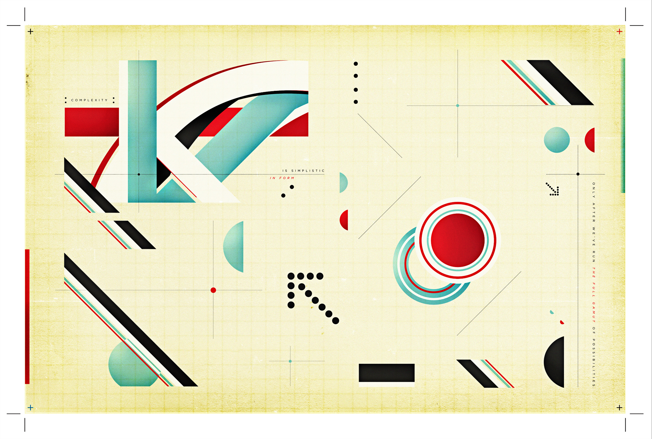
⬆️ Recent work above—“Object Diagrams”
origins: “graphic diagrams”… & a little rambling perspective

⬆️ Past work above—“Graphic Diagrams”
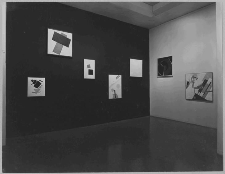
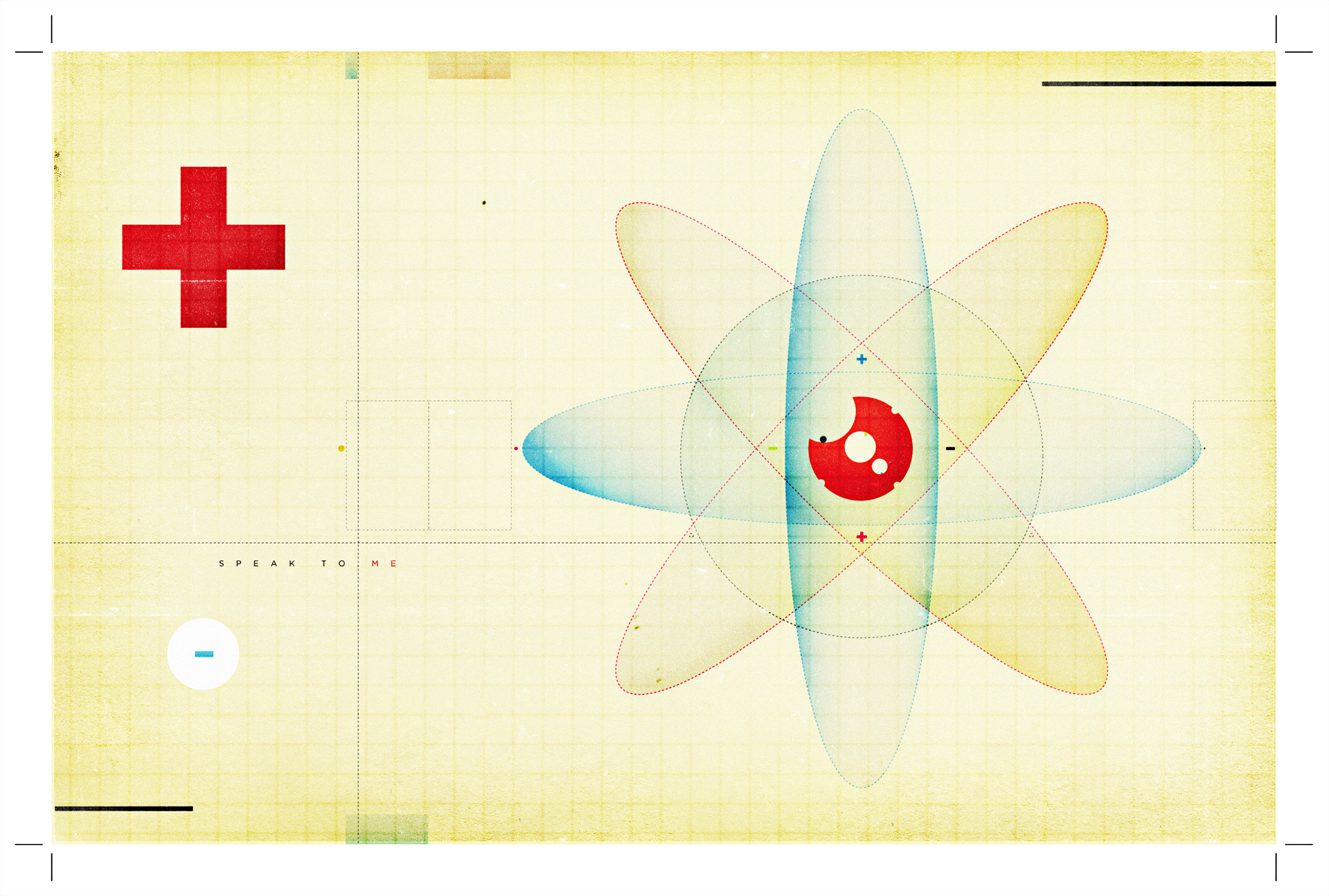
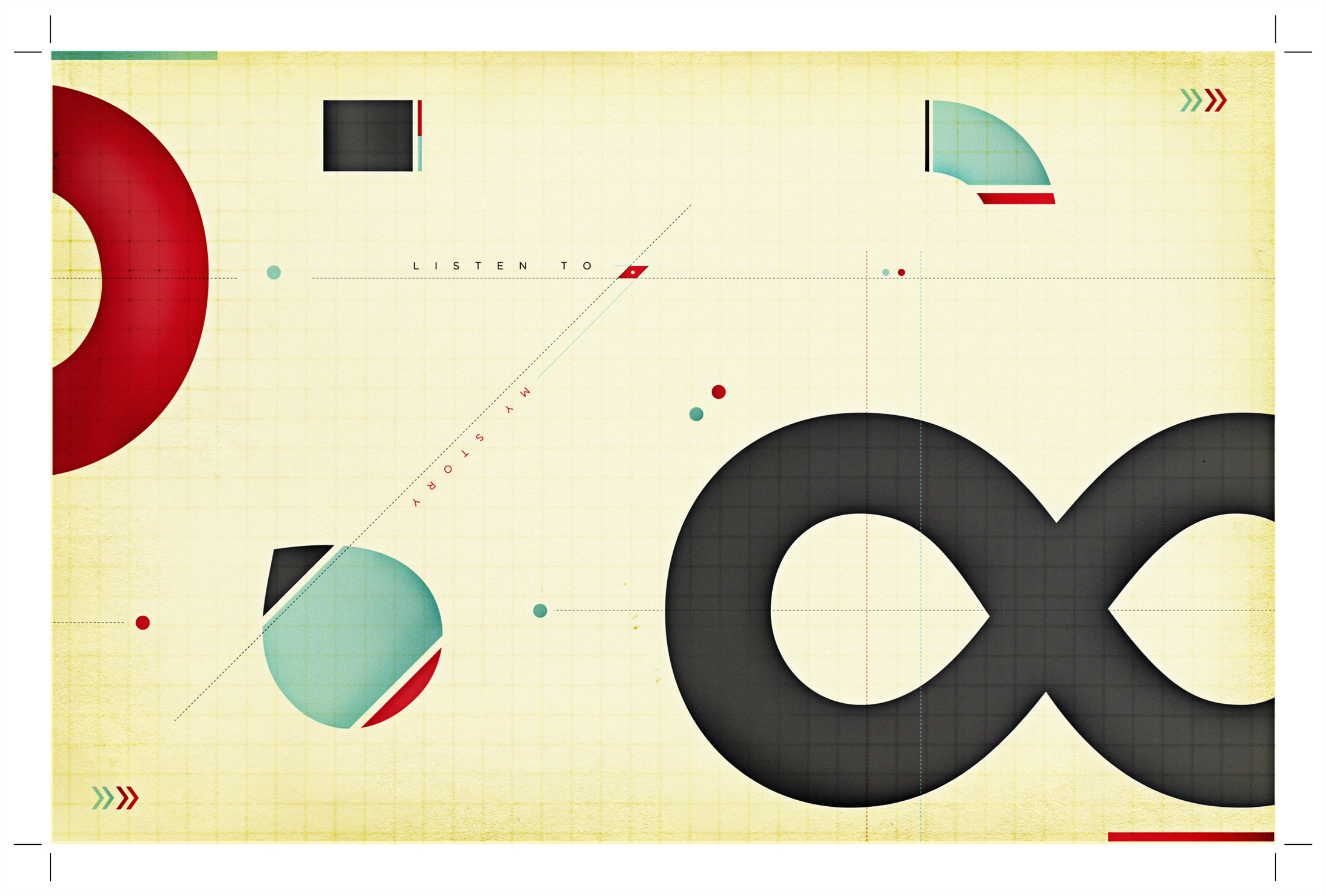
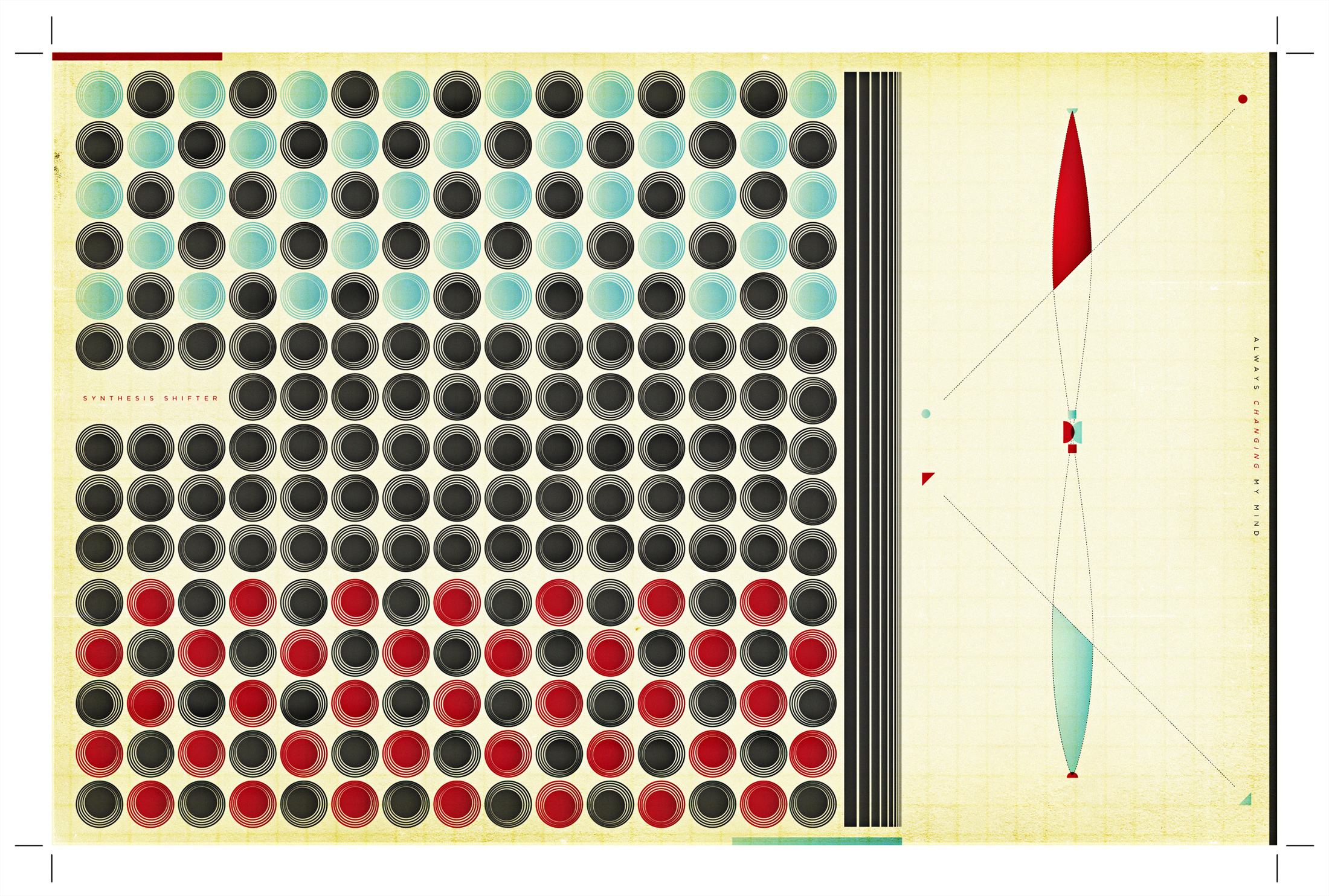
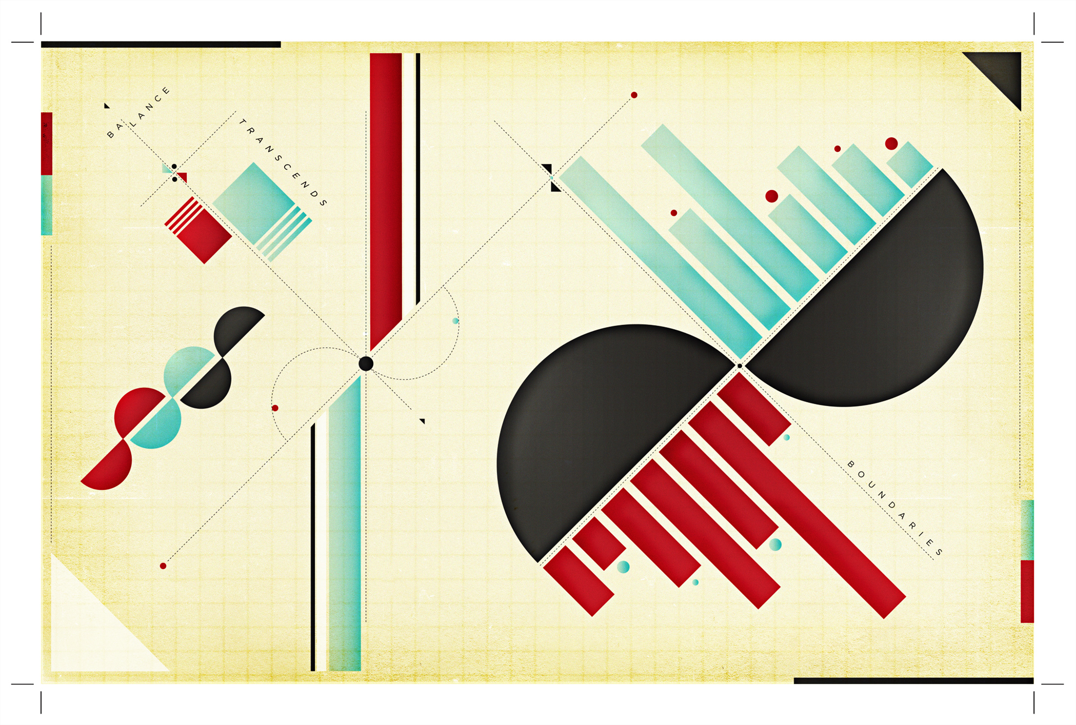
I created the collection of six color images above late in undergrad and early in graduate school (2007-2009-ish) as an experimental project + exhibition I called “graphic diagrams.” I was clearly influenced by Constructivism + Suprematism—in particular, El Lissitzky. The influence was mostly aesthetic at the time. It wasn’t until a few years later I started understanding the incredibly complex contexts in which the work was made. In addition to the socio-political aspect(s), it didn’t initially click with me what kind of impact this work (among other movements like Futurism, Dadaism, Bauhaus, etc..) had on shaping how we experience space and use typography as Graphic Designers today. It all started making sense when I started teaching—it’s funny how having to actually explain something for others to understand does that 😅.
My first experience teaching was assisting in a large intro to design course—I was fresh out of undergrad accompanied by four years of working at an advertising agency. The students were given exercises more or less rooted in Bauhaus design principles without any real context or sufficient design history supplement. Not surprisingly, many of them (18 or 19 at the time) had absolutely no idea what they were doing or why—there was discontent. Even I didn’t fully understand what was going on at first because my undergraduate experience pretty much 100% practical. I immediately hit the books (actually reading the text instead of just looking at all the sweet pics this time 🙃). Then magically the practical stuff I had experienced years prior started to click with what we were doing—ultimately allowing me to teach the stuff with a straight face and even a little confidence.
It’s obvious work from this era heavily influenced the eventual development of “Modernism” in Europe—which is, love it or hate it, still prominent today. Even though this movement played a large part in shaping what some might call the traditional “Canon” of Graphic Design we know there were many non-European voices / stories / narratives that were not included when it comes to how design / design history has been taught for the past several decades (in the U.S at least—can’t speak for other countries). Thankfully, that is changing in many circles because of educators / researchers like Dr. Dori Griffin and María Rogal —current colleagues of mine at University of Florida. It goes without saying I’m lucky to be surrounded by people pushing boundaries in these domains, as I have benefited greatly as a practitioner and educator from their hard work and contributions to the field. The ultra-intensive, long-term work of expanding the “Canon” through re-thinking how we teach design history and working to Decolonize the Design world is incredibly difficult, complex, and time consuming. While I feel there is experimental value in the work I posted above ⬆️ for me, it’s important to acknowledge it does nothing to intentionally move this needle. This topic requires so much more, but it’s better to link to a community of researchers that do it (among other things) better than I.
Hmm…I guess I’m getting a little into the weeds here—oh well. Even though the initial diagrams I created weren’t heavily typographic, this conversation is really interesting to me in particular from a typographic perspective. There are people like Wael Morcos (among others) that are transforming the typographic world into a more inclusive space by essentially building new multi-script alphabets or taking popular western typefaces and creating additional companion scripts. This accessibility across different script systems coupled with the rise of variable and parametric type is super exciting! Grilli Type’s GT Eesti comes to mind as a great example of new multi script typefaces—particularly within the context of this post because the alphabet was designed in Latin and Cyrillic character sets—all based off a found typeface in Soviet Russia from 1940.
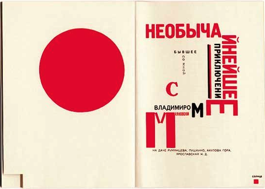
It’s interesting looking back at the work from Russia I was so inspired by from the early 20th century (you can see some in Tipoteca if you want) and acknowledge most of it is in Cyrillic Script—a non Western alphabet I certainly can’t read. Once again, even as a Westerner who used/uses typography extensively the full implication of this from cultural / technical-typographic perspectives never hit home with me, nor did anyone ever discuss the issue of design and type in different scripts with me during school. It’s also interesting to me to think about the impact these pieces in Cyrillic certainly had on design + layout with Latin-based alphabets. Russia seems to be situated in a unique space between common perceptions of “East” and “West.” I’m not going to attempt to tease any of that out here, although I think this work and its global communication impact (among other things) might be at the heart of that conversation. I wonder how different my experience would have been with this work if I had experienced it in a different context or had I been able to read all the text? I suspect it would have still been inspiring because of how transformative it was—even from purely technical and aesthetic perspective. This is surely what I noticed when I first saw it as a 19 year old literally sitting on the aisle floor in our university library. A lot of the work was temporal, political, and propagandized (probably most famously “Beat the Whites with a Red Wedge”). This was a reflection of divisiveness during the upheaval of a literal revolution. Upon further reflection of this, I can’t help but think of the visual vocabulary of divisiveness we’ve seen rise in America over the past several years 🤔. Would I still be inspired if the work said something I deeply disagreed politically or culturally with in the present? That’s very tough to say without the benefit of cultural distance and time. I will say it is hard for me to appreciate the array of communication tactics that have recently been used to transform our digital media landscape, even though one could make certainly make an argument of “innovation.” Ugh.
intentionally-intersecting-interests
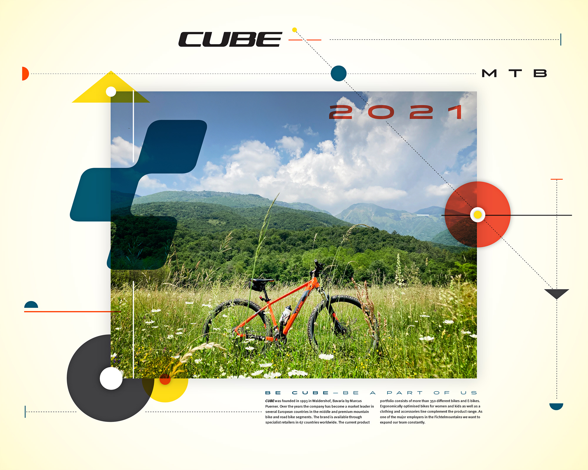
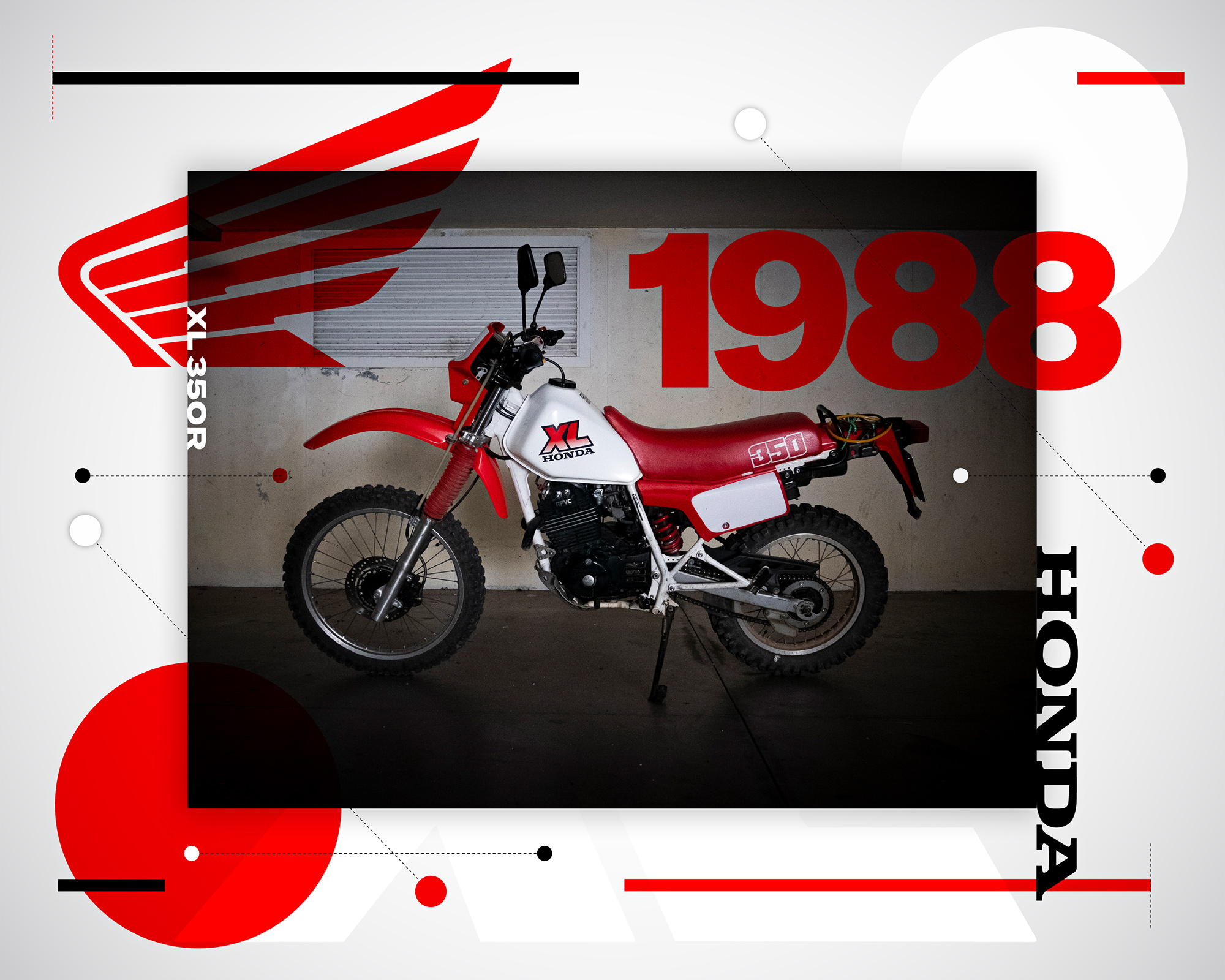
OK—let’s re-focus. Experiencing this work from Russia as a young person played a major role in shaping my visual vocabulary as a designer—it is evident in my early work and it’s evident now. I find it exciting to sit down with a blank canvas or artboard to just start drawing shapes. Who knows what will come out? Most of the text you see in my original diagrams (click or tap for a larger version) was literally on the page of my sketchbook that happened to be open at the time—a weak-ish play from the Dadaists. The images at the top of the post take my original “diagram” concept and introduce a photograph of a special object in each composition to build around. I chose to bring in the brand of each here for additional design/typographic elements to work with. Yeah, it’s commercial—and I’m cool with that. If you’re looking for a project or design exercise to do for fun I’d recommend trying this out for yourself. For me the process of selecting these particular objects to “diagram” was an intentional effort to create intersections between my design and cycling / motorcycling identities. The process was both enjoyable and reflective. Should you choose to try this exercise, consider the meaning and context of your selection and reflect on what these intersections of interest really mean to you as you make 🤔 You are bringing in something from the outside and not just designing in a vacuum for design’s sake. There’s real value there. Your favorite loud music and maybe a coffee or a glass of wine depending on timing might help too. Ciao!
✍️ +✌️