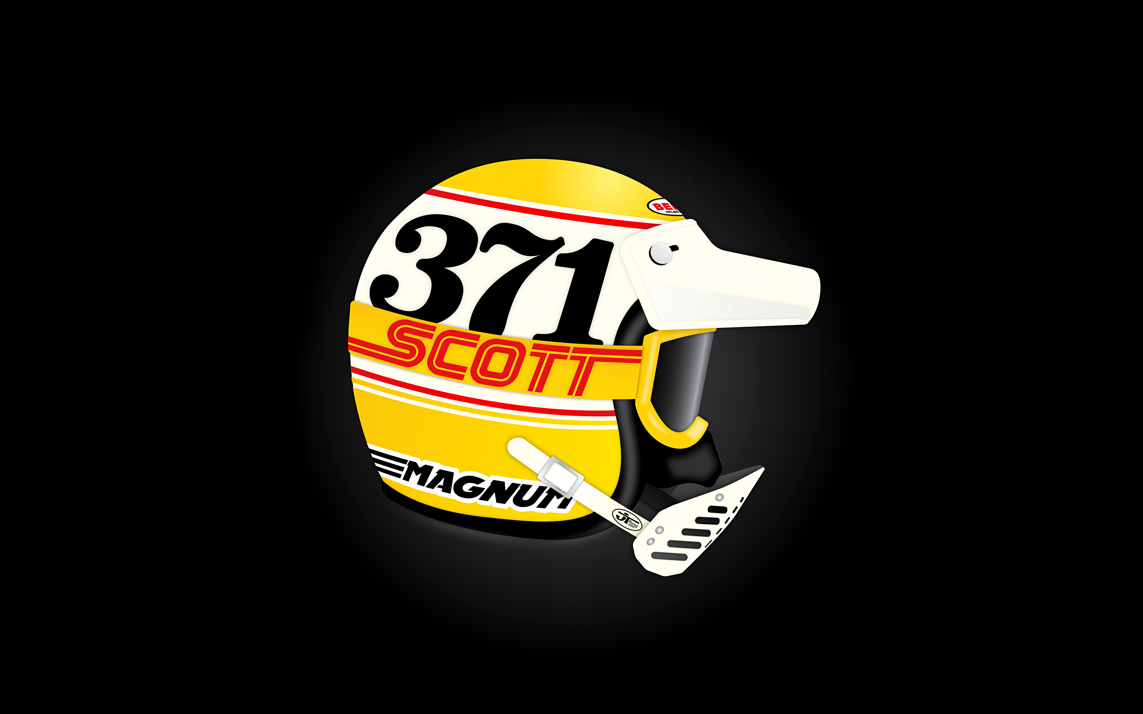
BELL MAGNUM
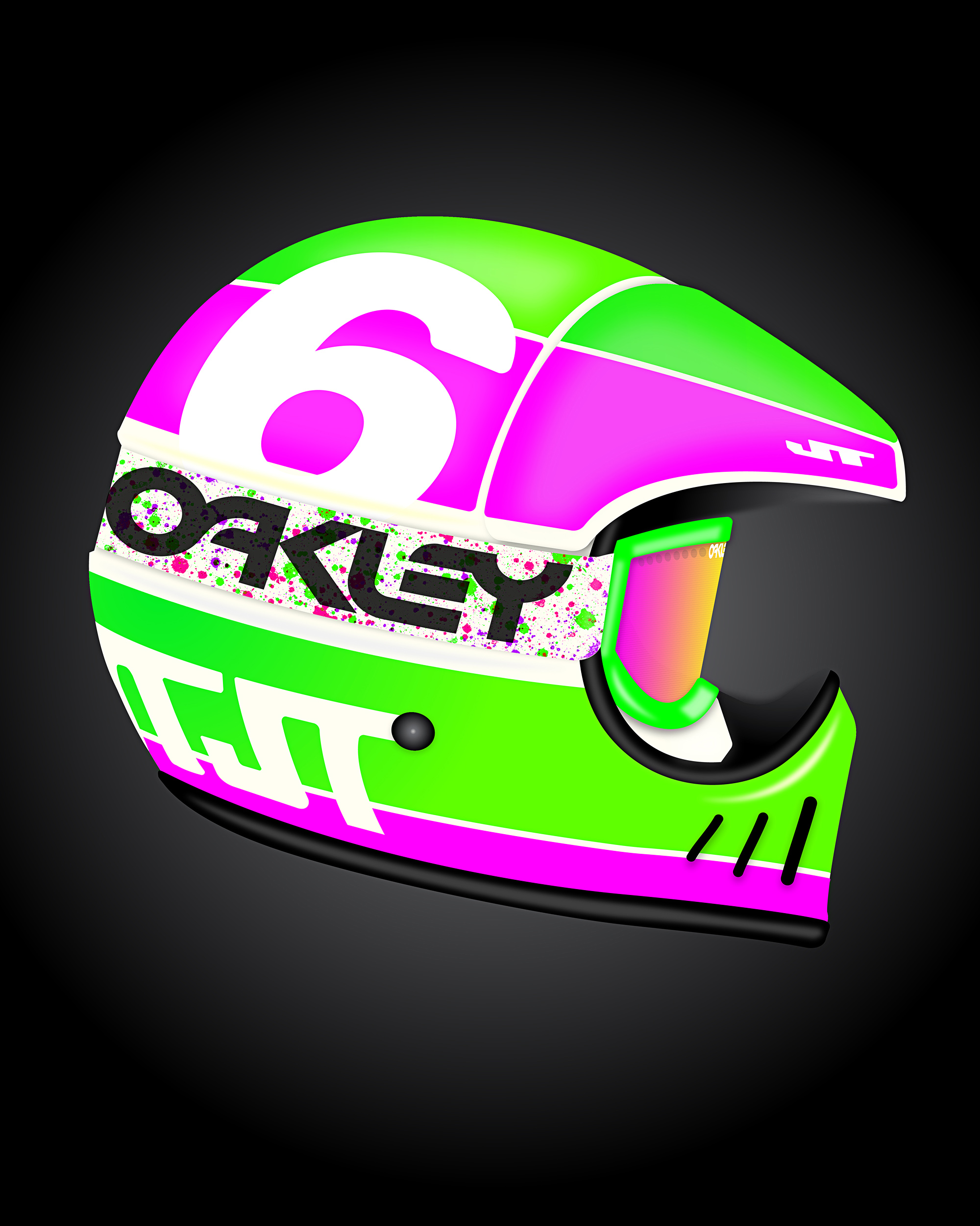
LEFT: BELL MOTO 3 | RIGHT: JT ALS2
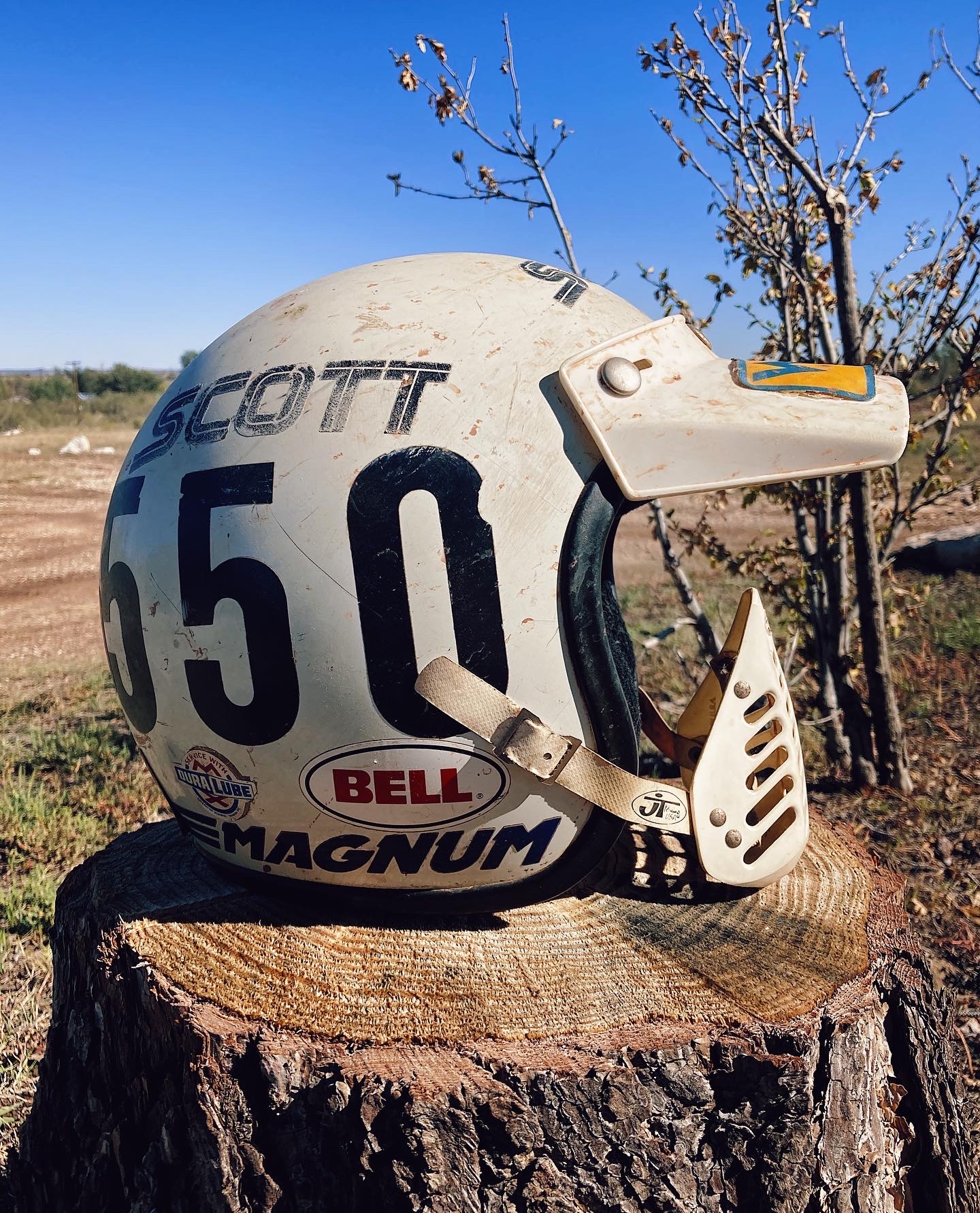
⬆️ Project Inspiration: My uncle Todd’s Bell Magnum from when he raced motocross in the early 1980’s.
Moto Helmetry: Bell Magnum—and more!
I’ve been meaning to start this project for a long time so I’m happy to finally be posting the first helmet of what I hope will become an 8-10 part series. I’m calling the series “Moto Helmetry”— kind of a goofy spin on the word “Heraldry” from the days of knights, kings, castles, etc… It’s a for-fun project that is meant to explore the design and decoration of motocross helmets from the early 80’s through current. I’ve gone through the decades and selected some of my favorite helmet models to illustrate and to create period-appropriate designs for.
I decided to start with the Bell Magnum for a lot of reasons. Probably the most important was that I have a great piece of physical inspiration with my uncle Todd’s Bell Magnum from his racing days. Todd unfortunately passed away recently after a multi-year battle with cancer—way, way too soon. I literally grew up on / around race bikes, gear, dirt race cars, etc… and this helmet was a big part of that. I remember my uncle even having a pair of SCOTT goggles in the color scheme.
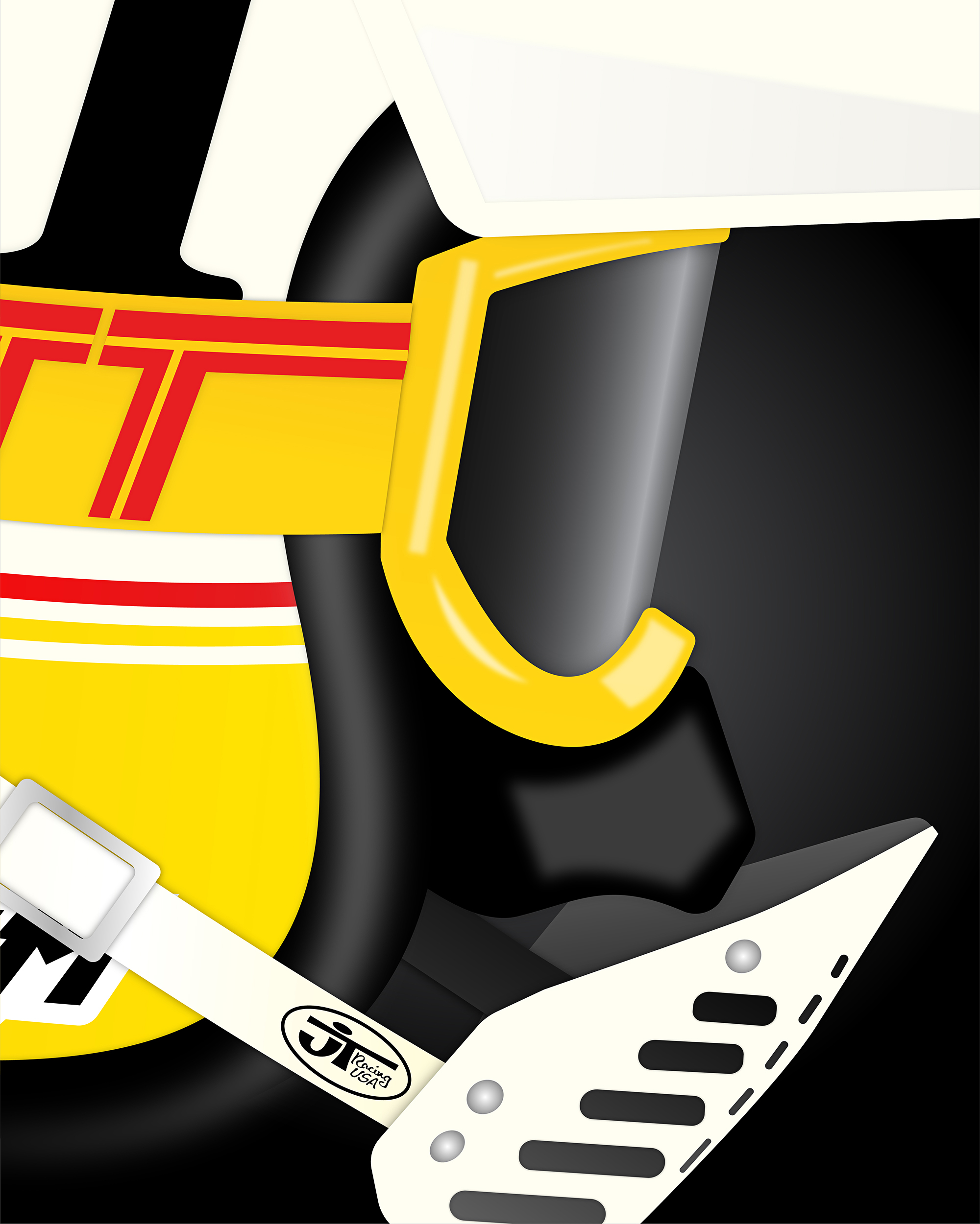
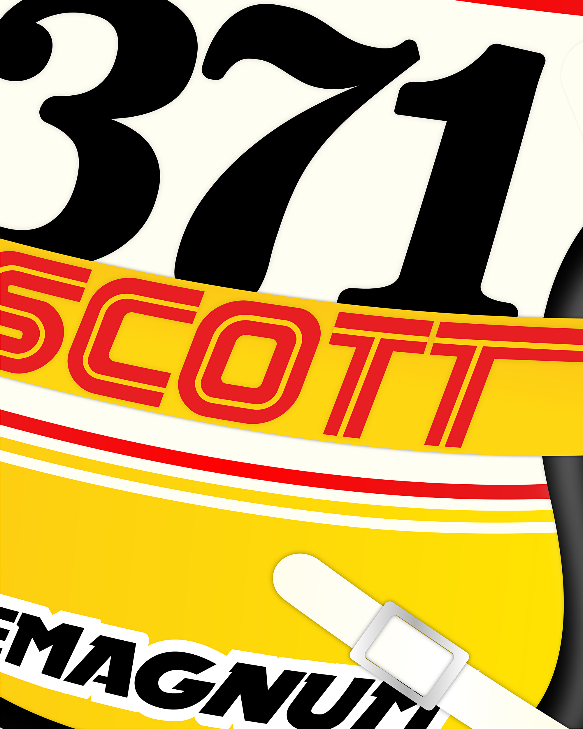
Design-wise you can see the helmet is a Bell MAGNUM open-face with a JT mouth guard for face protection and SCOTT goggles + nose guard. I took a little liberty with the nose guard, because I liked the base looks of Oakley’s guard much better than what Scott had at the time. I would absolutely never race motocross without a full face helmet, just like I’d never drive a sprint car without a role cage, but they did for many years. The mouth guard is definitely both an eclectic and interesting piece of moto history. They were mostly phased out by the mid-80’s, but there were notable hold-outs such as Jeff Ward, who stuck with the open face late into the 80’s (maybe even the early 90’s??!). I decided to add the nose guard attachment as well mainly because I think it improves the overall look of the setup. From a visual design perspective I kept it pretty conservative. I built my design around. 37 and 371 were number I used when I raced so that was a no brainer, lol. This would have been a common color scheme during this period and running the number on the side of the helmet was way more popular than it is now. I wish they would bring that trend back a little more. Heavy serif typefaces like Clarendon, used here were popular on number plates and helmets back in the day. Again, I’d like to see this trend come back around, too!
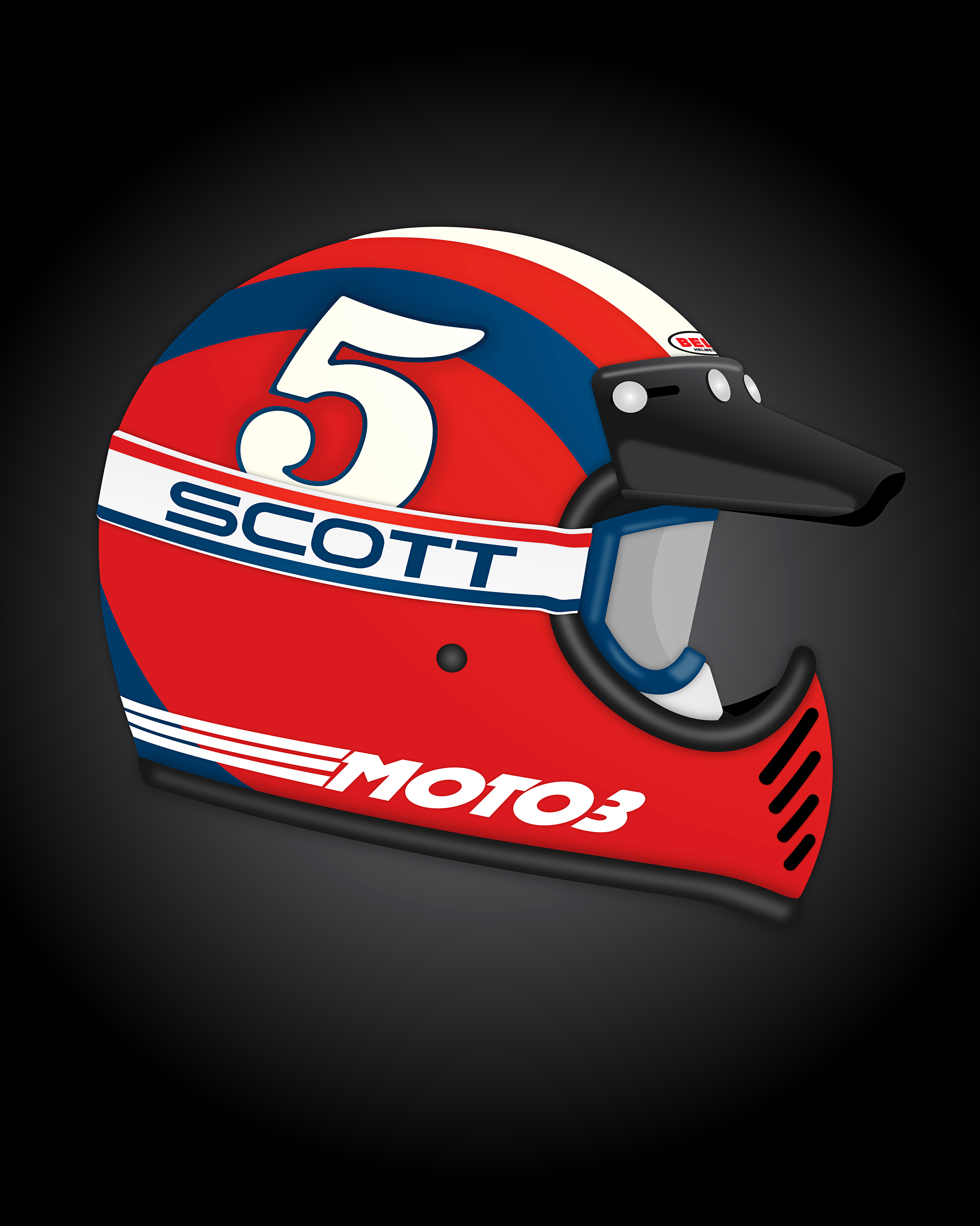
I had a blast making this first piece and hope to crank these out semi-regularly. I was a little concerned about pulling off the open face given I don’t actually have a rider wearing the helmet, but overall I’m happy with how it turned out. My next selection will be a full face helmet—most likely the Bell Moto III or the JT ALS 2. What do you think? More soon—ciao.
UPDATE: I decided to keep adding new helmets I design to this post instead of making a new post for each helmet. I think it’s neat seeing them all together in one post like this in order to see the technical progression—starting from oldest down to newest.