⬆️ Playing around with an app called ImgPlay that makes gifs or videos super easily on the phone. Normally I prefer to have more control by making my own in Photoshop, but this app works really well.
good problems—too much to post…
I haven’t been posting a ton on the journal as of late because we have been busy traveling—and—I’ve been wasting too much time on instagram. I’ve been playing with the idea of two accounts now, lol. One for more personal and designy / making stuff (@jarrederraj) and one just for type and textures I capture with my phone (@relentless_transient). As I mentioned in a previous post, I had gone in and cleared over 7 years worth of stuff from my IG account. I was considering just getting rid of it all together—I still hate that facebook owns the platform. That said, I have moved into a mode of acceptance that there is a time and content price we all pay to share on these platforms if you want to connect with people—and nobody cares because they aren’t thinking about you the way you might think they are. I like to share stuff I make, it’s just who I am. So, for now I share.
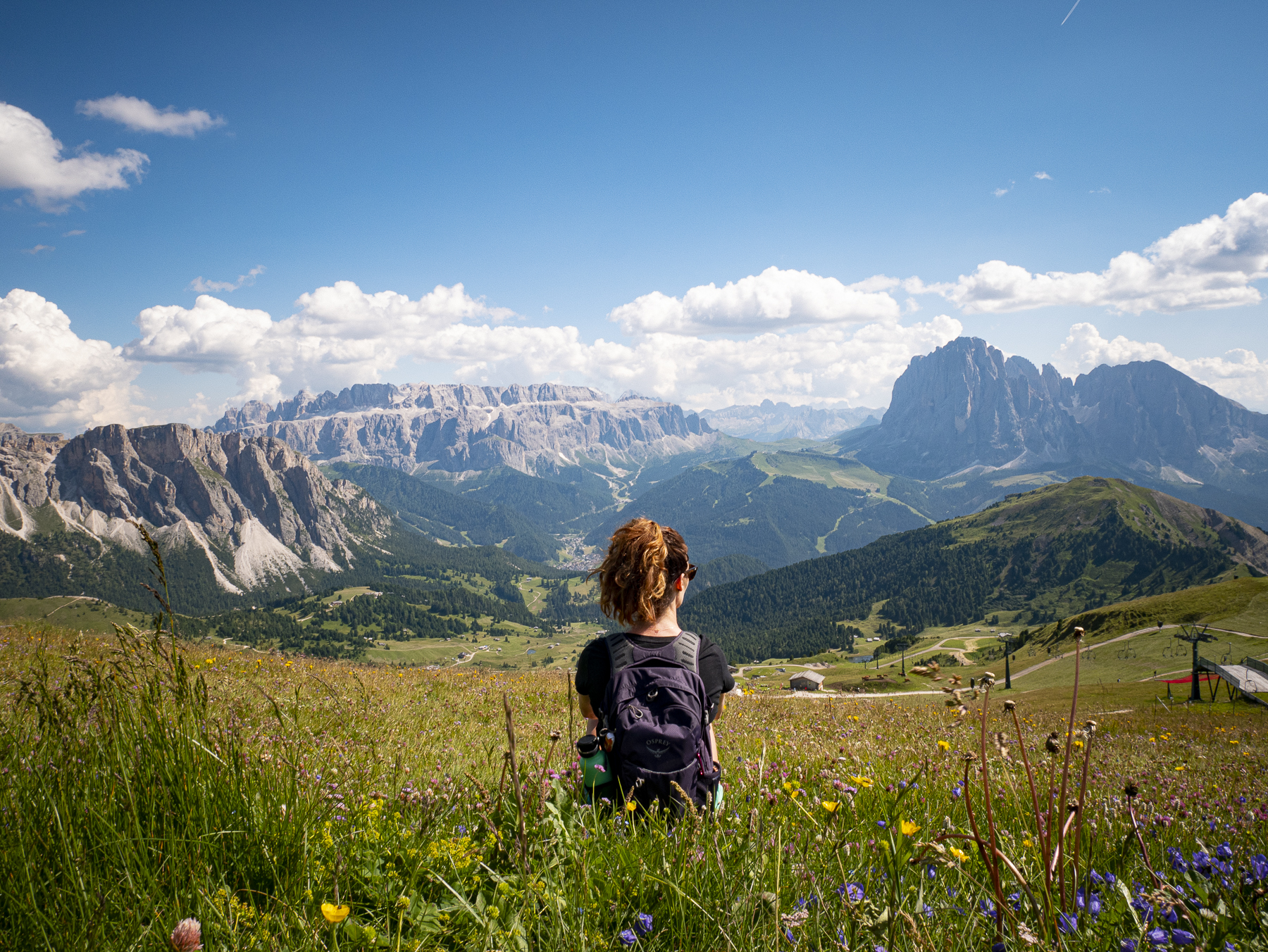
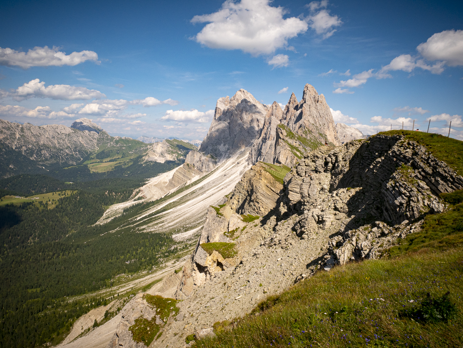
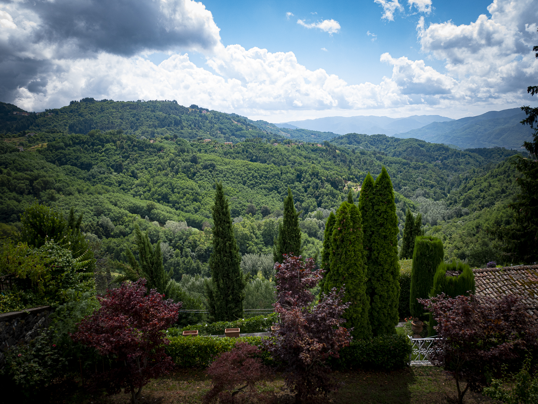
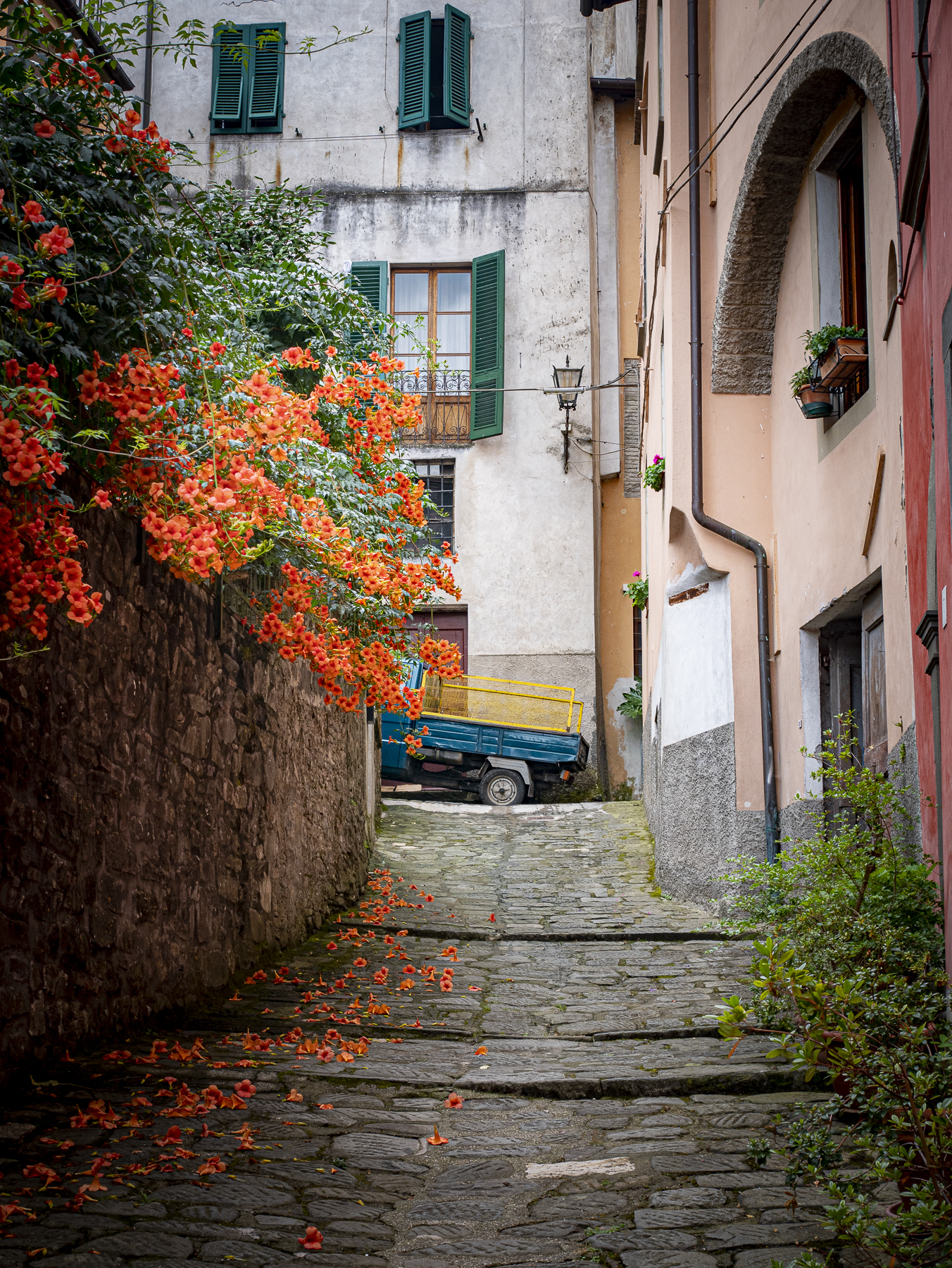
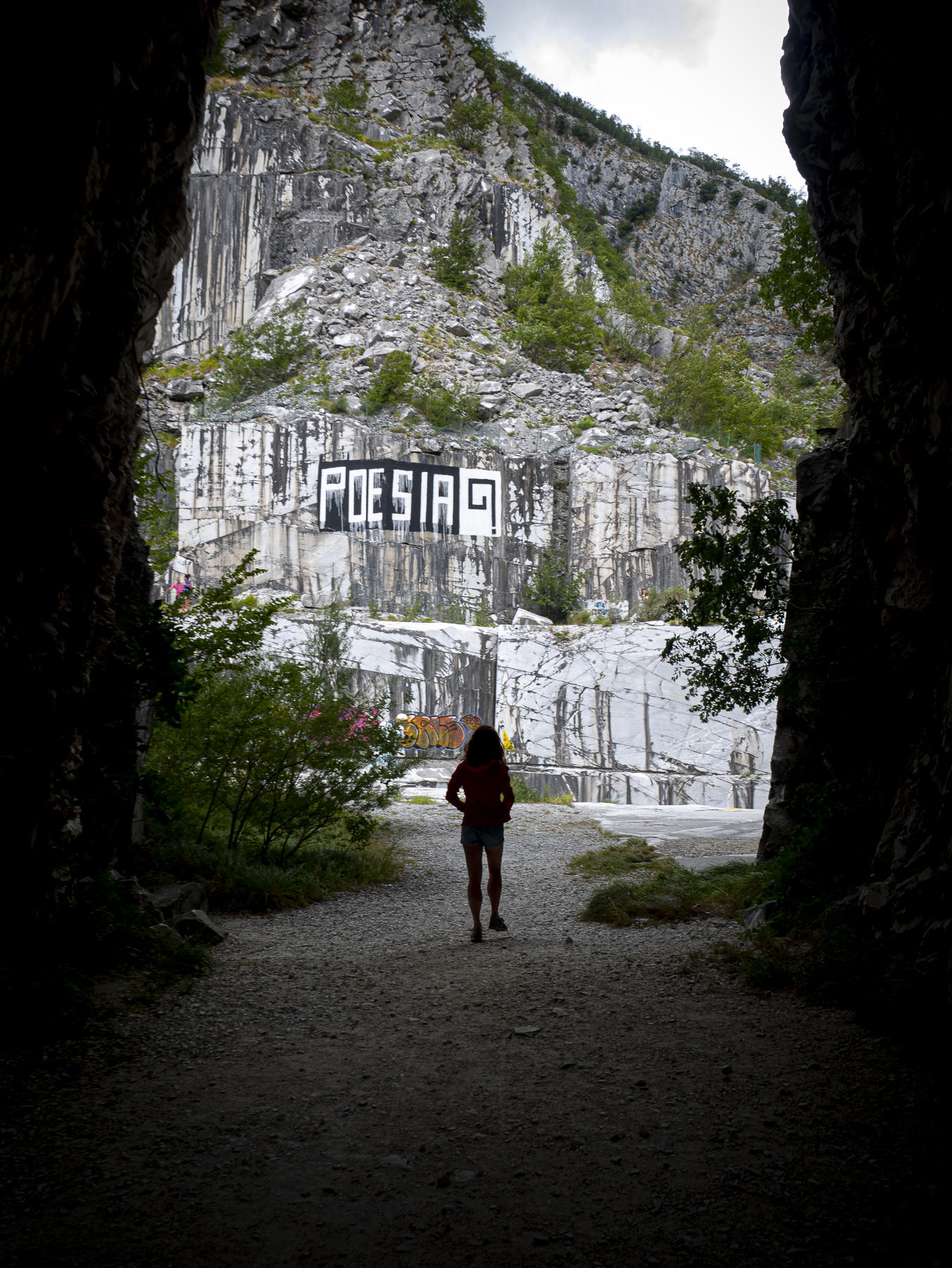
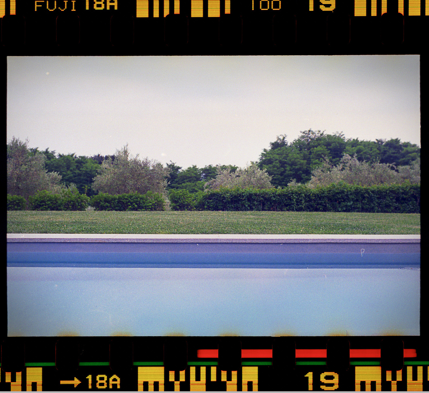
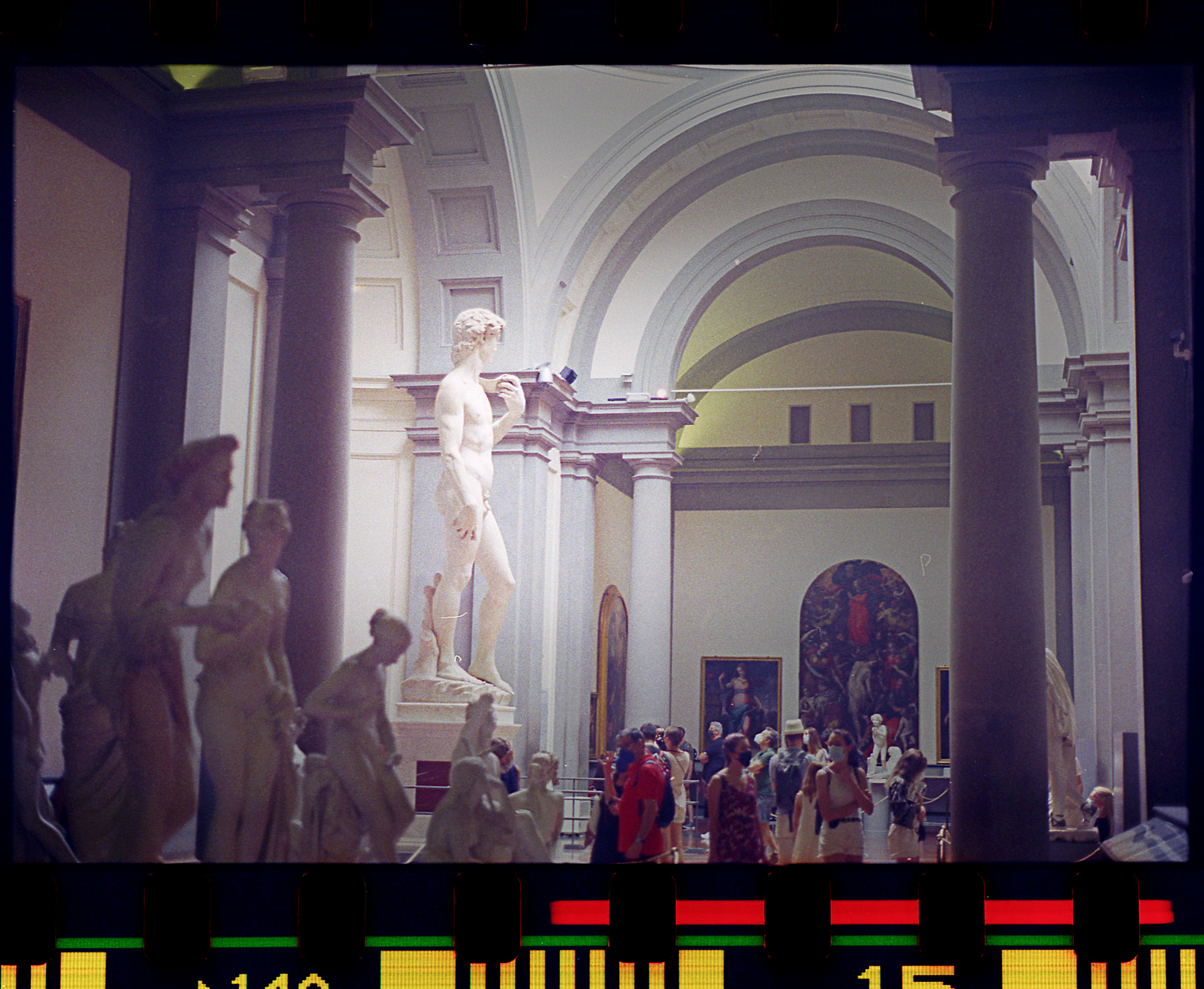
In going back to my phone archive and reviewing the library of stuff I had collected from so many places I… 1) wanted to get it all in one place so I could make sure it didn’t get lost and… 2) wanted to share it with anyone who might be interested. It felt stupid to just have all of these images saved in a few different places on my phone for no one else to see. I decided to use the handle @relentless_transientas a nod to my first website from way back in the day. I feel the name is still fitting for my ridiculous all in or nothing attitude when it comes to sharing on social media. I suppose it doesn’t really matter who’s looking at it, but it feels good to know the images are there. The photos above were shot with my Panasonic LUMIX—I really enjoy shooting full manual raw with this camera. It’s easy to carry and I’m happy with the output. It’s hard to take a bad photo in places like this, but I did my best to capture the feeling of massive space and time you get when experiencing with your eyes. There’s definitely something special about the Tuscany region here in Italy. The light in the hills is like nothing I’ve ever seen before. It’s also observed in the Prosecco Hills closer to us here in Polcenigo. The images of the Dolomiti further North speak for themselves—absolutely spectacular bordering on unbelievable to experience in person. Feeling very thankful for the opportunity to see and photograph these places. These photos are best viewed on a large screen (prob sacrificing a few seconds of load time, but oh well). Ciao everyone.
Sigh…scanning / editing negatives takes serious time! I’m working to view the process as a discipline that is practiced as a form of reflection on the experiences had while shooting. It’s hard to even compare the process of acquiring film, loading, shooting, processing (by yourself or by a shop), and scanning/processing film negatives to any form of digital photo processing. Film costs way more, it takes waaaay more time, there’s no instant review or second chances in that moment, and yet…
I’d like to think everything that goes into the film process makes viewing the image a more rich experience for the viewer—I’m not so sure about this. For me as the maker—it does. And that’s enough for me to keep coming back to film. I choose to leave the borders on my film when I scan as evidence of the physical and temporal process of making the image. I suspect photo purists might say this takes away from the image (and I’d say they were right)—much as a proficient letterpress printer of their time would see the pressure imprint we all love so much as a printing mistake. I think we all crave evidence of physicality these days for obvious reasons. Things like film borders and letterpress imprints…or the velvety touch of a screenprint don’t necessarily alter the meaning of the content captured, but they do speak to a process that has real edges—this creates a sort of additional meaning that gets layered in. I guess the concept is similar, but not exactly the same as what Craig Mod said about “edges” with physical and digital publications several years back—reading that had a big impact on me. Not only in the way I consume content, but in the making and teaching process as well.
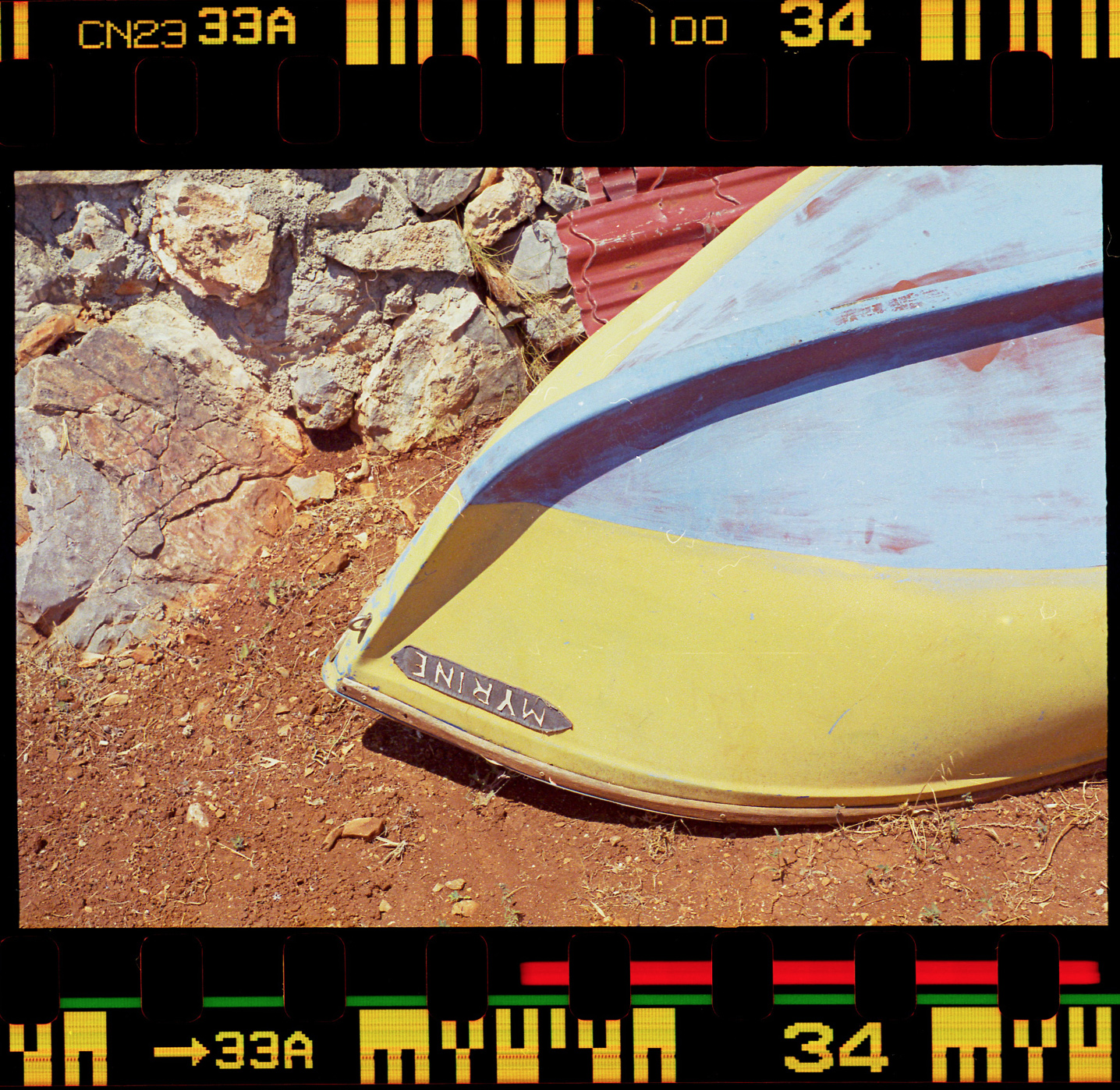
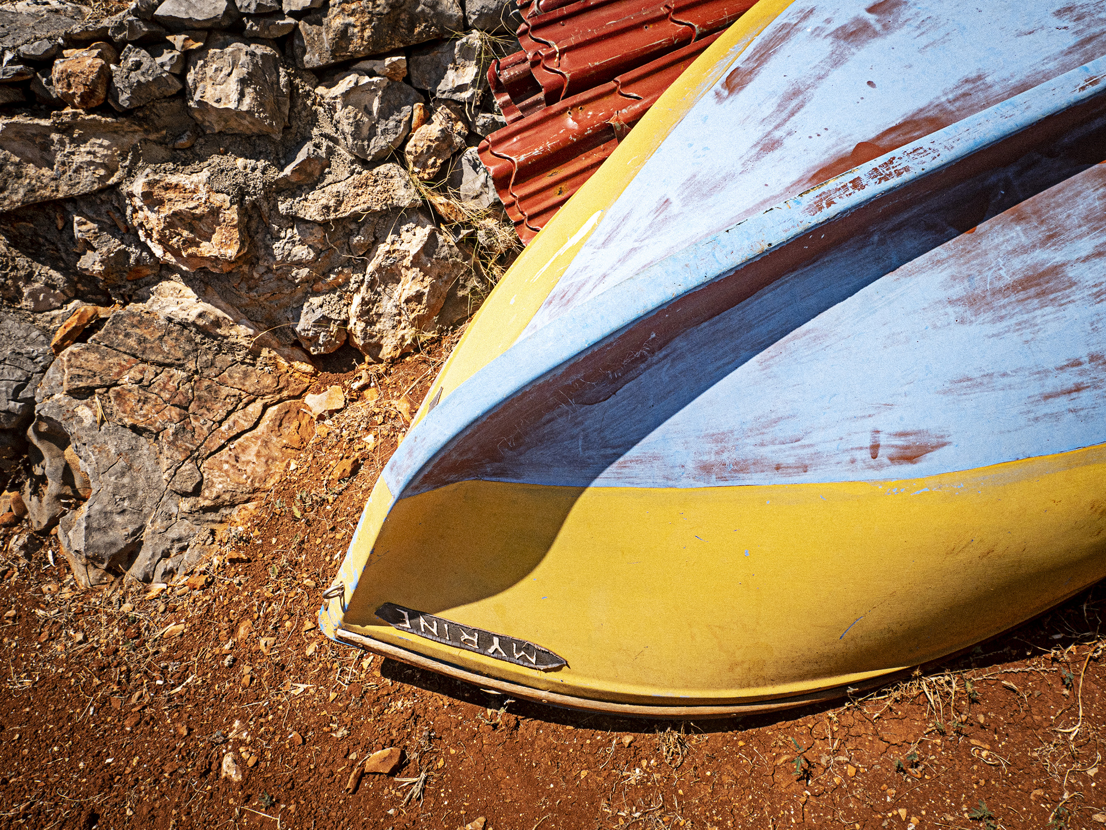
With a film strip I know there are generally 12, 24, or 36 frames to process depending on what I’m shooting with. When I’m scanning working in this smaller domain is a comforting thought. I’m sure we’ve all experienced the overwhelm of having shot 2-300 digital photos at a time (or more)—all good until it comes time to process. That said, shooting digital and film at the same time is a big problem for me—and it’s something I do to myself often. I’ve actually found something first with my point and shoot digital, photographed it, and actually come back with my film camera to capture it again (see blue and yellow boat from above shot again in digital form here) . This is probably not efficient, but I like the intentionality of it—and I like both images. It’s too much to process and great images fall through the cracks. I’ve often noticed this after going back into a folder after a period of time. I almost always notice something I wrote off then, but now seems to stand out as successful. I suppose we all have our methods of finding those edges in the digital processing space. For me it’s a process I repeat religiously: Shoot manual / raw, first round of deletions in camera, second round deletions on large screen, list the keepers on paper, star the absolute best, process / optimize all the keepers per platform context, make the final call on what to share/send out. It’s probably old school and inefficient, but it works for me! I suppose it’s about time for me to turn that process on its head to see what happens. Forms of printmaking like letterpress and screenprinting are similar when working with rudimentary equipment as a team of one. Everything has clear edges defined by the steps of the process, the available equipment/resources, and what is physically do-able. With the edges of process so clearly defined there’s room to focus on the joy of producing and reflecting on the content. Enough rambling for now—ciao!
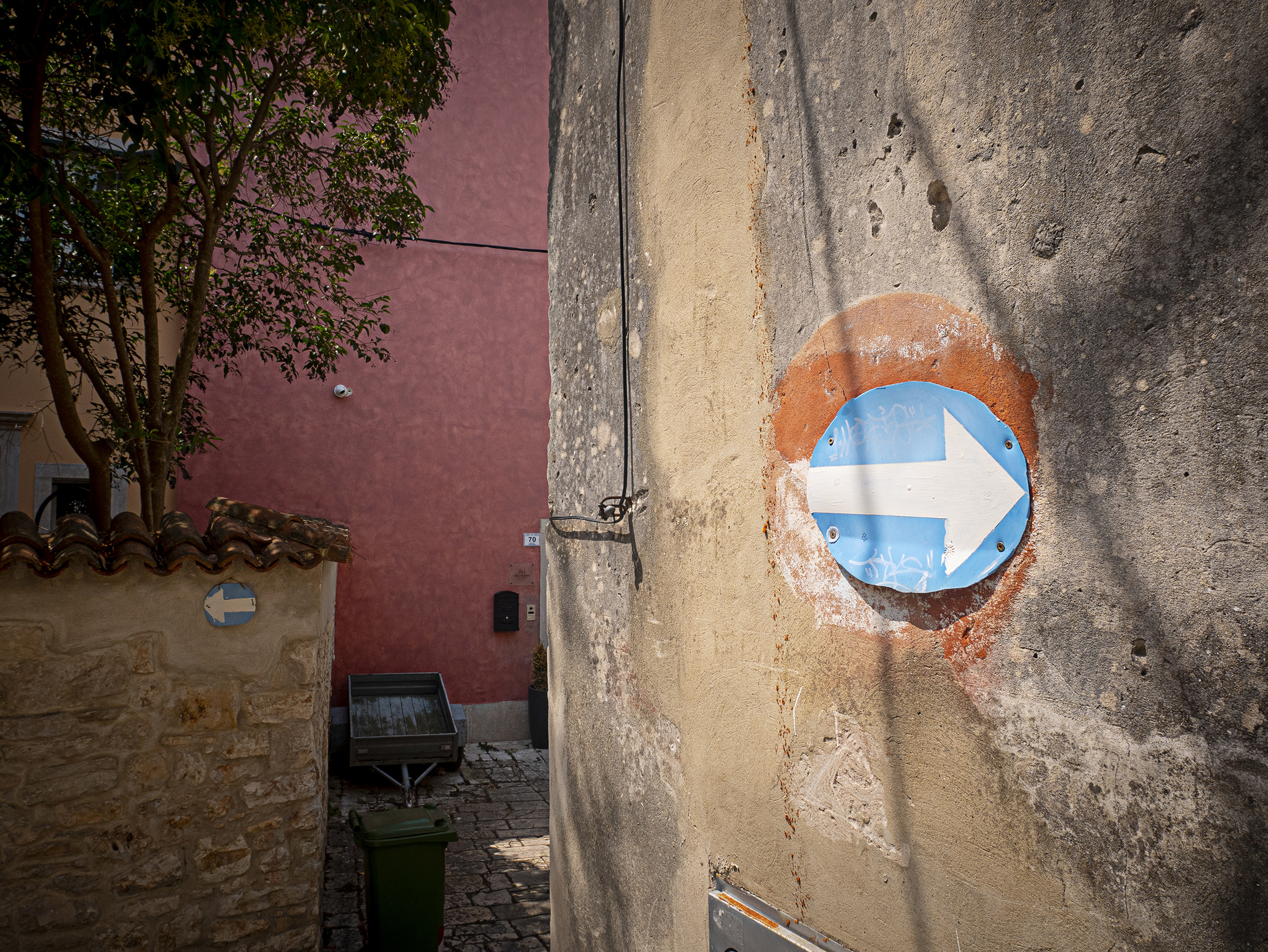
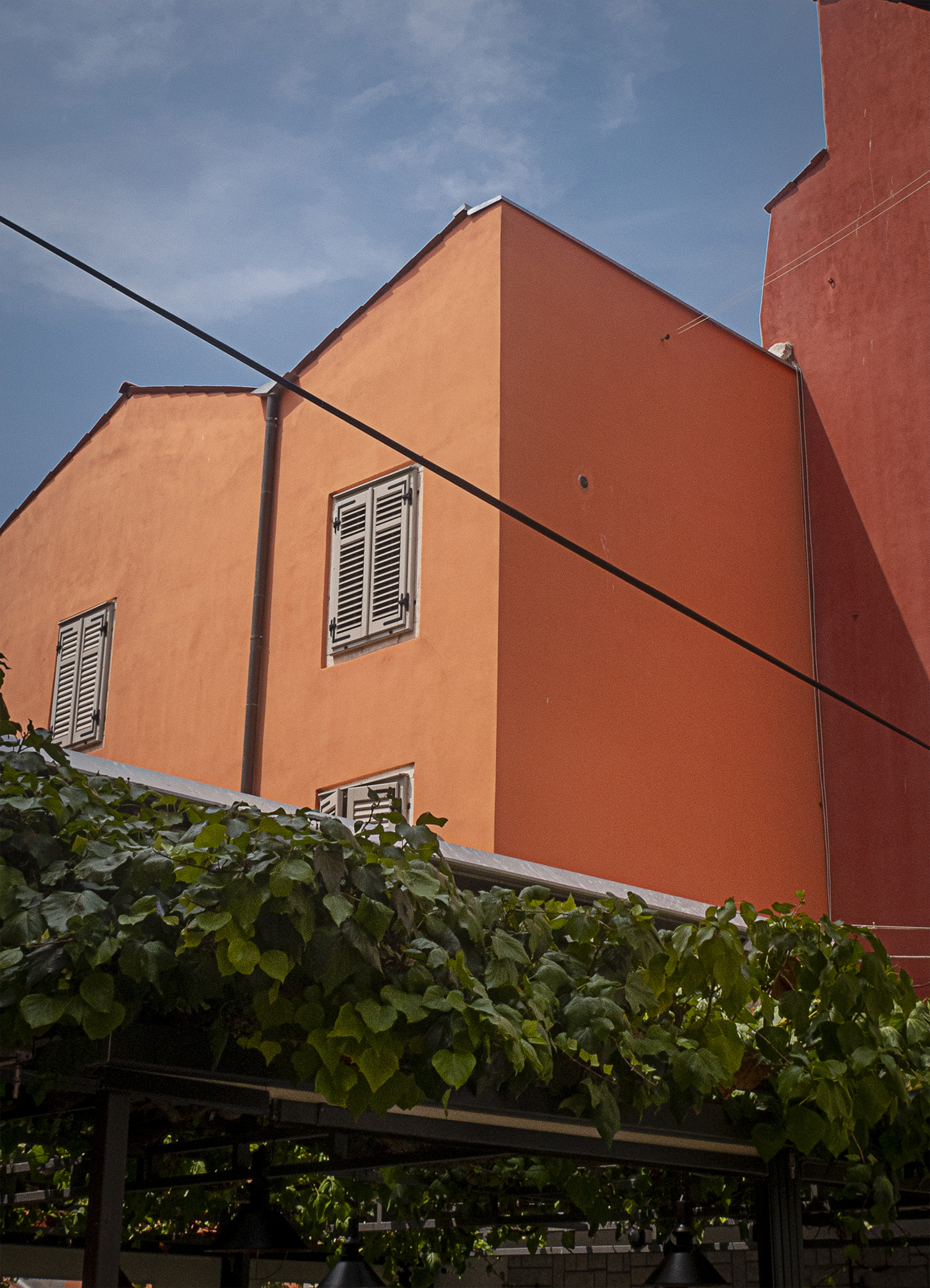
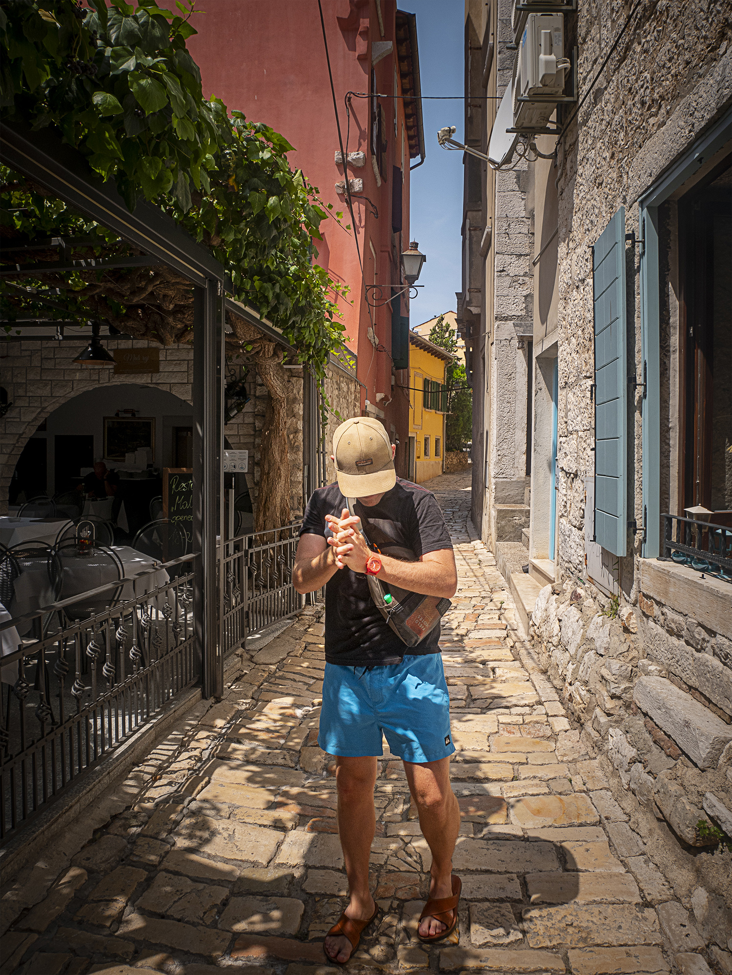
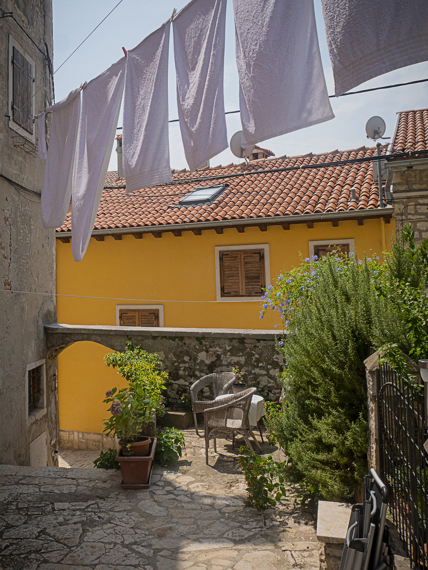
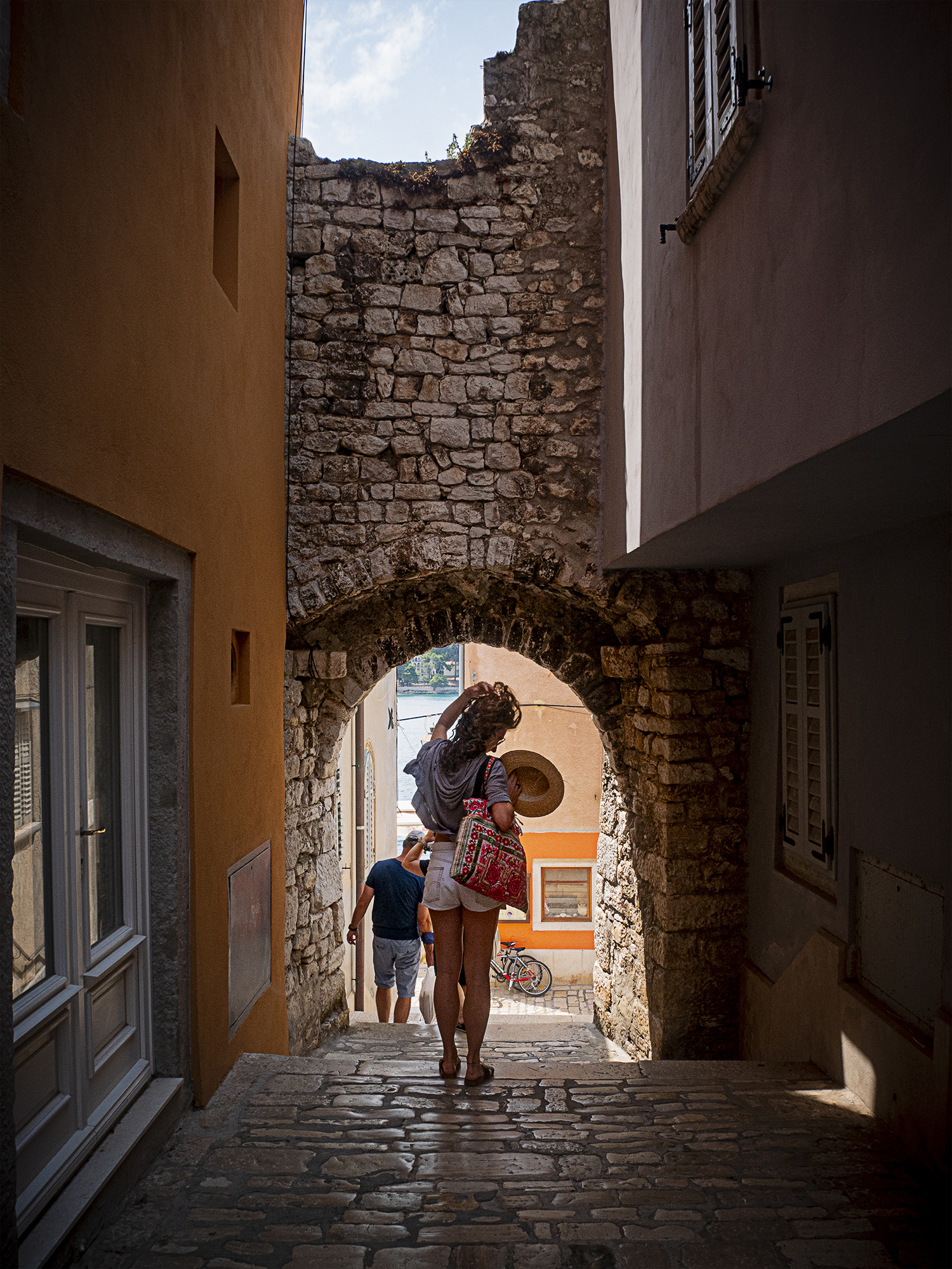
A few snaps from our weekend visit to Rovigno, Croatia. It’s an amazing city! We were able to drive there from Polcenigo, Italy in 2.5 hours—partially through Slovenia. The drive was as beautiful as it was full of hills / curves. The colors and textures of the city are an amazing match with the incredible coastline, public parks, and the super nice people. I posted a few more things from the phone on the IG ⬇️.
Last year (2020) when I still had my studio in Gainesville, FLI video documented my lo-fi screenprinting process. I guess it’s not really that lo-fi, but I like the idea of doing a lot without a ton of specialized equipment. When I really learned to screenprint at the University of Tennessee, I was spoiled by an incredibly nice printing space. That said, they also taught us on-the-fly DIY techniques (coating screens with credit cards, baby oiling white paper for transparent separations, crop-mark registration techniques, etc…) that I still lean on heavily today when I print and prep digital files. I really enjoy teaching this process to designers, as it opens up a whole new world for them in terms of coupling their hand and digital skills—plus it’s just damn fun to get your hands dirty trying stuff. No matter how much control you have in the digital space, manually printing the separations always puts the mind in a mode of “I wonder what will happen if…” with test prints, unexpected overlays, etc…
I had posted original snippets in stories on instagram, but realized the time limits were too restrictive. I finally got un-lazy and put the full length videos on my laptop, using Premier Pro to cut them all together into one piece. As I say in the caption, I was shocked to see it was over 40 minutes long! That said, it was fun to make and was also interesting to reflect back on—it also feels like something I own now because I’ve taken the time to document and archive it properly (even write a little about it here). I have my setup here in Italy almost complete (now a garage studio)—this gives me motivation to finish the thing and print again. I also had the idea to do a “the hard way” series for IGTV for other stuff like loading cameras with film, maybe some black and white processing (need to order the kit tho 🙄), changing oil in motorcycle, fixing bikes, etc…who knows! I’m a shy guy when it comes to sharing on social media—even though I feel it’s important to share process, but I’m working to just get over myself and use the social tools as intended if that’s what I’ve decided to do. I spent a lot of time trying to figure out how to use platforms like Instagram differently, but nothing ever felt right or authentic. I really dislike that facebook owns IG, and I’m honestly still trying to come to terms with that. I really wish they would have remained independent. I’ve actively been having conversations with other creative professionals about this. The prevailing opinion seems to lean towards not overthinking it.
Getting off instagram was part of the reason I started this blog back up, but now I find myself using them in tandem—and I’m feeling surprisingly pretty good about it. I worry less about rolling tons of time into the design/ image quality on my IG posts (because nobody gives a crap—really—they’re probably only seeing it for literally one second most of the time)—and— I’m doing that over here already. In fact, when I make a post here I have everything I need for IG already prepped if I want to use it. The difference is… I’m actually learning from my process here and building something that’s both cohesive and creative for myself (sounds selfish—and it is). That said, when I roll significant time into something there’s a sense of satisfaction that I can actually hang onto + build on. With IG, you post and it’s literally consumed by the feed immediately. I’m lucky to be in a space where I have time to leverage my creativity to build these posts…one might argue IG is faster for doing things on the fly. This may be true, but I wonder what the trade off would be in terms of time if you look at post time compared to mindless scrolling time with IG 🤔. I suspect they would be comparable—for me at least when I allow myself to get sucked into the IG content void. I’ve rambled on more here than I expected on these loose ideas. I’ll need to think and re-visit this for more focus, but this is here for now—ciao.
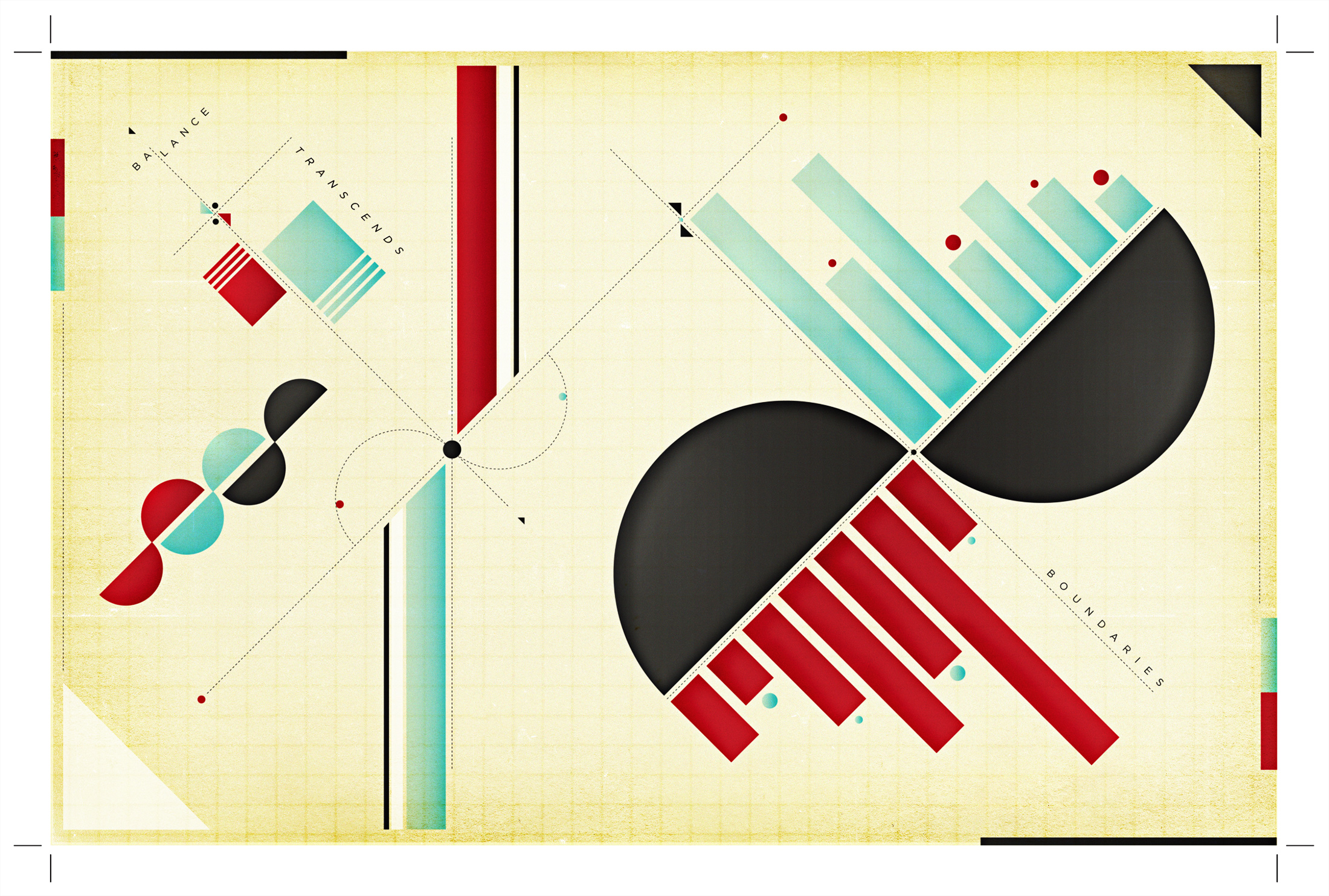
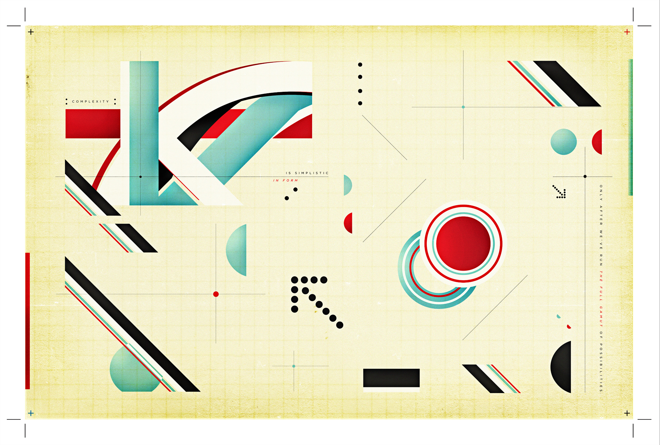
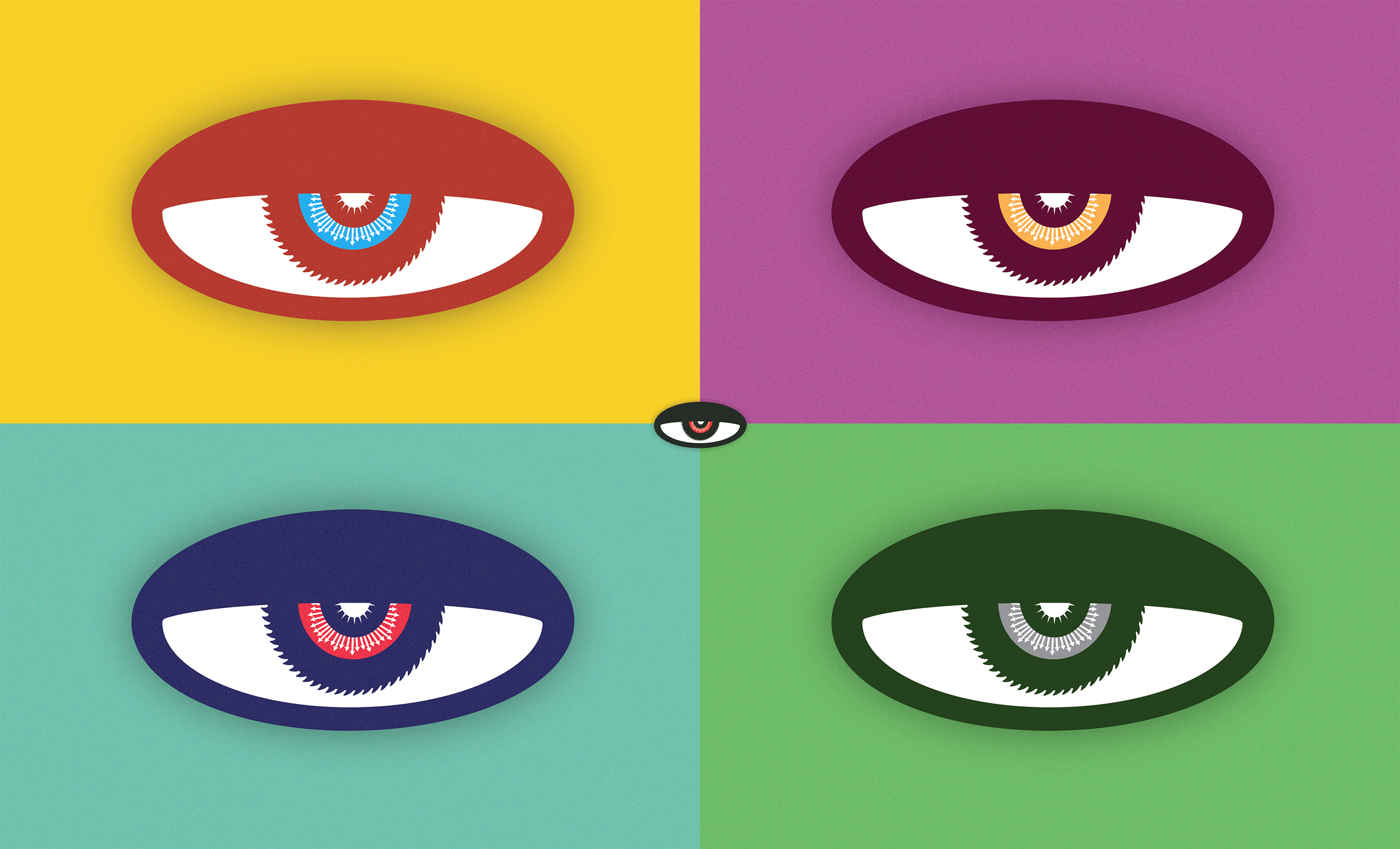
I created the collection of six color images above late in undergrad and early in graduate school (2007-2009-ish) as an experimental project + exhibition I called “graphic diagrams.” I was clearly influenced by Constructivism + Suprematism—in particular, El Lissitzky. The influence was mostly aesthetic at the time. It wasn’t until a few years later I started understanding the incredibly complex contexts in which the work was made. In addition to the socio-political aspect(s), it didn’t initially click with me what kind of impact this work (among other movements like Futurism, Dadaism, Bauhaus, etc..) had on shaping how we experience space and use typography as Graphic Designers today. It all started making sense when I started teaching—it’s funny how having to actually explain something for others to understand does that 😅.
My first experience teaching was assisting in a large intro to design course—I was fresh out of undergrad accompanied by four years of working at an advertising agency. The students were given exercises more or less rooted in Bauhaus design principles without any real context or sufficient design history supplement. Not surprisingly, many of them (18 or 19 at the time) had absolutely no idea what they were doing or why—there was discontent. Even I didn’t fully understand what was going on at first because my undergraduate experience pretty much 100% practical. I immediately hit the books (actually reading the text instead of just looking at all the sweet pics this time 🙃). Then magically the practical stuff I had experienced years prior started to click with what we were doing—ultimately allowing me to teach the stuff with a straight face and even a little confidence.
It’s obvious work from this era heavily influenced the eventual development of “Modernism” in Europe—which is, love it or hate it, still prominent today. Even though this movement played a large part in shaping what some might call the traditional “Canon” of Graphic Design we know there were many non-European voices / stories / narratives that were not included when it comes to how design / design history has been taught for the past several decades (in the U.S at least—can’t speak for other countries). Thankfully, that is changing in many circles because of educators / researchers like Dr. Dori Griffin and María Rogal —current colleagues of mine at University of Florida. It goes without saying I’m lucky to be surrounded by people pushing boundaries in these domains, as I have benefited greatly as a practitioner and educator from their hard work and contributions to the field. The ultra-intensive, long-term work of expanding the “Canon” through re-thinking how we teach design history and working to Decolonize the Design world is incredibly difficult, complex, and time consuming. While I feel there is experimental value in the work I posted above ⬆️ for me, it’s important to acknowledge it does nothing to intentionally move this needle. This topic requires so much more, but it’s better to link to a community of researchersthat do it (among other things) better than I.
Hmm…I guess I’m getting a little into the weeds here—oh well. Even though the initial diagrams I created weren’t heavily typographic, this conversation is really interesting to me in particular from a typographic perspective. There are people like Wael Morcos (among others) that are transforming the typographic world into a more inclusive space by essentially building new multi-script alphabets or taking popular western typefaces and creating additional companion scripts. This accessibility across different script systems coupled with the rise of variable and parametric type is super exciting! Grilli Type’s GT Eesti comes to mind as a great example of new multi script typefaces—particularly within the context of this post because the alphabet was designed in Latin and Cyrillic character sets—all based off a found typeface in Soviet Russia from 1940.
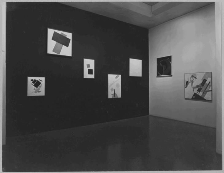
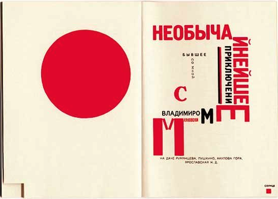
It’s interesting looking back at the work from Russia I was so inspired by from the early 20th century (you can see some in Tipoteca if you want) and acknowledge most of it is in Cyrillic Script—a non Western alphabet I certainly can’t read. Once again, even as a Westerner who used/uses typography extensively the full implication of this from cultural / technical-typographic perspectives never hit home with me, nor did anyone ever discuss the issue of design and type in different scripts with me during school. It’s also interesting to me to think about the impact these pieces in Cyrillic certainly had on design + layout with Latin-based alphabets. Russia seems to be situated in a unique space between common perceptions of “East” and “West.” I’m not going to attempt to tease any of that out here, although I think this work and its global communication impact (among other things) might be at the heart of that conversation. I wonder how different my experience would have been with this work if I had experienced it in a different context or had I been able to read all the text? I suspect it would have still been inspiring because of how transformative it was—even from purely technical and aesthetic perspective. This is surely what I noticed when I first saw it as a 19 year old literally sitting on the aisle floor in our university library. A lot of the work was temporal, political, and propagandized (probably most famously “Beat the Whites with a Red Wedge”). This was a reflection of divisiveness during the upheaval of a literal revolution. Upon further reflection of this, I can’t help but think of the visual vocabulary of divisiveness we’ve seen rise in America over the past several years 🤔. Would I still be inspired if the work said something I deeply disagreed politically or culturally with in the present? That’s very tough to say without the benefit of cultural distance and time. I will say it is hard for me to appreciate the array of communication tactics that have recently been used to transform our digital media landscape, even though one could make certainly make an argument of “innovation.” Ugh.
intentionally-intersecting-interests
OK—let’s re-focus. Experiencing this work from Russia as a young person played a major role in shaping my visual vocabulary as a designer—it is evident in my early work and it’s evident now. I find it exciting to sit down with a blank canvas or artboard to just start drawing shapes. Who knows what will come out? Most of the text you see in my original diagrams (click or tap for a larger version) was literally on the page of my sketchbook that happened to be open at the time—a weak-ish play from the Dadaists. The images at the top of the post take my original “diagram” concept and introduce a photograph of a special object in each composition to build around. I chose to bring in the brand of each here for additional design/typographic elements to work with. Yeah, it’s commercial—and I’m cool with that. If you’re looking for a project or design exercise to do for fun I’d recommend trying this out for yourself. For me the process of selecting these particular objects to “diagram” was an intentional effort to create intersections between my design and cycling / motorcycling identities. The process was both enjoyable and reflective. Should you choose to try this exercise, consider the meaning and context of your selection and reflect on what these intersections of interest really mean to you as you make 🤔 You are bringing in something from the outside and not just designing in a vacuum for design’s sake. There’s real value there. Your favorite loud music and maybe a coffee or a glass of wine depending on timing might help too. Ciao!
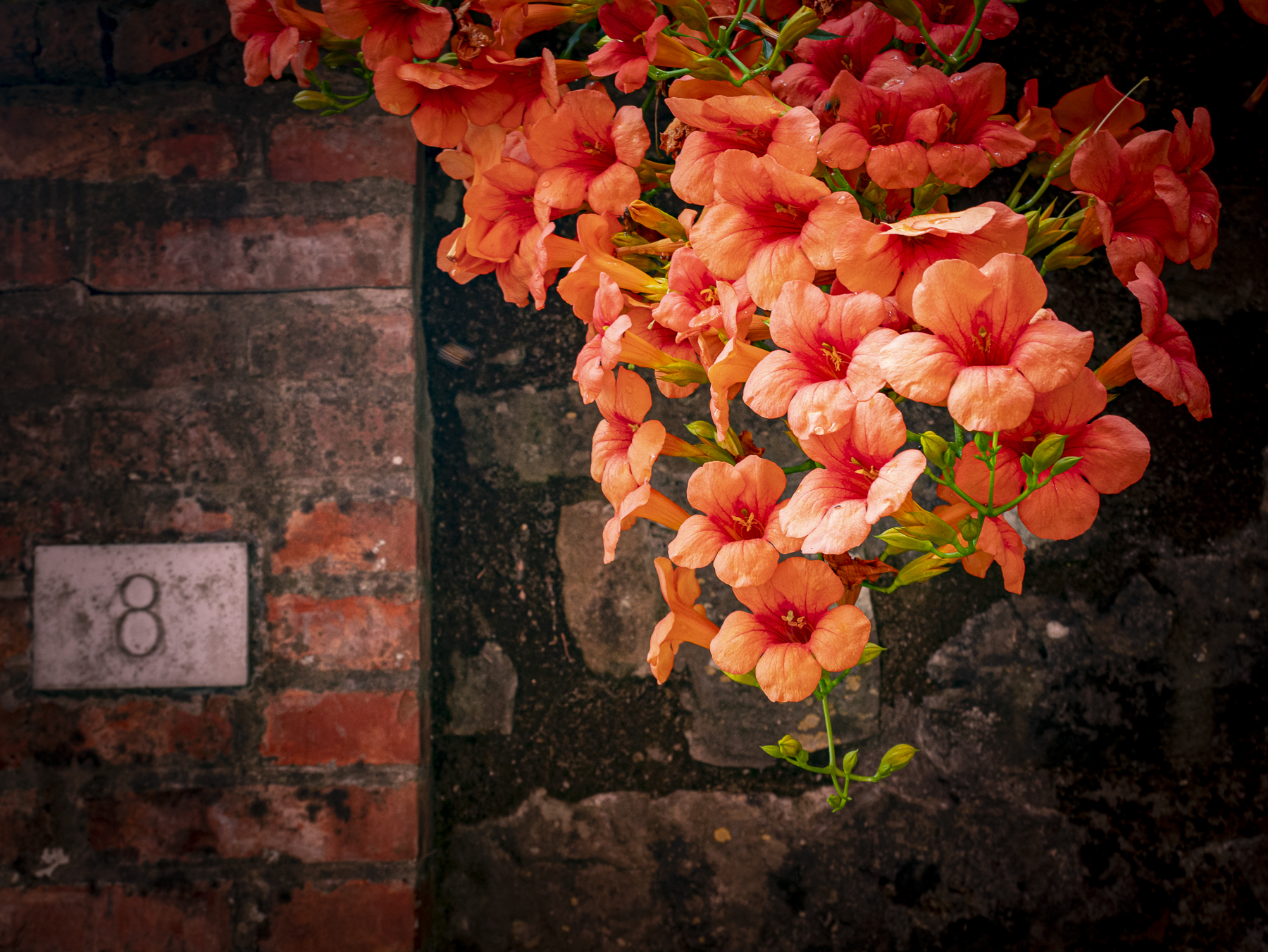
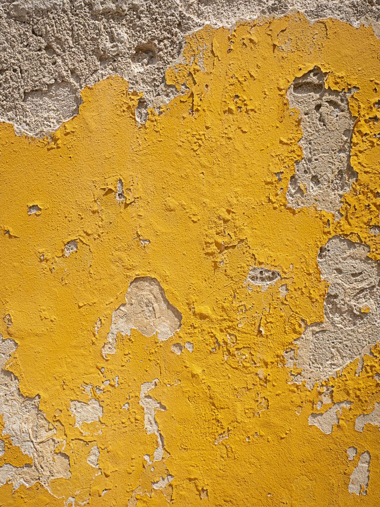
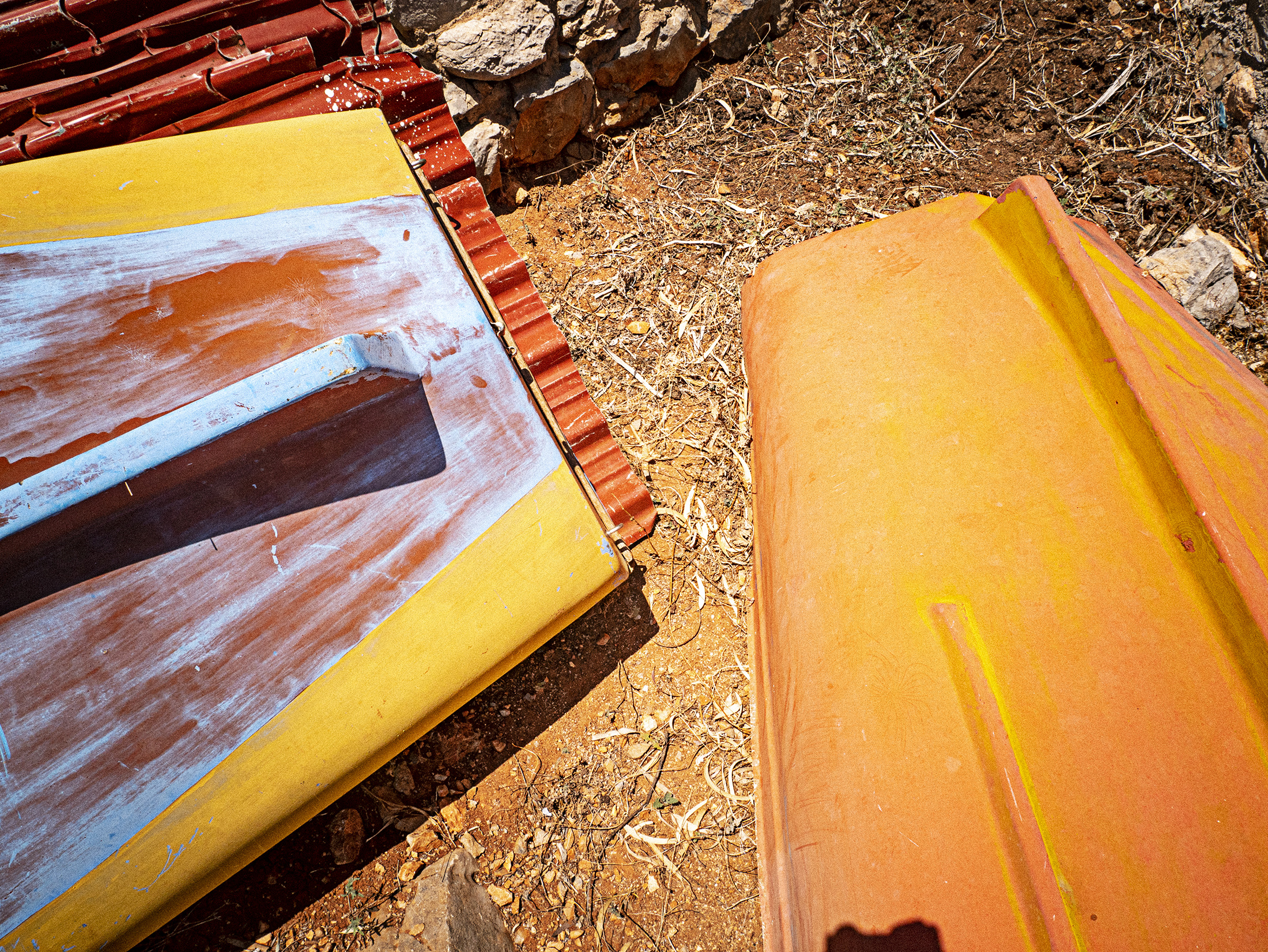
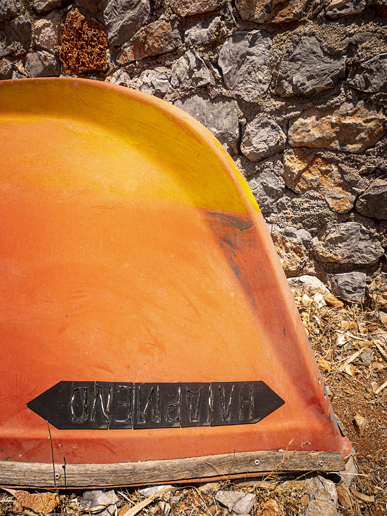
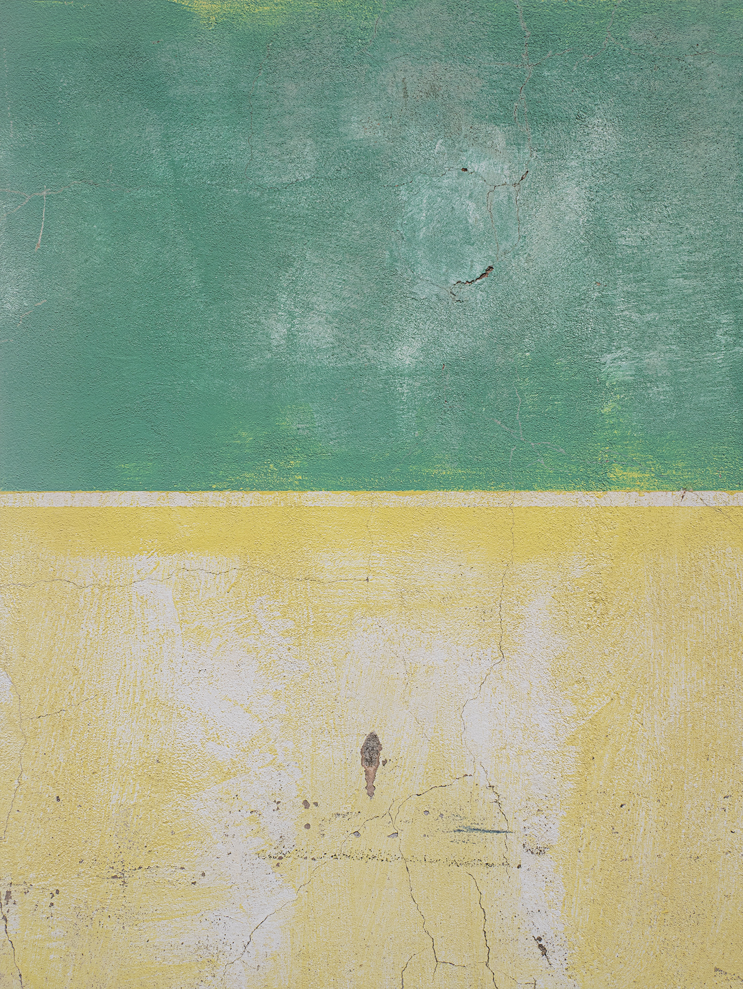
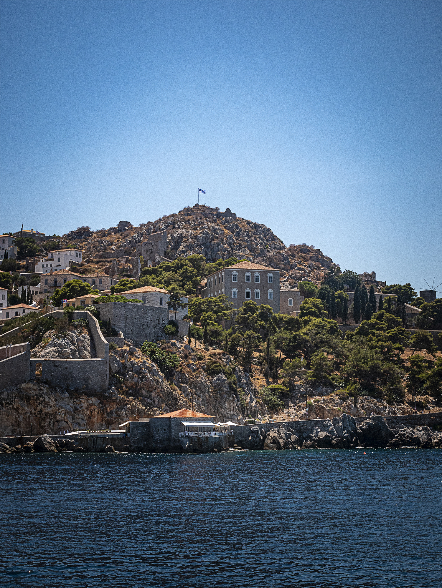
A few assorted shots celebrating color and texture—the boat photos were taken on Hydra, Greece and that amazing wall was photographed near Vigonovo, Italy.
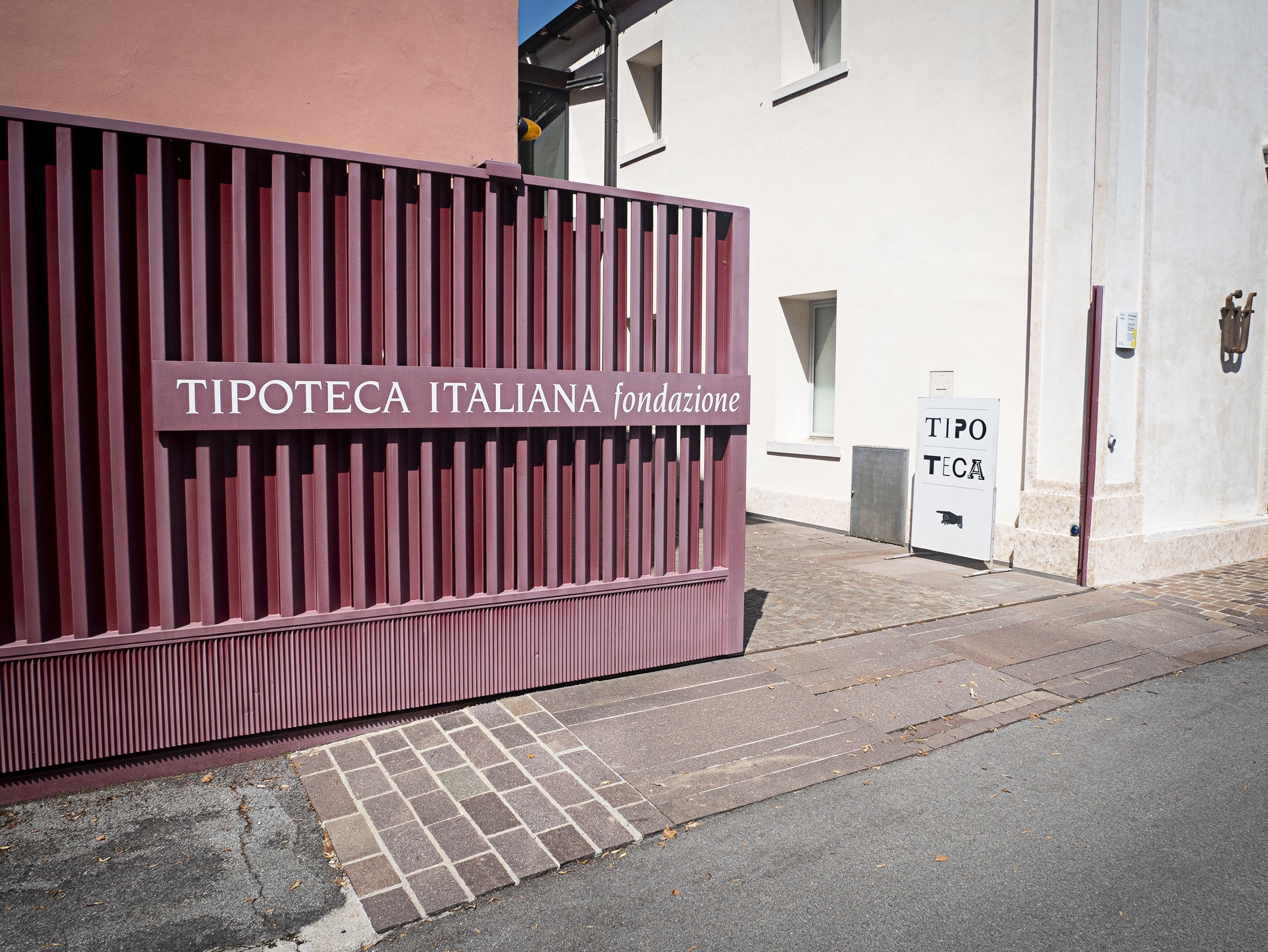
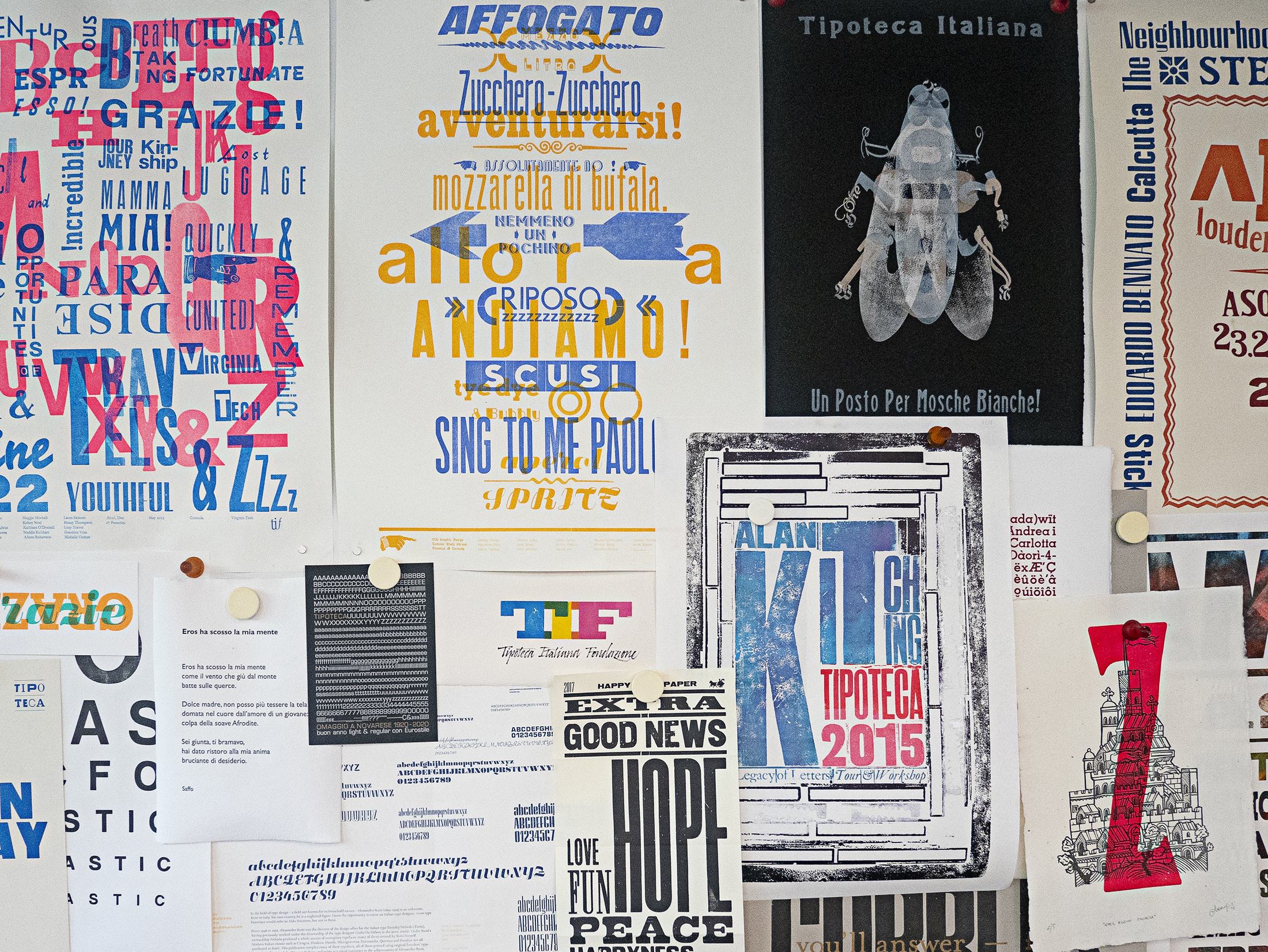
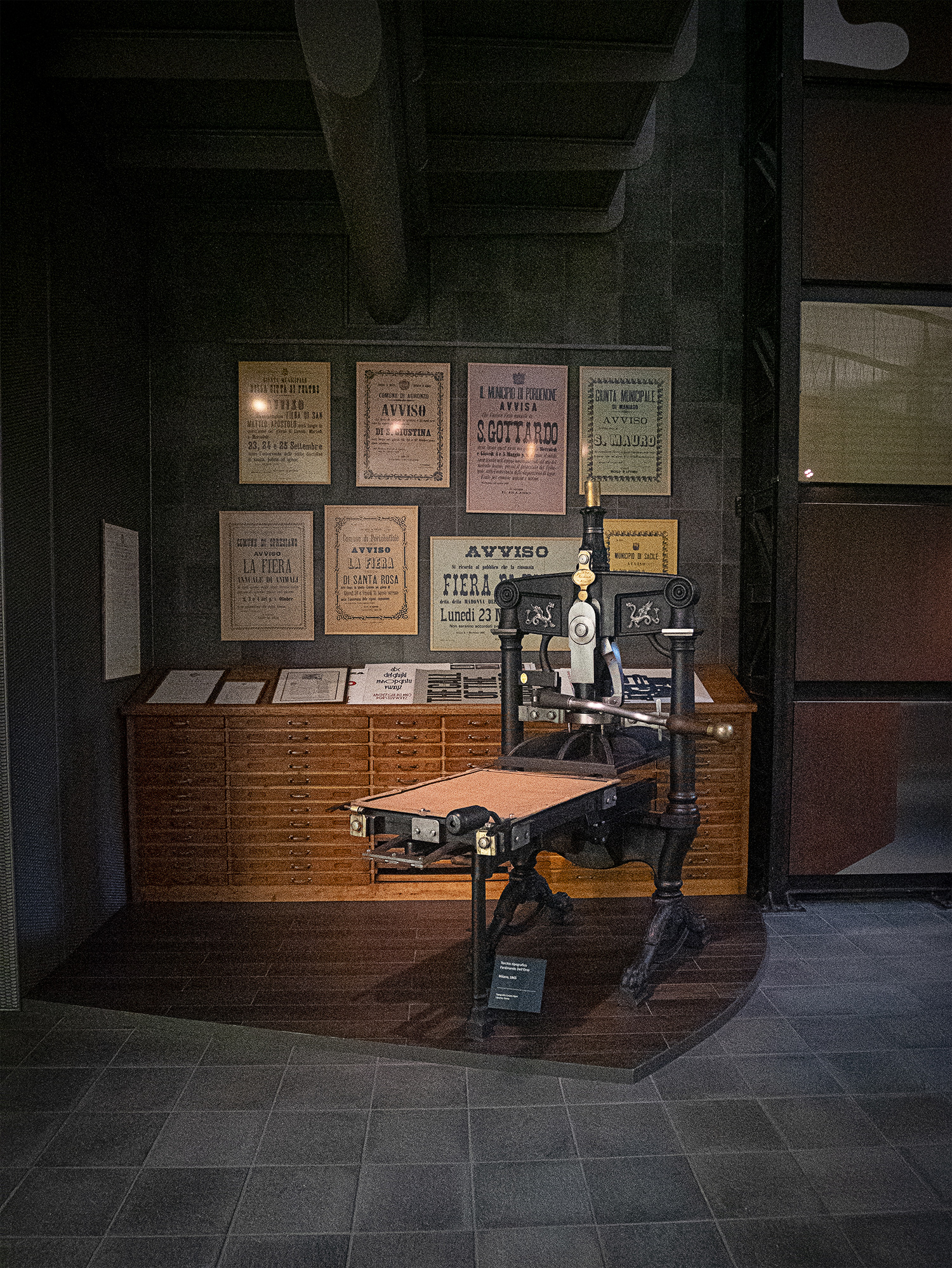
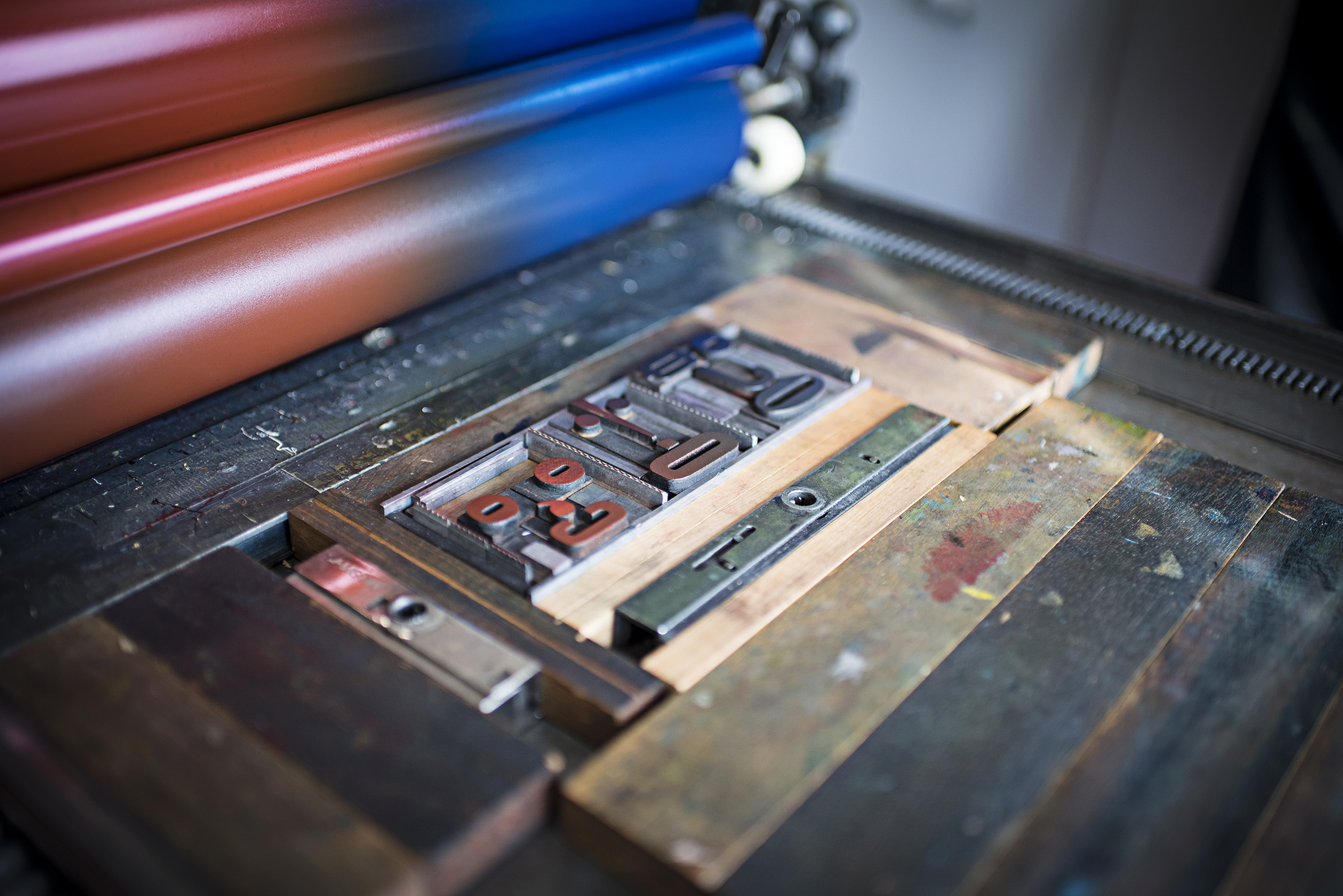
Tipoteca Italian Foundation is a printing museum located near Treviso in the small town of Cornuda, Italy. Amanda and stumbled upon it during a visit to the Prosecco Hills—this was completely unexpected since Letterpress has been a huge part of my career development and interest in Graphic Design since I started college.
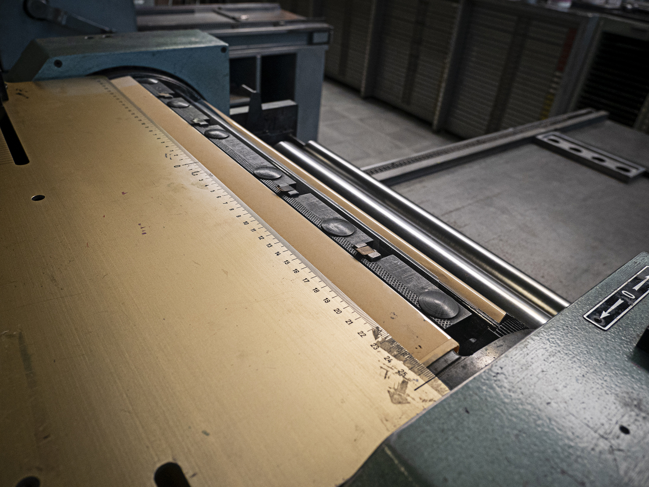
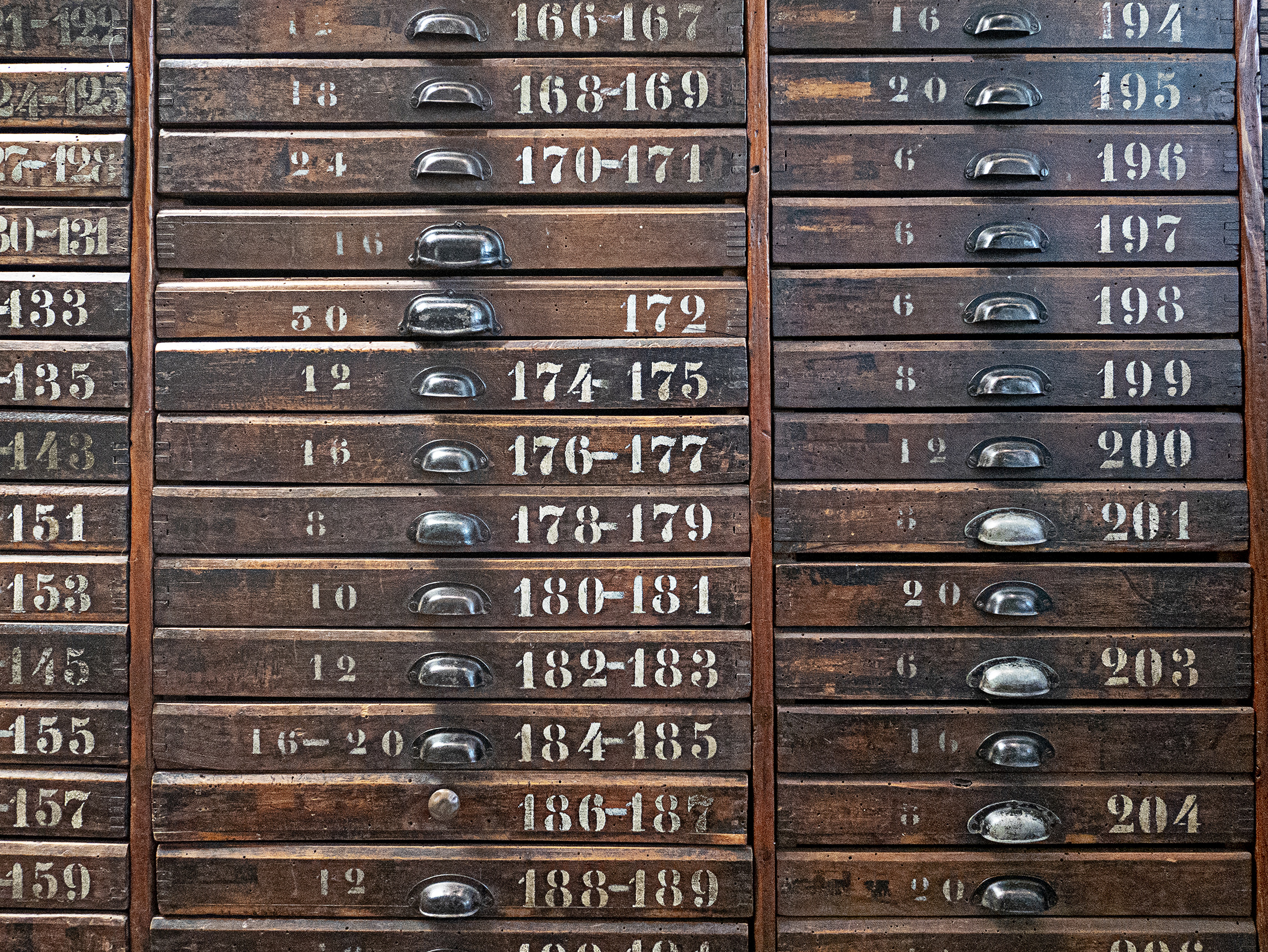
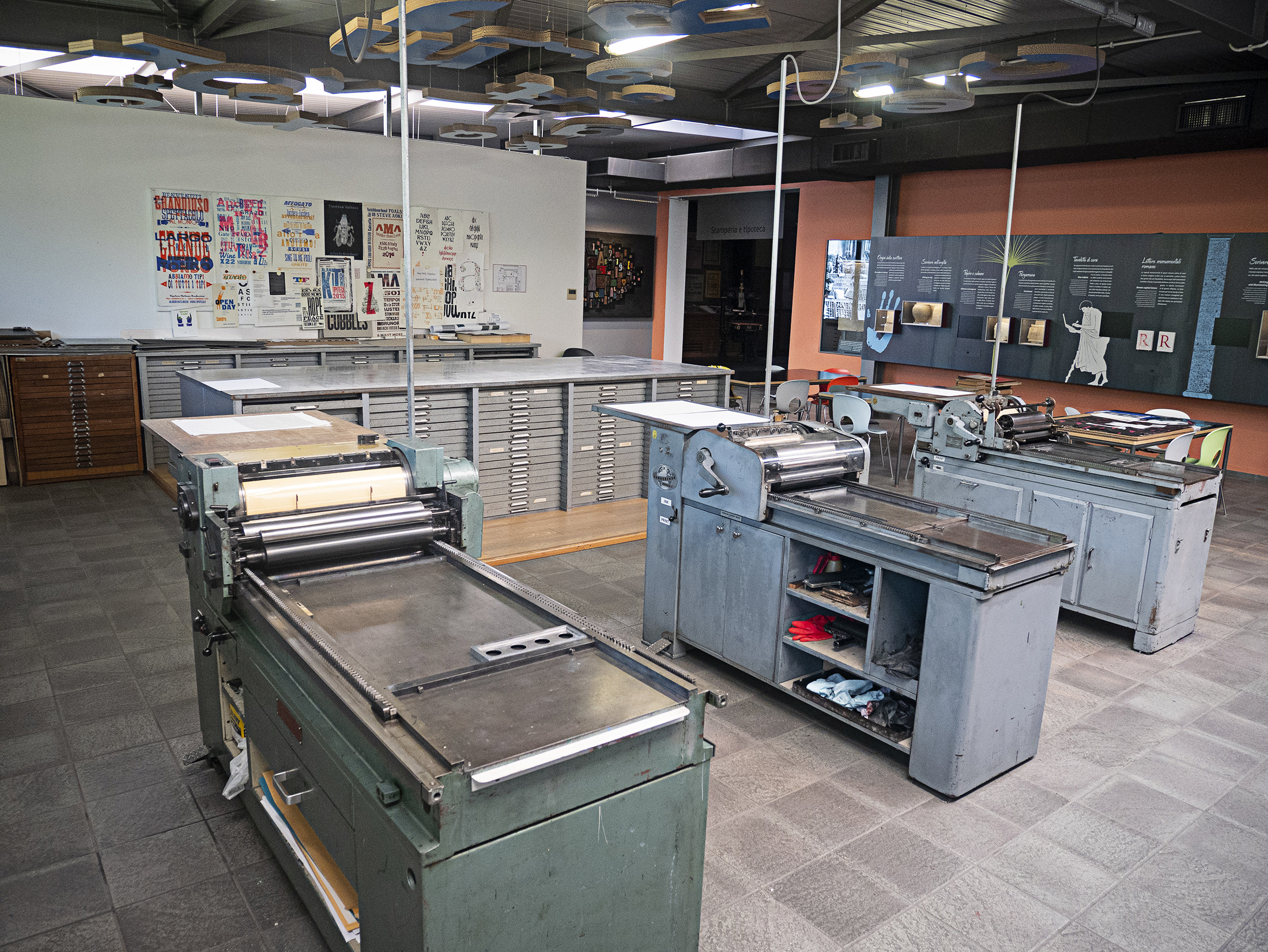
That said, after we found the museum I went tofollow them on Instagram. Upon doing this I realized I had been following them since before we moved to Italy—it’s a small community! The first time we found the museum it was Sunday and everything was closed, but I was able to make the hour drive back from Polcenigo the other day to explore the museum and printing studio (which I didn’t know they had on-site)—the resources and history here are incredible!
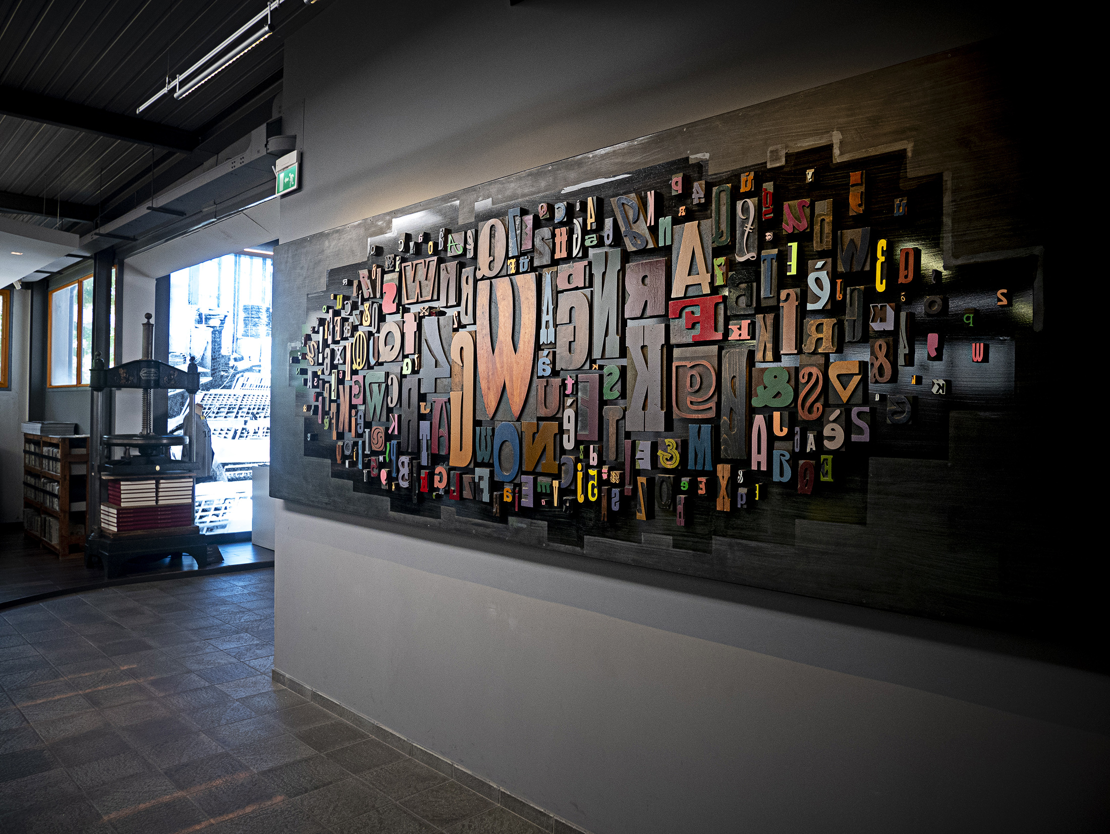
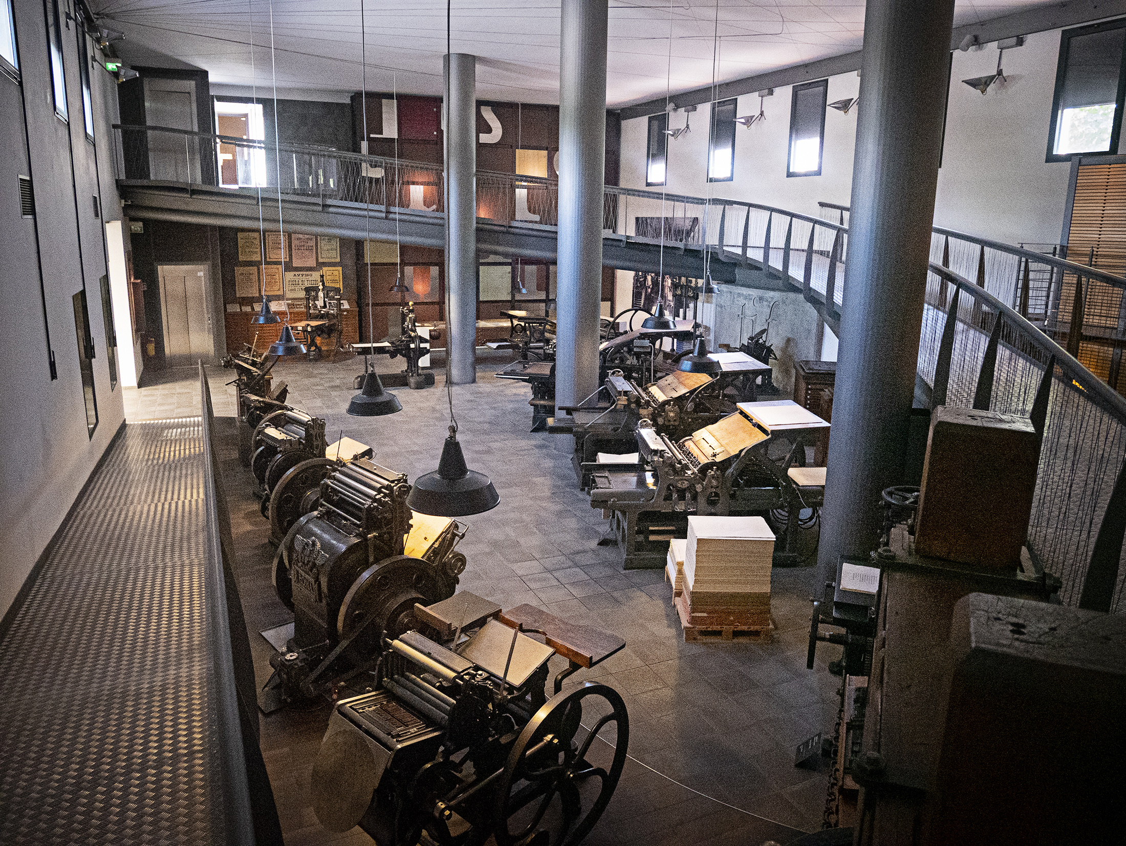
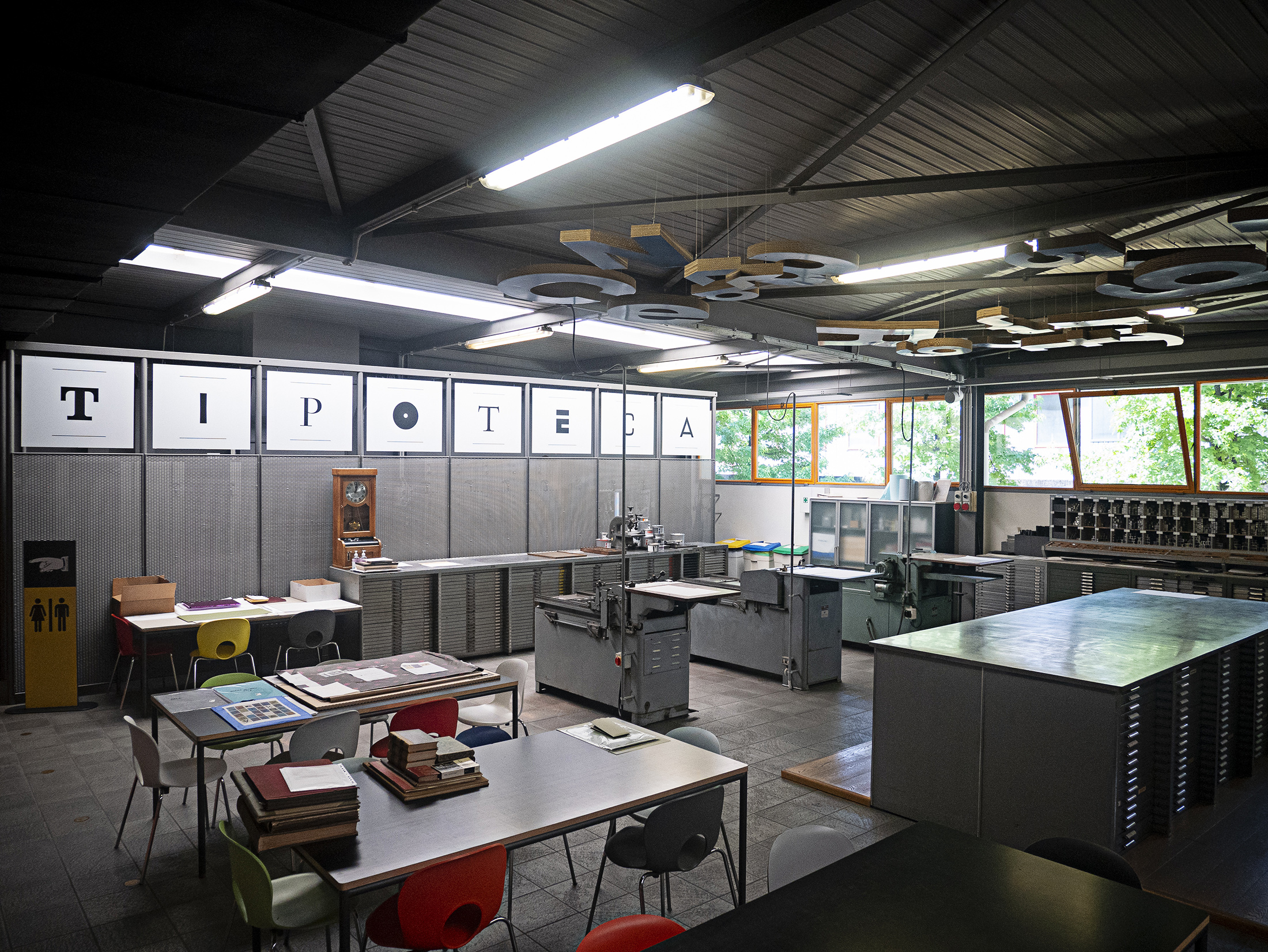
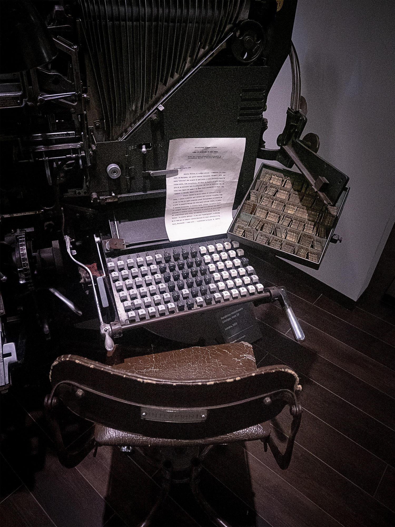
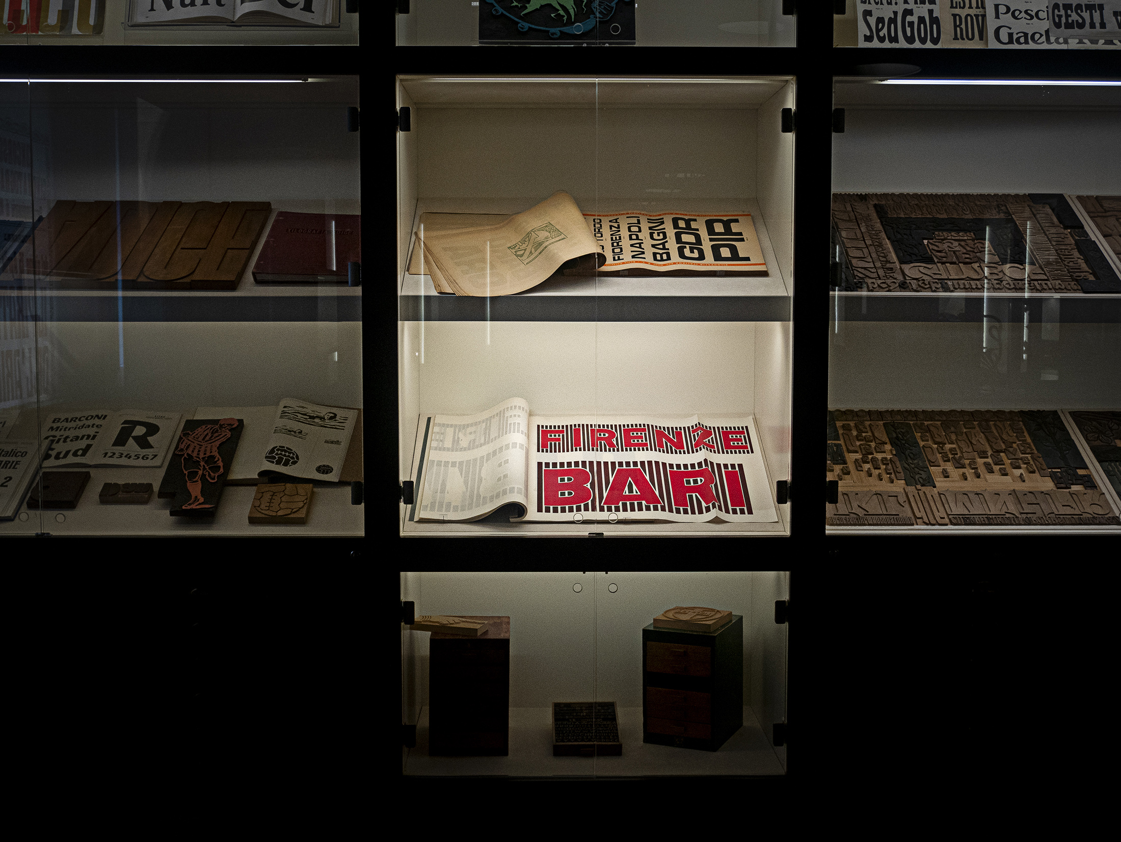
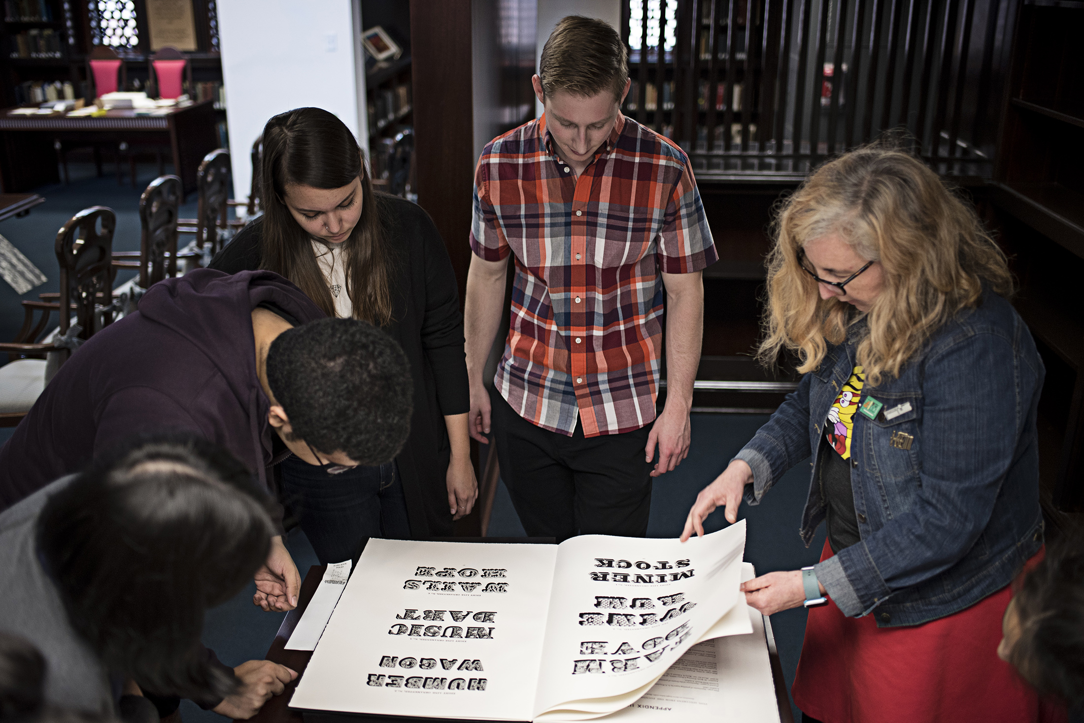
A few looks at the workshop, museum (shout out to Bari), and upstairs gallery. The current exhibition is a “25 years of Tipoteca” anniversary poster. P98a, Hatch Showprint, Hamilton Wood Type Museum and many others were featured—all of the prints are fabulous. I took a ton more photos—these literally barely scratch the surface as to what is available to see and experience in the museum. We were lucky enough to visit and print in the workshop during Jim Moran’s “Letterbugs” exhibition. Dan Rhatigan happened to be our press assistant, which was an incredible treat!
reflecting on my own letterpress story…
The strange coincidence of moving to a new, far away place and literally stumbling upon a place like Tiptoteca prompted me to reflect on the importance of letterpress for me—and how, to a large degree it has shaped my career as a teacher and practitioner. My fascination with letterpress started my Sophomore year of college when Dirk Fowler of F2-Designvisited one of my classes and showed us what he had been printing—this was a mind-blowing experience for me. It was also an amazing experience to eventually work with him as a colleague for three years as Graphic Design faculty at Texas Tech University. Nobody has taught me more about teaching than Dirk. As I had mentioned in previous posts, an assistantship in letterpress was the reason I chose to go attend the University of Tennessee. At the time, Yeehaw Industries was in Knoxville, now Voodoo Rocket (Kevin Bradley) was there. Also the University of Tennessee had a top three printmaking program in the United States. In 2007, I was accepted into the Graphic Design program, but collaborated with the printmaking program to start a functioning letterpress shop that would be open to students—I’m proud to see it’s still going today!
I taught one studio course in foundations and letterpress through weekly open hours and workshops. This paid my out-of-state tuition at the university fully and provided enough of a monthly stipend for me to live on—it was such a wonderful time in my life. I had full, 24/7 access to the studio and I quickly became addicted to letterpress. It was literally like a drug for me—that and screenprinting 🤓.
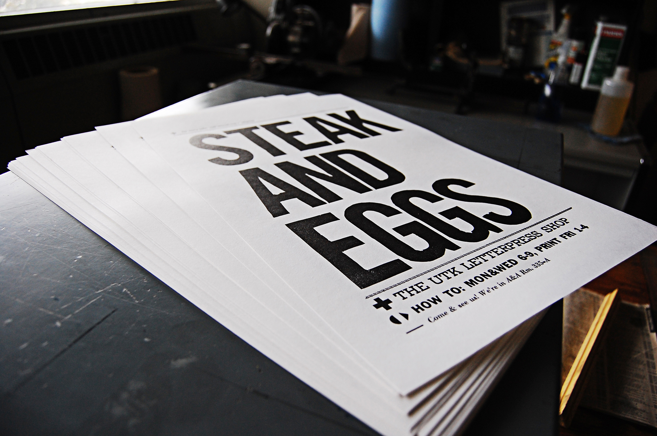
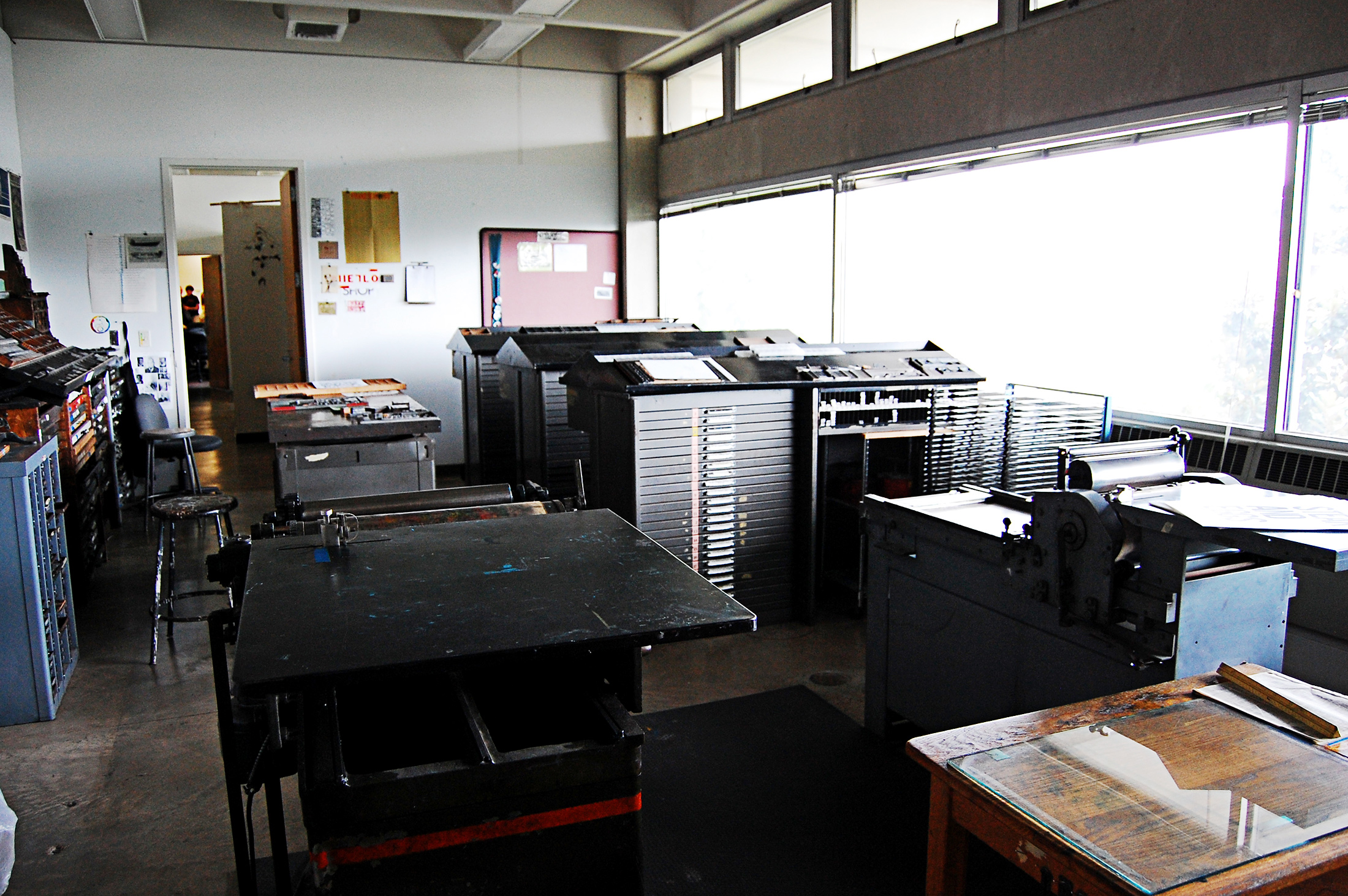
Directly above and below ⬆️ ↘️ are some early shots of the UTK Letterpress shop and one of the first posters I printed. We didn’t have much in the way of large wood type, so I took to carving my own letters in wood or linoleum. (got some nice scars on the hands from learning 😅 ).
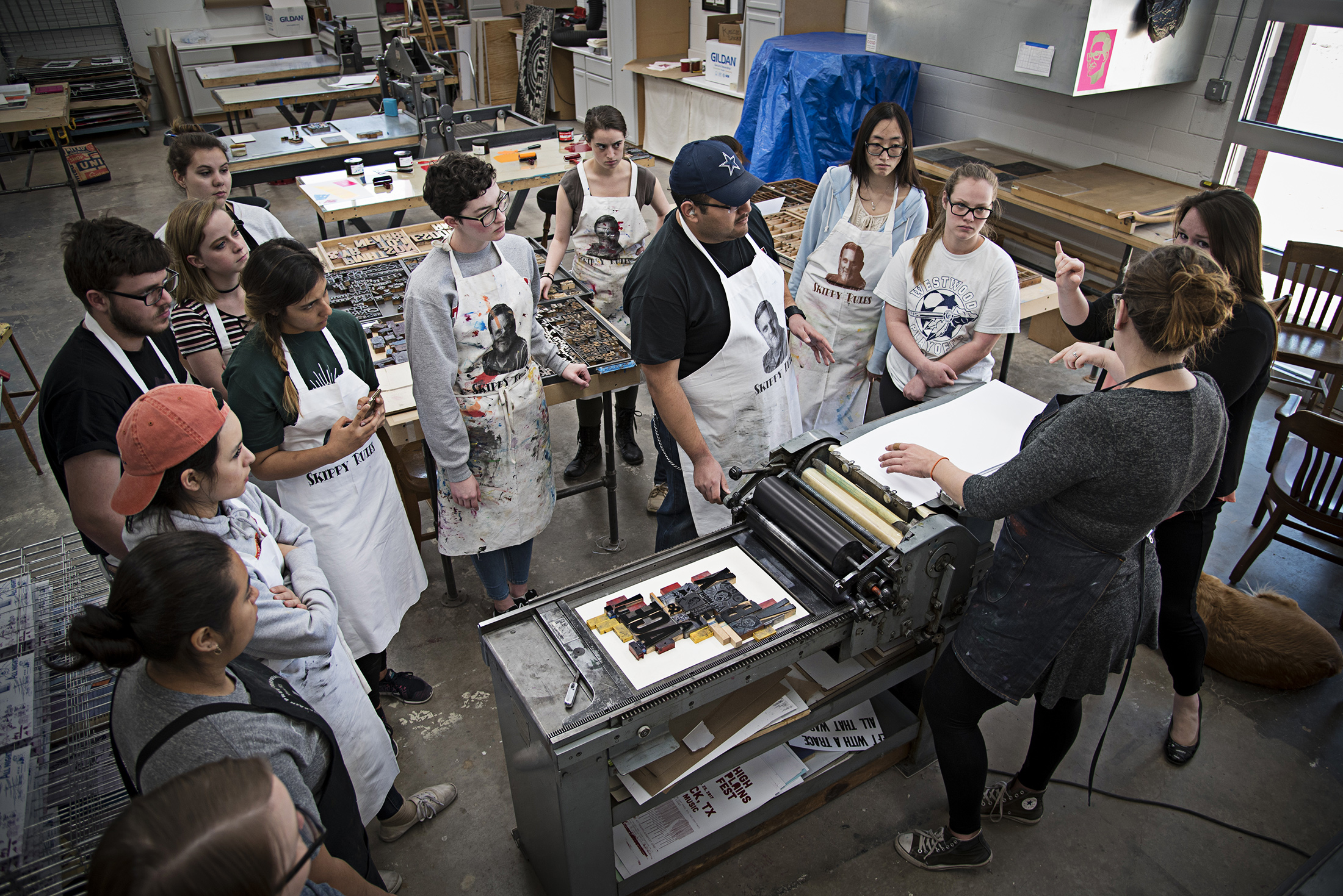
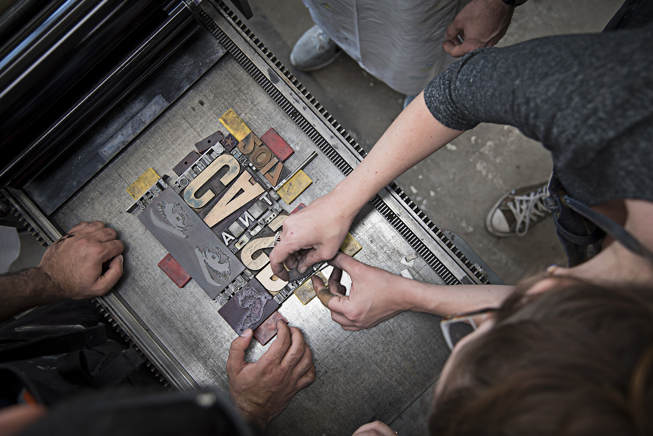
Since I left UTK, I’ve always stayed connected to letterpress and take every opportunity I can to share it with my students, but I do miss printing and having that 24/7shop access! The photos above ⬆️, taken between 2017-2020 are from Texas Tech University’s satellite printmaking studio, CASP with Victoria Marie Bee and The University of Florida’s letterpress shop and special collections library with Ellen Knudson of Crooked Letter Press.
letterpress follows me, I follow letterpress
Visiting Tipoteca was such an amazing experience and I hope to go back and visit soon—heck, maybe I can even print something there ( I already have a few ideas—maybe I’ll post about them here later). I joke that letterpress follows me, but I suppose it isn’t really a joke. Seeing the printing studio here made me feel the same excitement as a maker I felt when I was just a. kid applying to graduate school. The museum and gallery sections of Tipoteca are incredible, but for me the shop is always where it’s at—it’s where I feel most comfortable and capable.
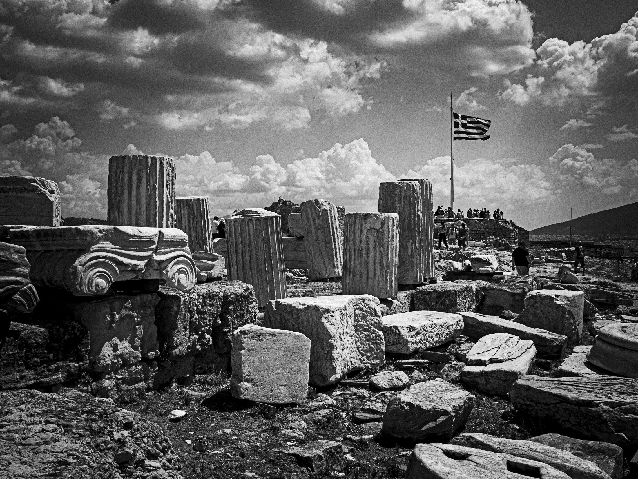
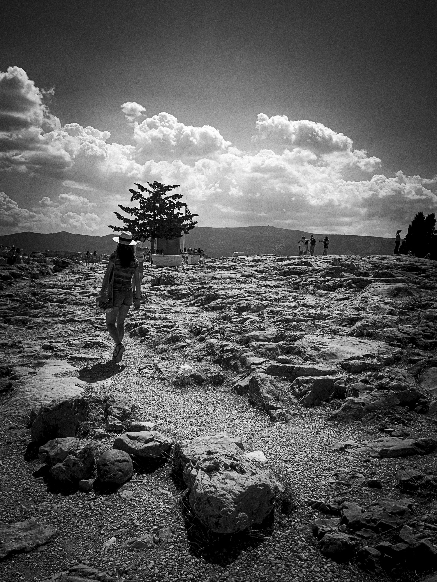
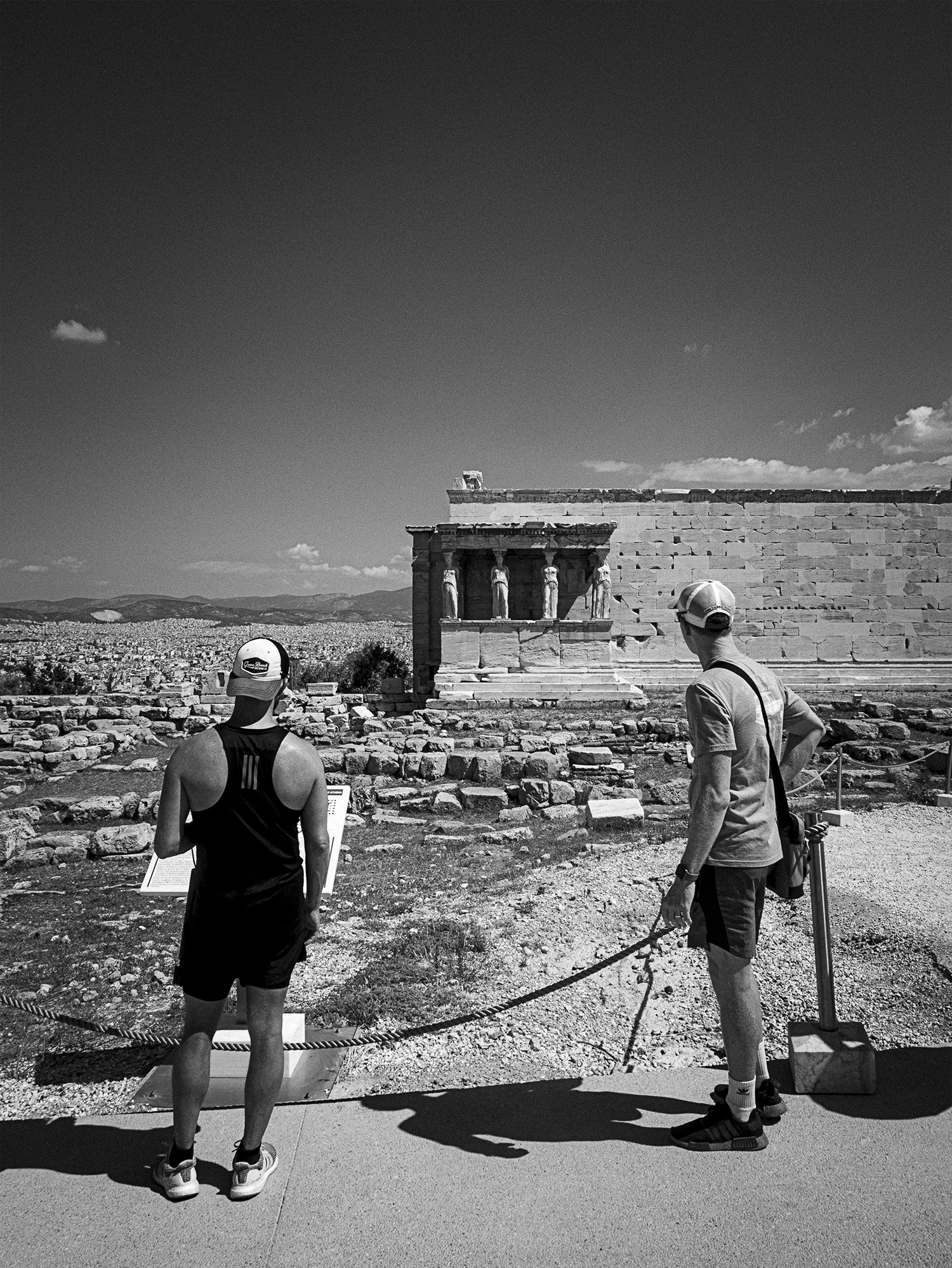
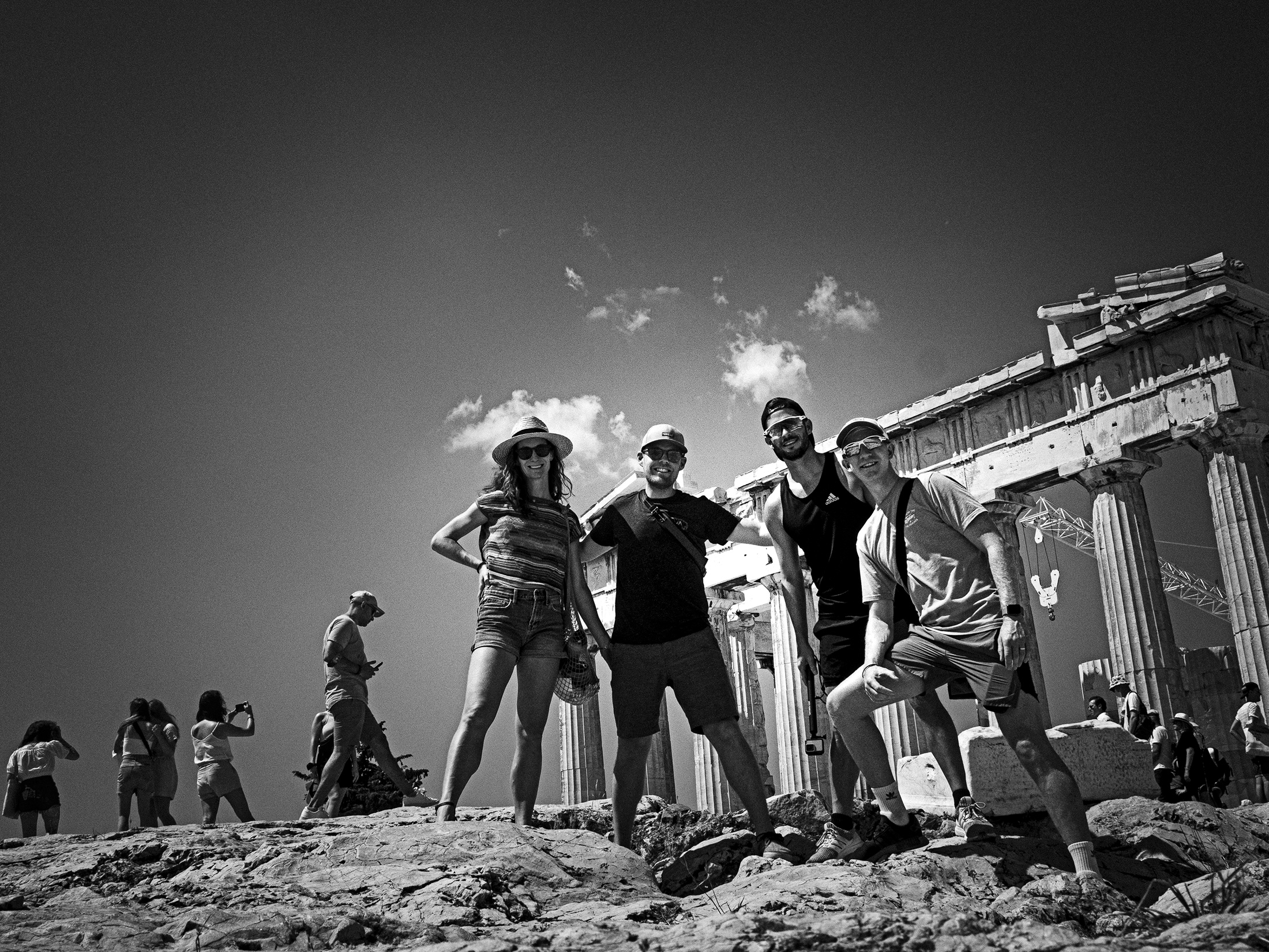
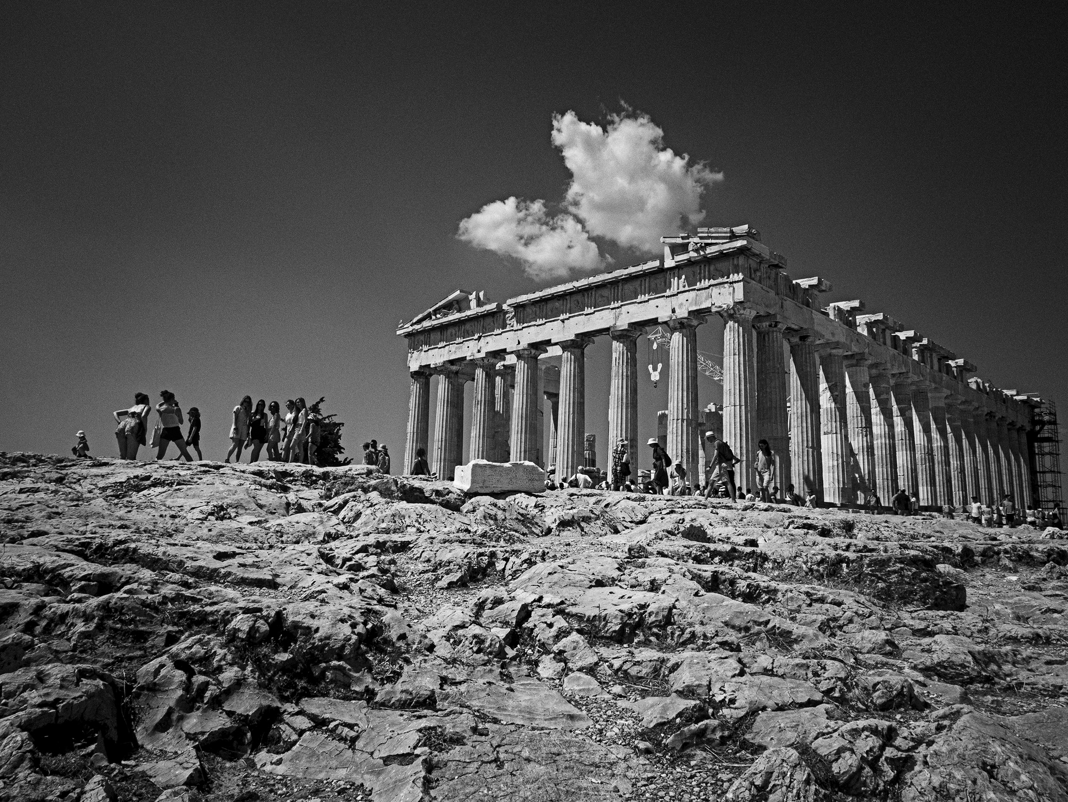
We came from Northern Italy to Greece to visit our best friends, who were visiting from the United States. We only had a few days overlap in Athens with them—staying in a hotel just a few blocks from the Acropolis. Visiting the Acropolis was something we were all looking forward to experiencing together, and it was indeed an incredible experience to explore with such great company. I tried to uniquely capture that shared experience through my photos—not an easy challenge in probably one of the most photographed places in the world! Having conversations with one another about the structures and context(s) in which we were viewing as we walkedmade the experience both rich and memorable.
⬆️ Jon and Amanda working to make sense of it all. One thing about the Acropolis site that was really striking to me (aside from the incredible ruins) was the 360 degree view of surrounding Athens—the metro area was strikingly large + dense ⤵️.
The Parthenon was under pretty heavy construction, but it didn’t take away any of the grandeur to see it in person—such an incredible experience!
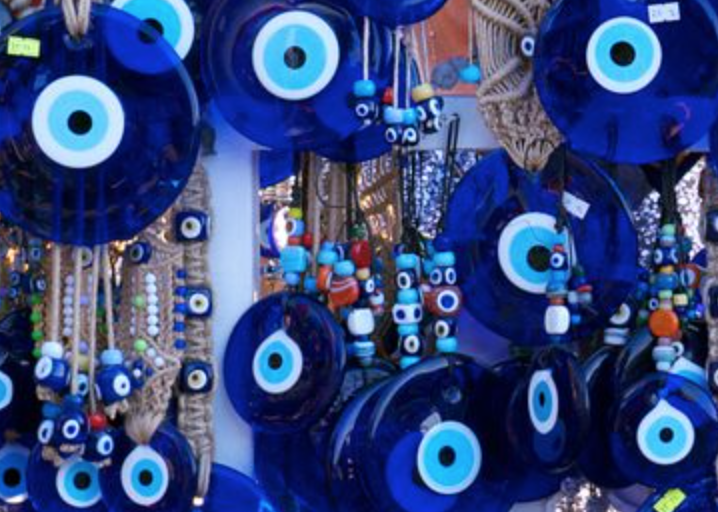
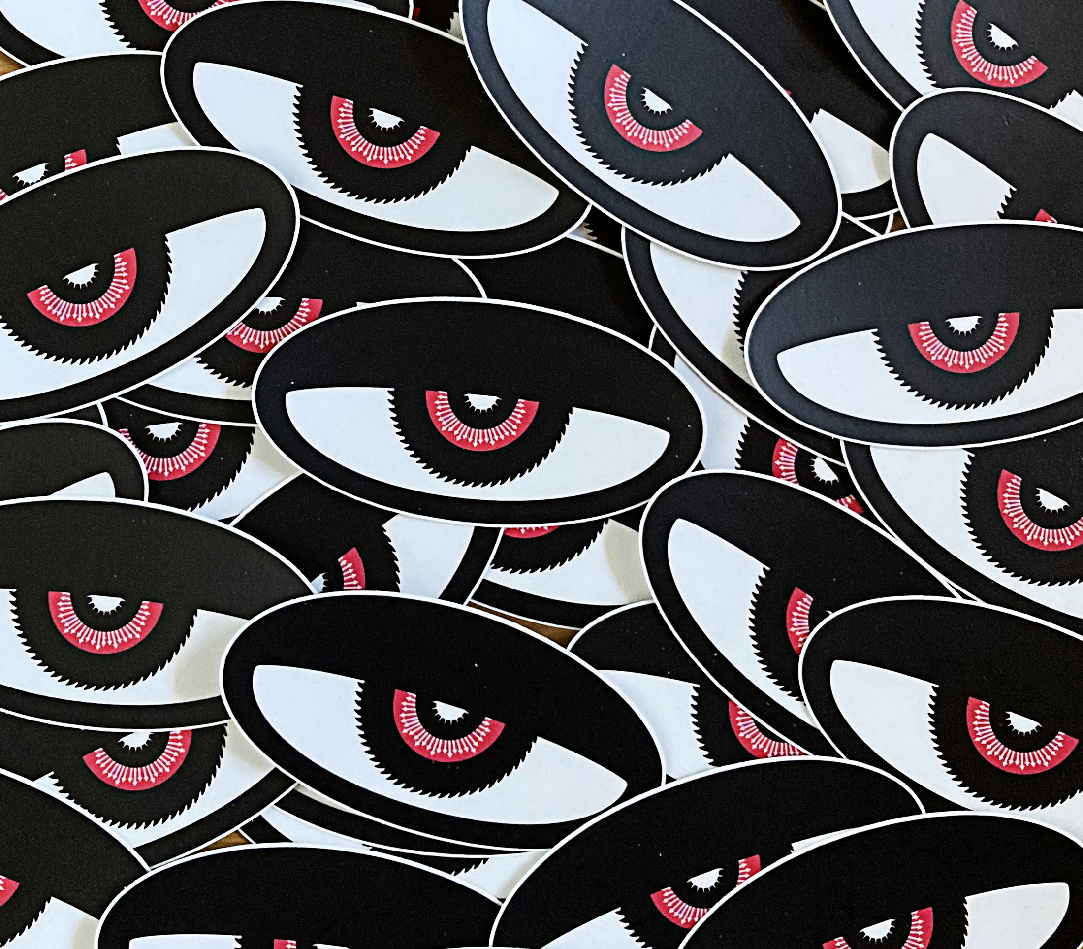
One thing I kept noticing in Greece (mainly in the city of Athens) were references to what they call the “Evil Eye” (image to the left ⬅️ ) I’m sure there is an element of touristy go-to stuff here, but none-the-less I’m very attracted to the meaning and thinking around the evil eye—it was something that kept coming up for me over and over again—even after we left Greece. Then I realized that without knowing it I had already created a version of my own Evil Eye. I made the above full-width graphic into stickers (image below ⤵️ ) a few years back. I am also reminded of Aesthetic Apparatus’s “Doom Drips” series, which was influential on me when I was in school.
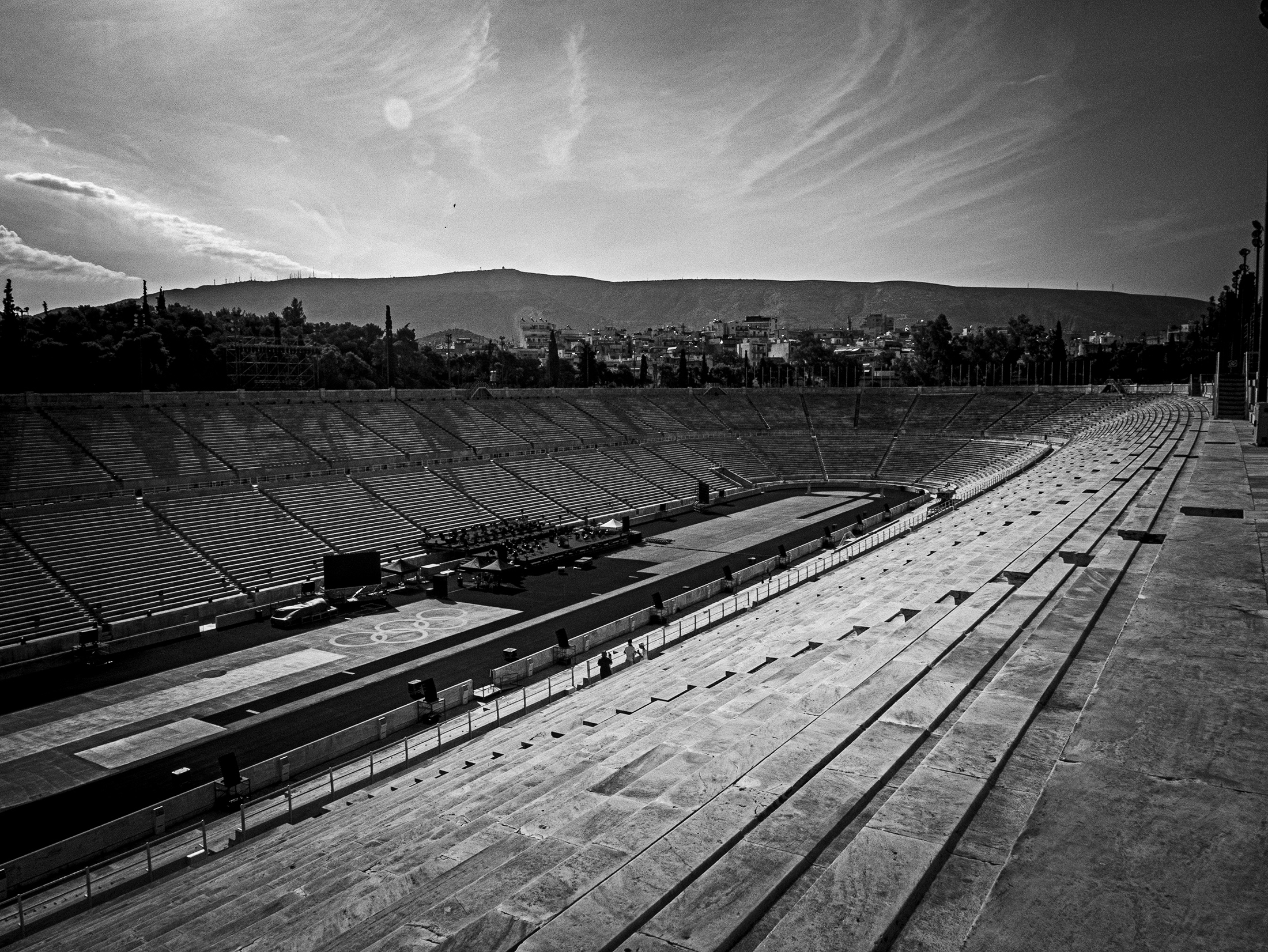
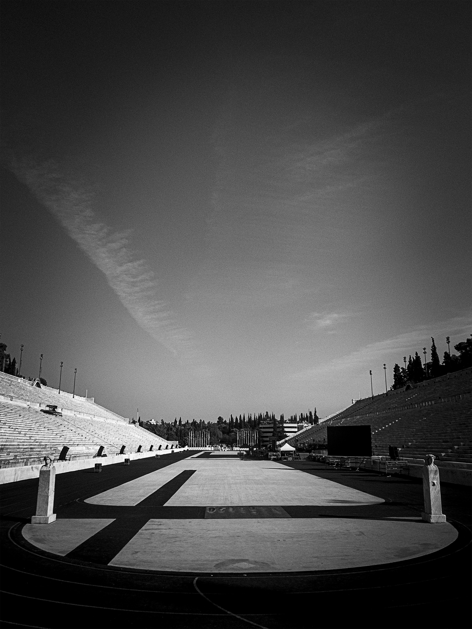
Panathenaic Stadium—Athens
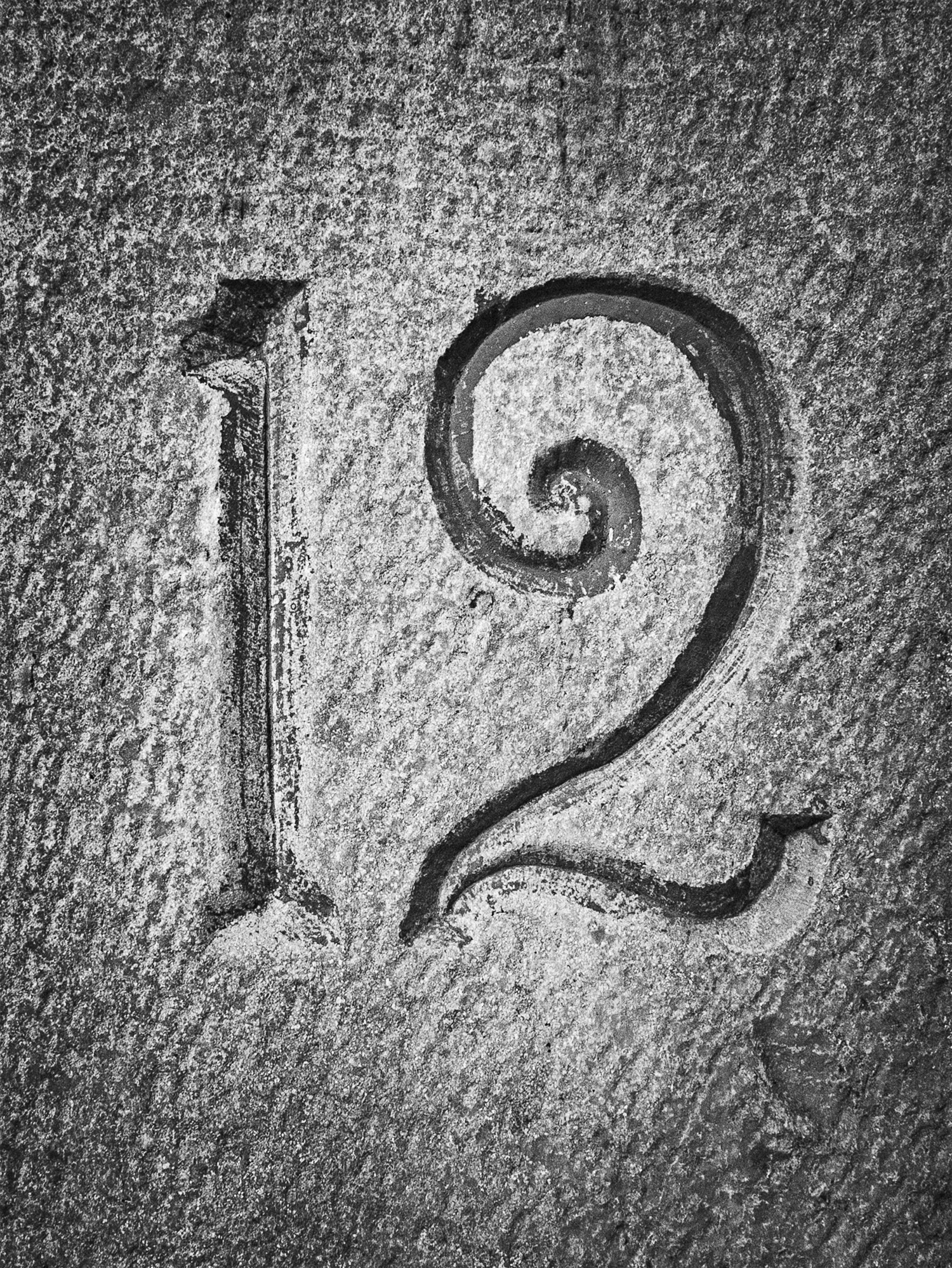
The Panathenaic Stadium is built on the site of the ancient Olympics dating back into the BCE —and—the site of the first officially sanctioned “modern” Olympics in 1896. Long story short, this was a very cool visit (and just look at that engraved type—muah) and an easy walk from the center of Athens. Everything is made of marble and the track (track surface not marble 🙂 is shaped like a paperclip—I suspect any athletes that competed on this track had amazing ankle mobility because of those sharp turns 😅. If you want to read more about the history of this site, I’d recommend visiting the official museum website.
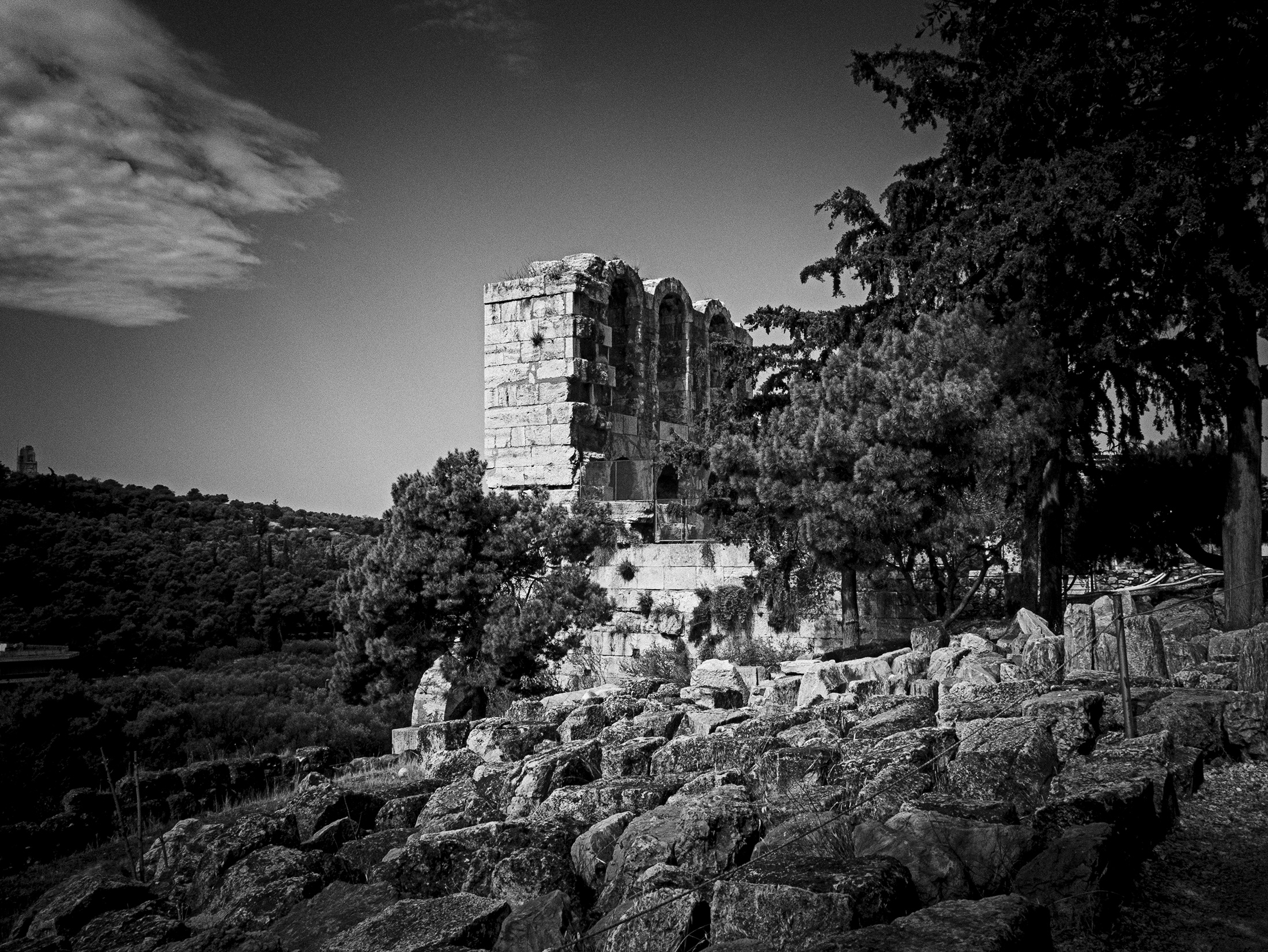
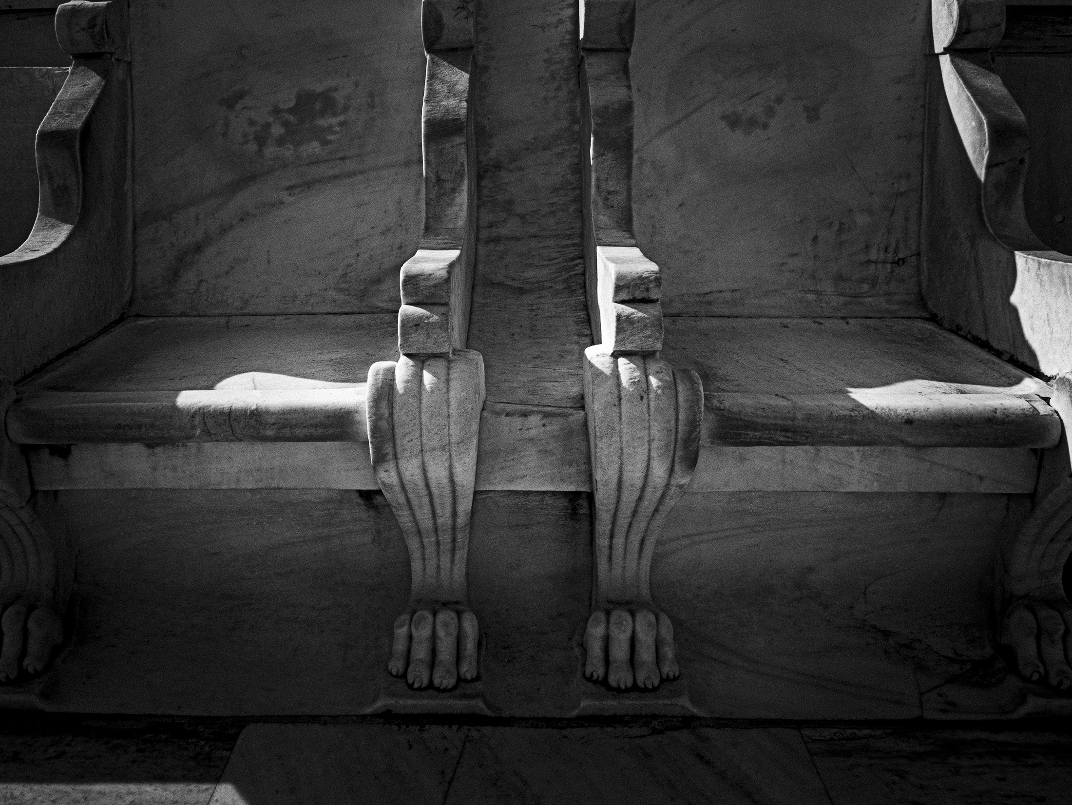
The ancient version of box seats. These are from the re-build in the late 1800’s, but were modeled from the original ancient stadium—we saw ancient seats like this in the public theatre spaces at the Acropolis as well.
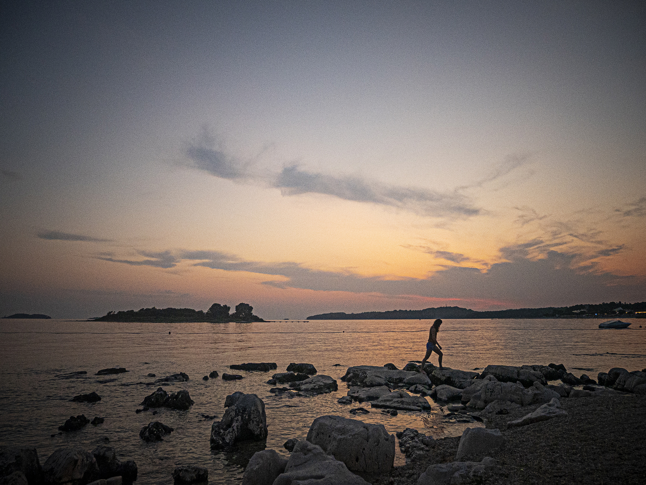
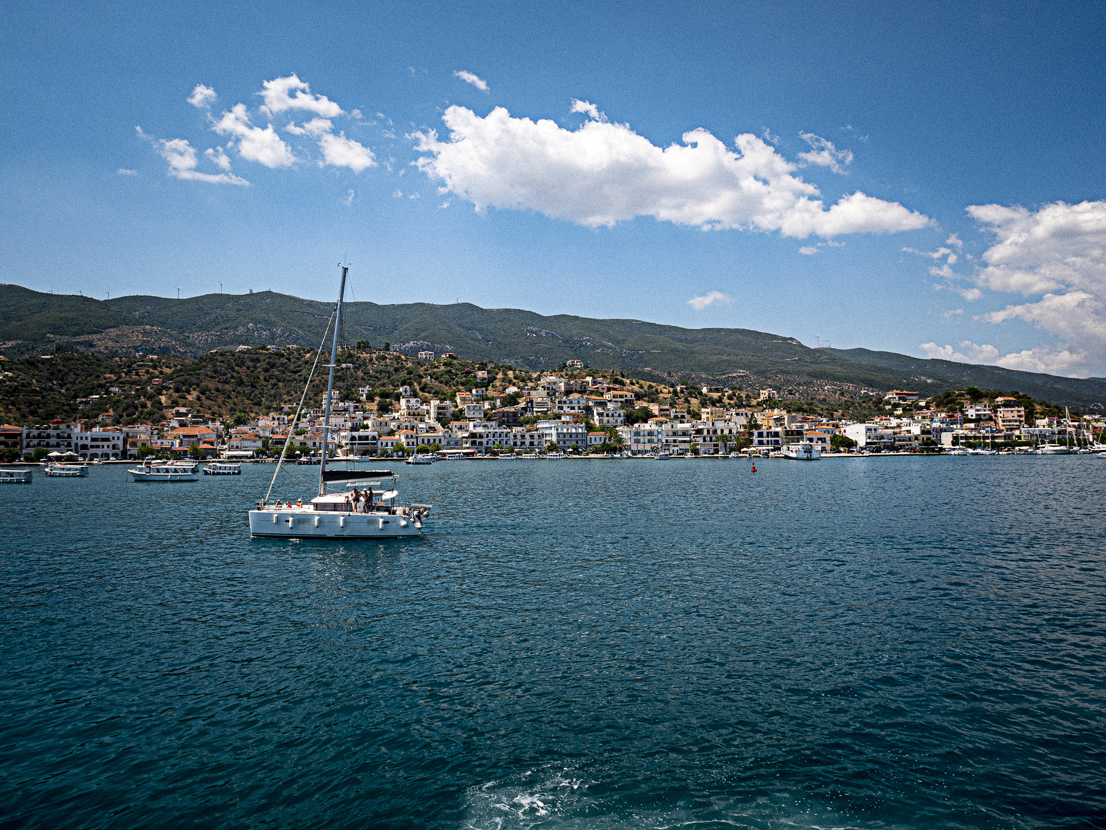
Island time—Hydra
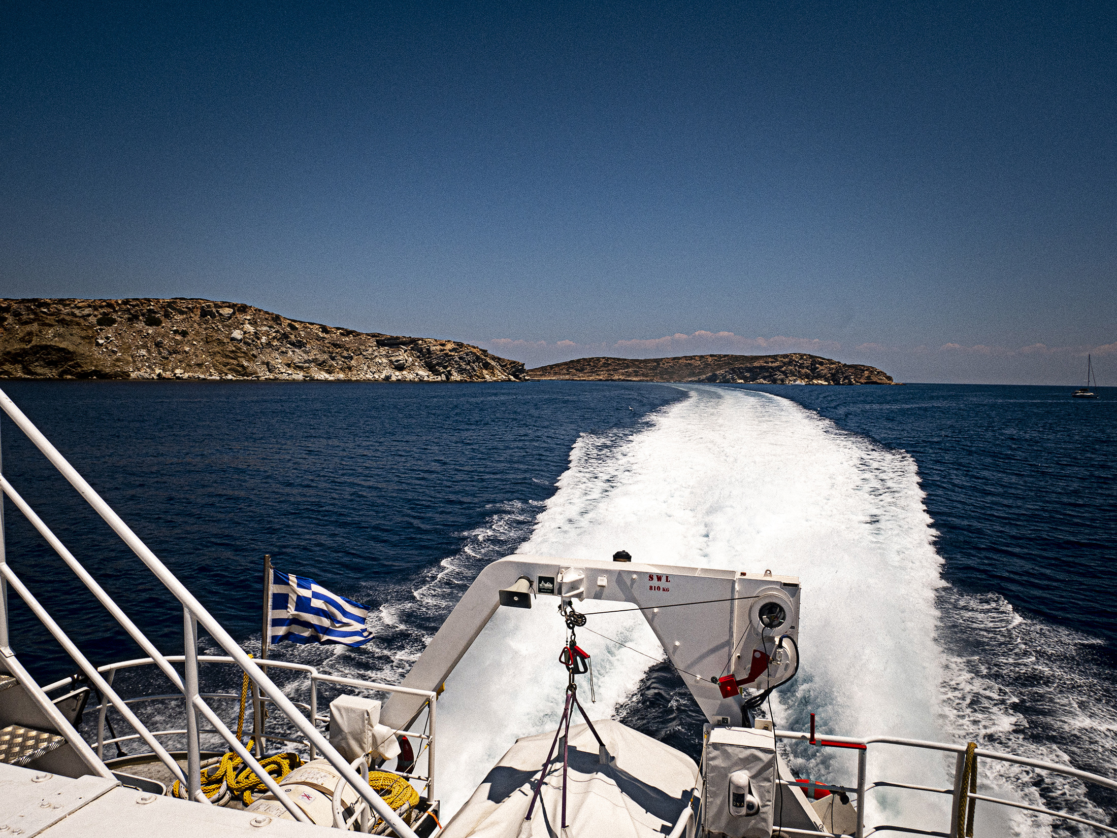
Headed to Hyrda after a few great days in Athens—cruising through the other islands on an Alpha Lines ferry.
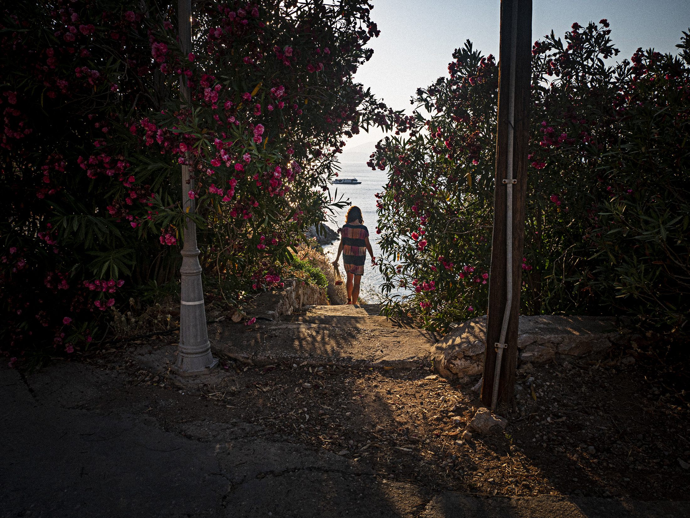
We stayed in a great spot on the water that was an easy 10 minute walk from the city center—paths down to the water like ⬆️ were common and great for sunset time.
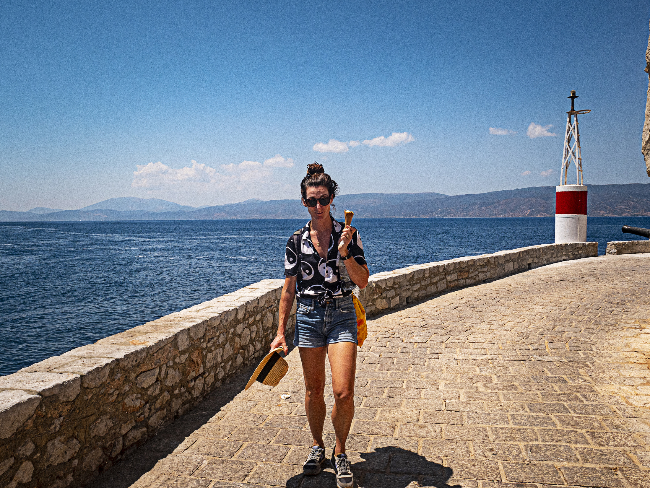
Amanda in her element—gelato in-hand and ocean near. The ferry through Alpha Lineswas easy to navigate and affordable. The roof deck on the boat allowed us to ditch our cabin seats and ride on the roof for the whole 1.5-2 hour journey both ways—this was both refreshing and beautiful (bring your sunscreen, people).
the value of new contexts…
When I attended college in West Texas we studied Ancient Greece during my Art History courses. I honestly never thought I’d have a chance to see any of what we looked at in person—my mindset at the time wasn’t capable of allowing it. I suspect it was because my perception of what it meant to “travel” at that time had been very limited (this was the case with the majority of my peers as well). It wasn’t until my undergraduate Graphic Design professor (hi Bob!) suggested I look into the University of Tennessee for graduate school because of their opportunities to work in a letterpress studio. I didn’t know anyone in the state of Tennessee—I did know I really wanted to learn Letterpress. I had no idea what I was doing when I applied, was accepted, and agreed to move. The real weight of my decision (leaving family, friends, etc.) didn’t hit me until about one week before my move because I was so naive. It wasn’t so much the roughly 1,200 miles of distance between cities in Texas and Tennessee that changed my mindset on travel—it was the complete and total destruction and re-construction of my physical and emotional comfort zones that did it. It took a solid 1/2 year of feeling sorry for myself in Tennessee until I started realizing the deep value in the leap I had made. A lot of folks would say moving from Texas to Tennessee isn’t that big of a deal, but at my young age coupled with extreme lack of experience and general ignorance it was a major deal! People in other places do things differently—and there is so much that can be learned from that. I came to understand this through my own process of re-learning how to live and work in a new context—initially in Tennessee, but since in other locations—each move its own unique growth experience—these experiences are generally both difficult and exciting at the same time.
After that move for graduate school, the notion of continuing to build my experience library through travel or taking advantage of great relocation opportunities became essential. I’m deeply grateful for the opportunity to have had in-person experiences like this trip to Greece. I was inspired by how enthusiastic Athenians we spoke to were about their city and surrounding islands—the cuisine, culture, texture, history, etc…I was also embarrassed to not have the appropriate language skills as an outsider to communicate in Greek, but once again almost everyone we met was bi-lingual (or more). None-the-less, we were made to feel incredibly welcome everywhere we went and encouraged when we did try to speak. This has been the case time and time again as we travel more and now live outside of the United States.
Over the past decade I’ve had conversations with many students contemplating big moves or major life-changing experiences as a design educator. It’s hard for me not to time warp back to that time I left Texas long-term for the first time with zero experience. I usually begin the convo by asking if they can clearly identify the combo of emotions about the upcoming change they feel most often: discomfort coupled with excitement or discomfort coupled with dread? It’s no solution, but generally if the compass is clearly pointed more towards excitement it’s something worth really un-packing.
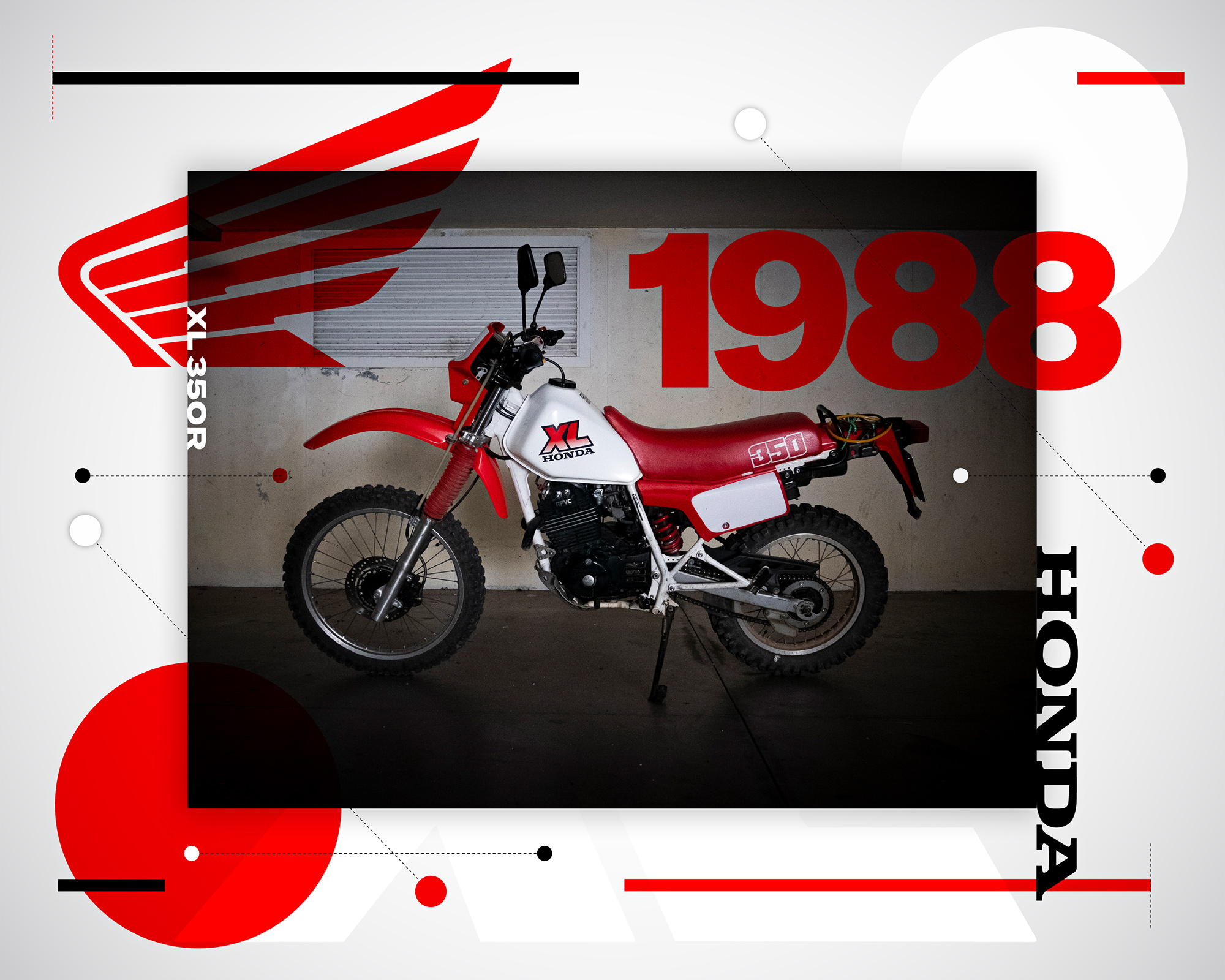
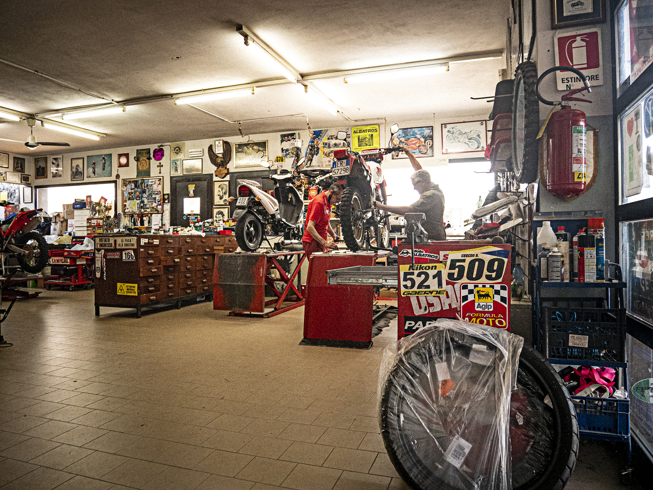
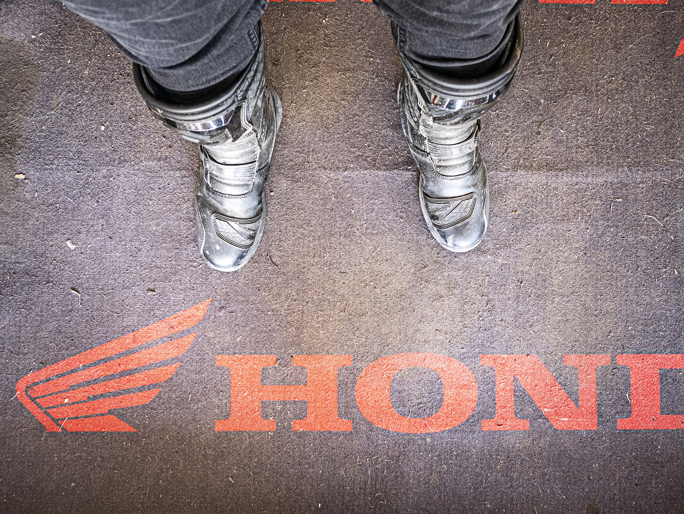
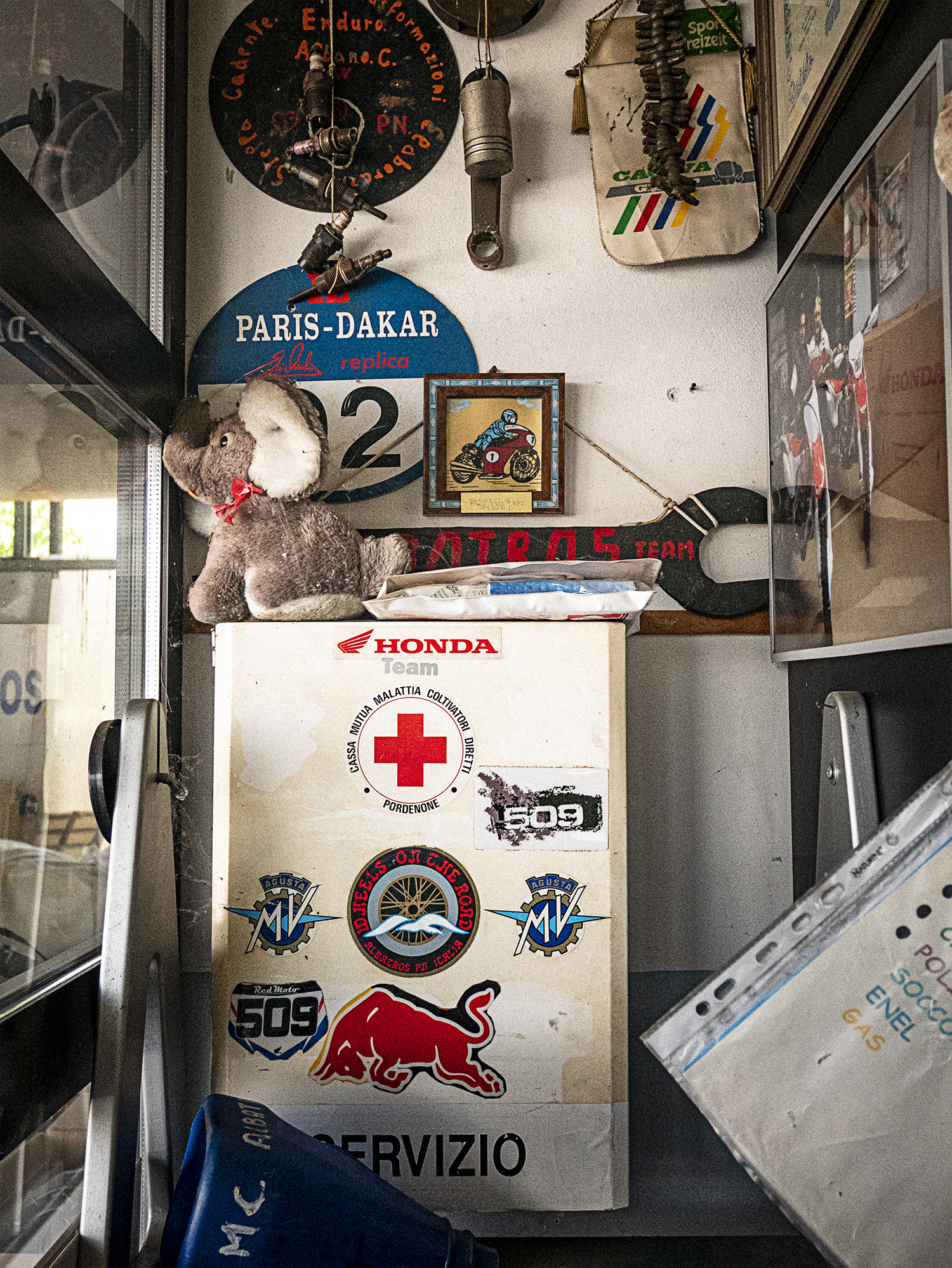
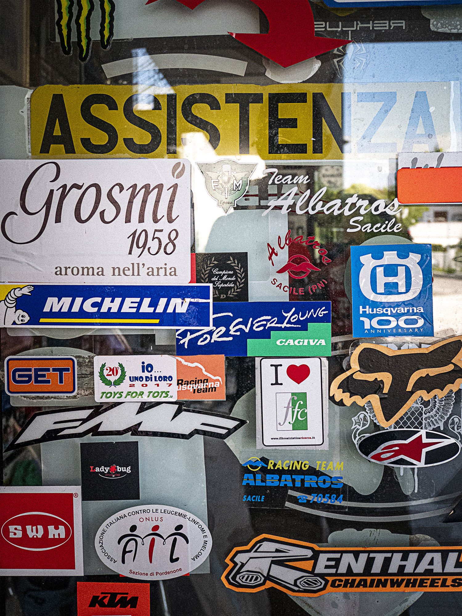
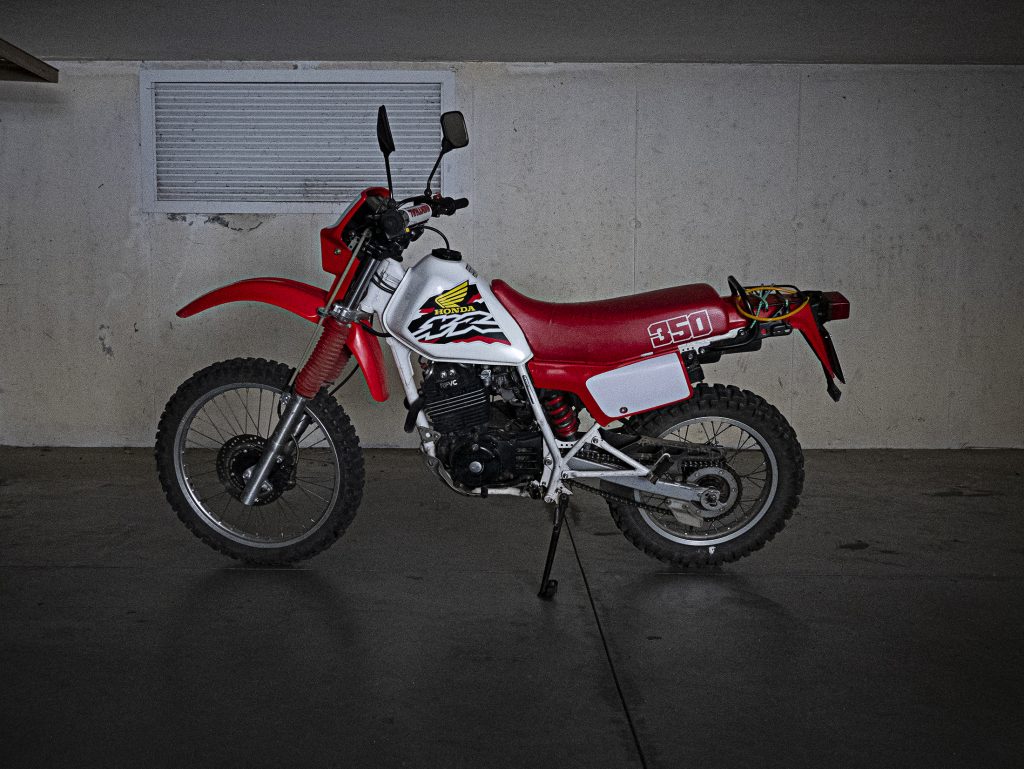
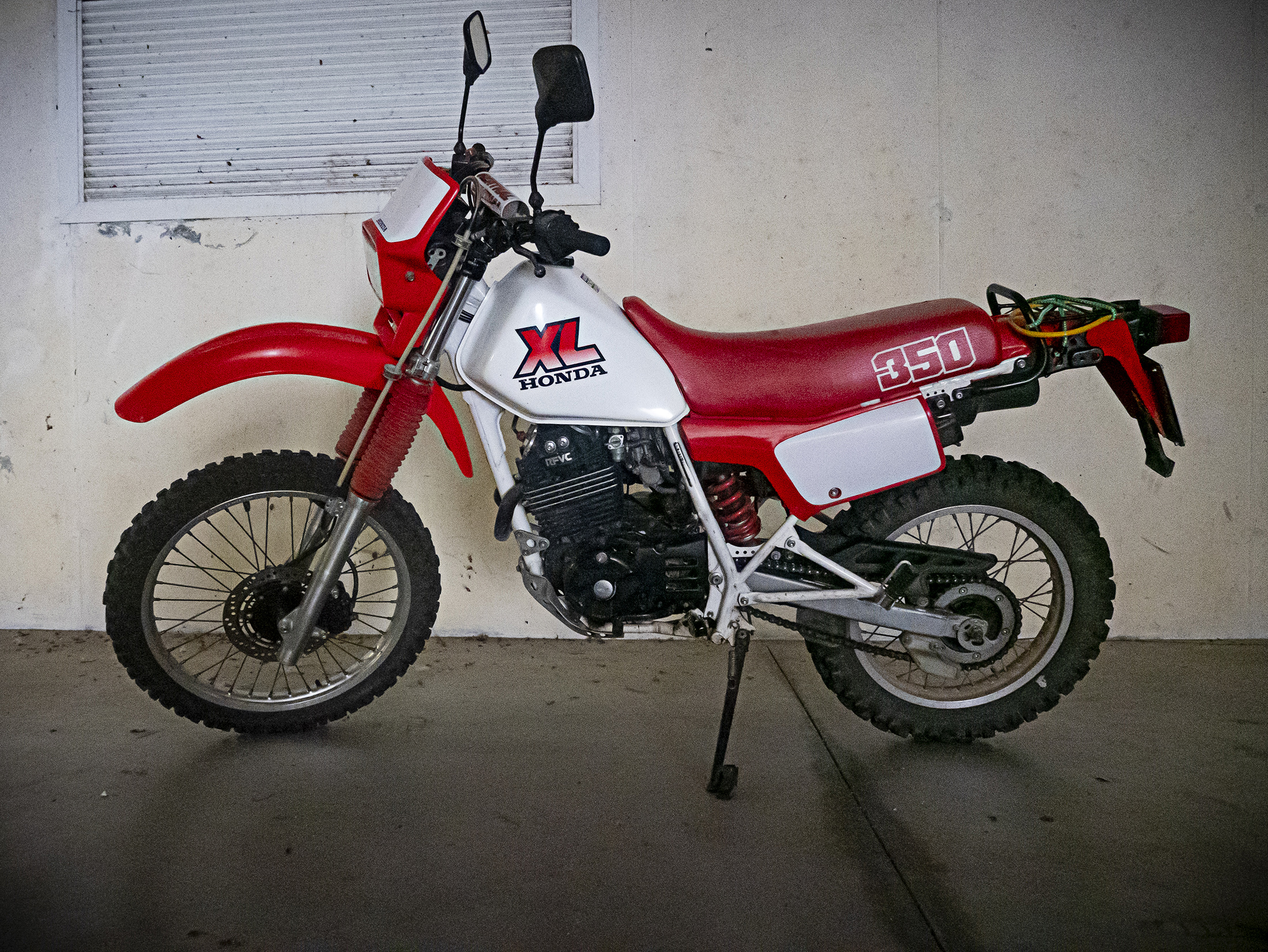
⬆️ Albatros Moto in Sacile, Italy has a showroom and a shop—a few months after we relocated to Italy from Florida I bought the Honda XL350 (below photo) there. These are images of the shop, which I loved visiting because of how unique it is. The stickers and the well-worn space tells the multi-year story in a way nothing else can.
↗️ The previous owners took amazing care of this motorcycle given how old it is (33 years!). That said, the tank graphics are not correct / original. These XR graphics appear to be from the 1998 XR line—a decade newer than this motorcycle and not the right model. I knew I wanted to replace those when I got the motorcycle. That, and it was in need of a new chain slider.
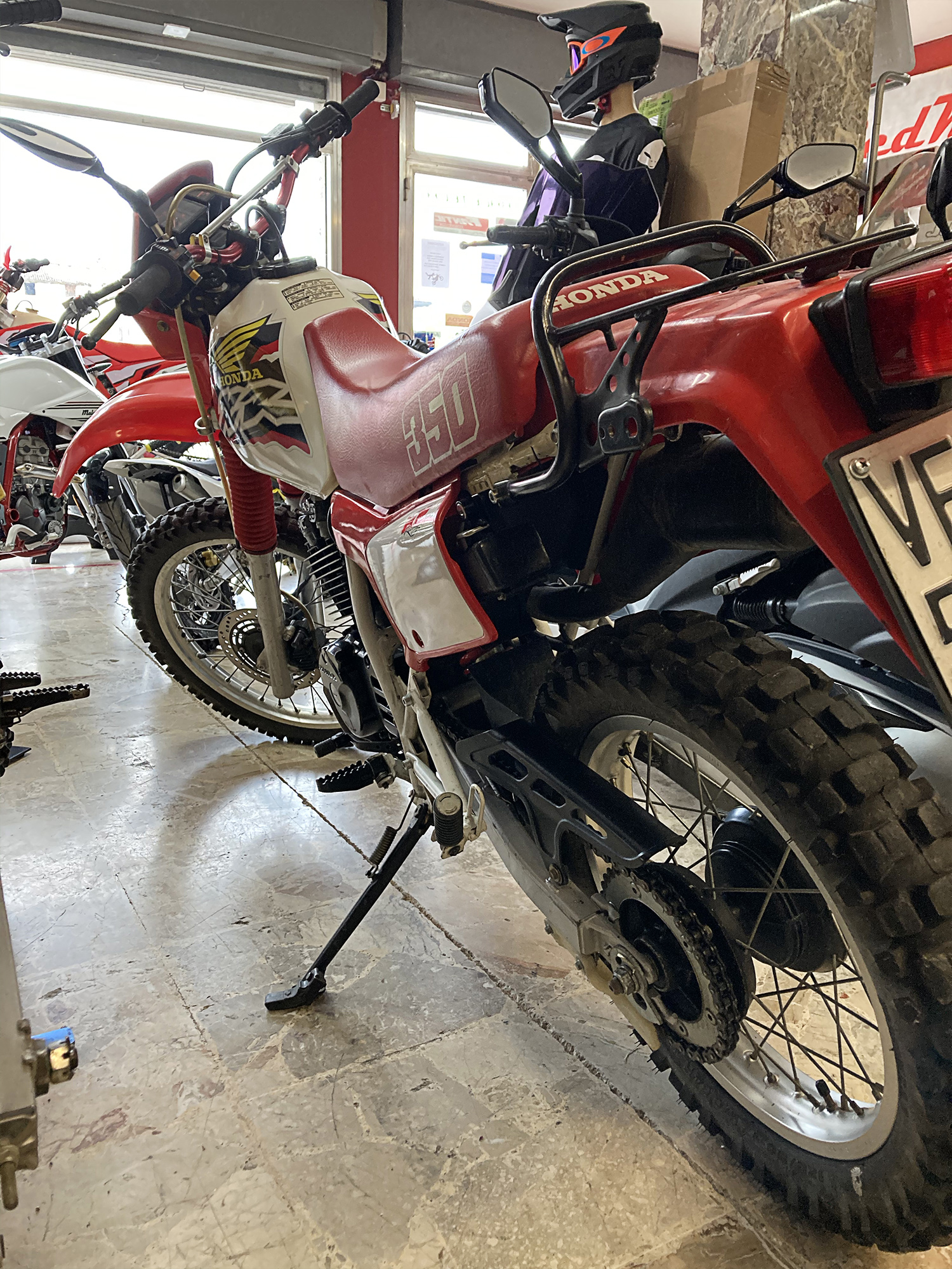
↗️ The XL on sale in the showroom at Albatros
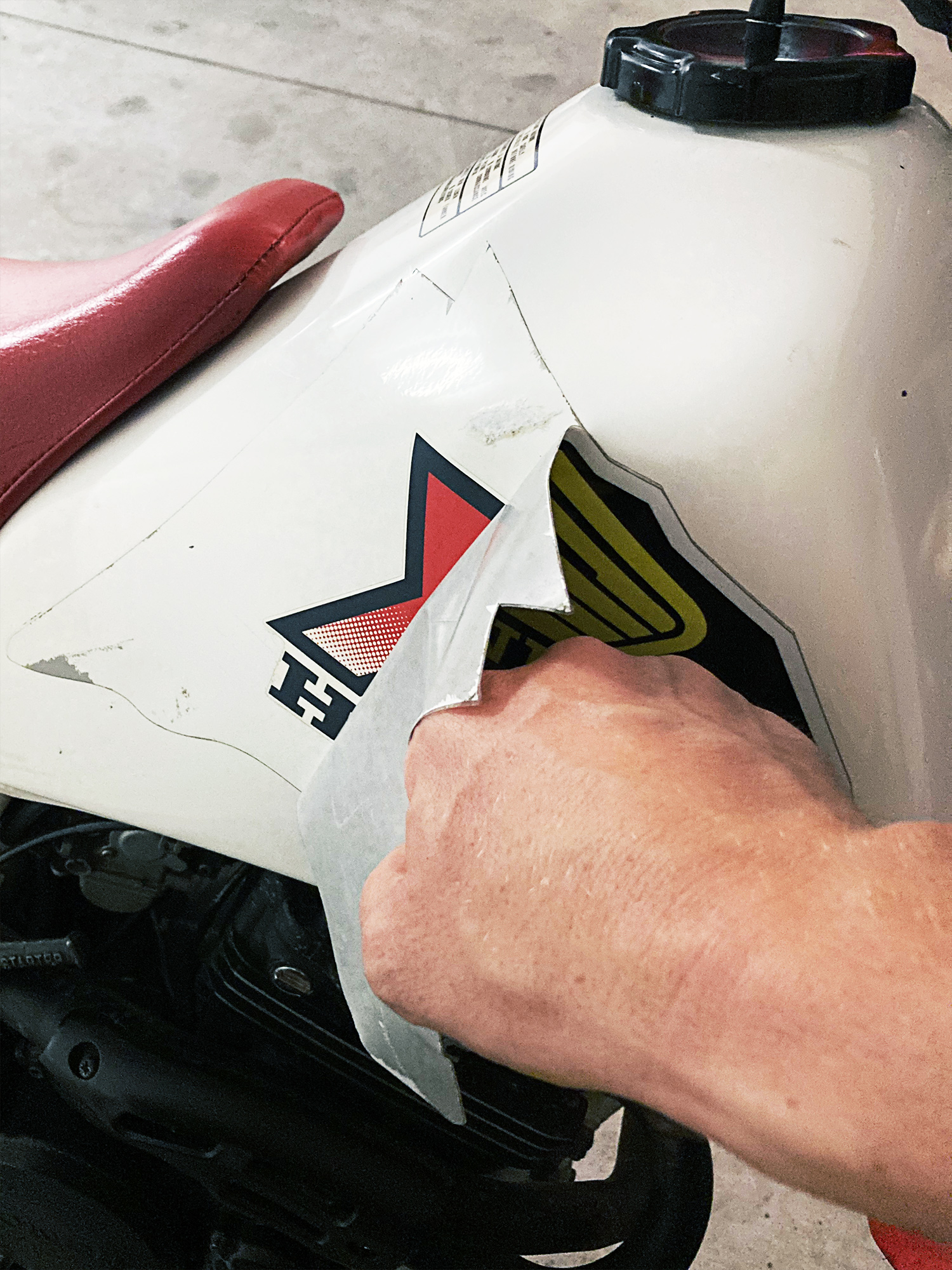
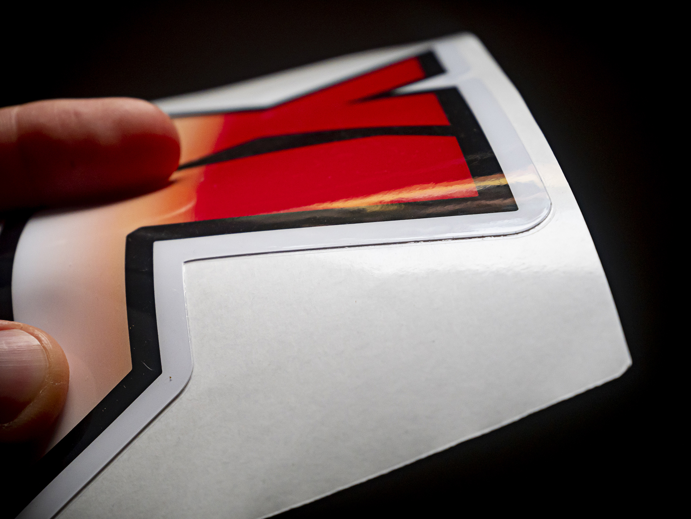
↗️ After rebuilding and printing the stock graphics I was shocked to see the original tank decals unharmed underneath the XR stickers. I was able to remove the XR stickers without damaging the XL graphics, so I decided to keep them.
↗️ Back to the original tank graphics—just keep it simple.
⬆️ The sticker rebuild process: The photo of the tank in the middle image above was the best image I could find of the original lettermark graphic kit for the European release of this motorcycle (the graphics were not the same in the US, nor did they even release XL 350s after 1985—this one is listed as a 1988 on the paperwork. I worked with Albatros to have these stickers printed and am super happy with the quality even though I ended up sticking (no pun intended) with the original graphics since they were still there under the fake XR decals (above left).
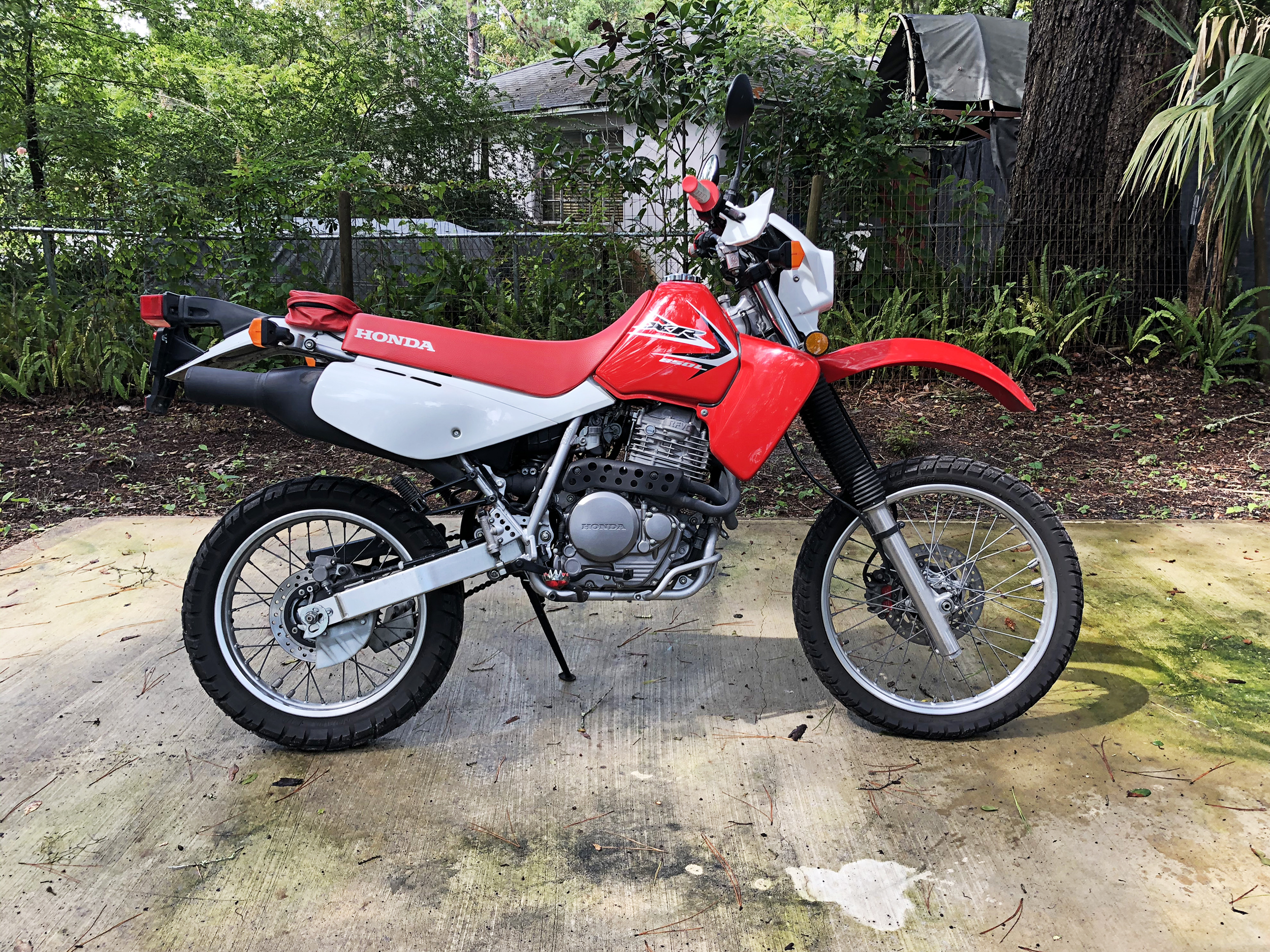
⬆️ My 2016 Honda XR 650L—sadly in storage right now in the United States. This motorcycle has as much sentimental value to me as it does anything else and I really wanted to have it here in Italy. It’s symbolic of a reconnection for me. That said, the cost and risk of shipping it overseas was too much. I’ve only had this motorcycle for a few years, but I enjoyed having one again so much this is what led me to find another motorcycle here in Italy. Ironically, I ended up finding an older / smaller version of what I already have—not intentional, but ok with me (still miss the XR, though).
on motorcycles & making…
My first motorcycle was a 1983 Yamaha PW50. I was four years old and it was the best. I had a VHS tape of the 1989 AMA Supercross season I watched on repeat. I grew up around motorcycle and car racing in a family of racers. I started racing go-karts and then micro-sprint cars myself between the ages of 12-20. The bright colors and numbers (especially from dirtbikes of the 80s and early 90s) became ingrained in my visual vocabulary from a very early age. I’m sure these experiences influenced my eventually becoming a Graphic Designer—and someone who loves and teaches typography.
After the PW I moved onto a YZ 80, then a RM 250, and finally a KX 250. I broke my ankle on the KX when I was 20—it was around 2003-2004 and I was going into college. I decided to sell the motorcycle and buy my first iMac computer. At the time this was a good decision, as it kickstarted my career as a Graphic Designer. I moved away from motorcycles and racing (not intentionally) in my 20’s and early 30’s. Getting reconnected over the past few years has been a unique and fulfilling experience in so many ways. I’ve spent a good deal of time reflecting on my early experiences around racing and being a racer myself. I moved from the Texas Panhandle to the University of Tennessee for graduate school in my early 20s. Lots of amazing things happened in Knoxville—including the beginning of an amazing relationship with my partner Amanda I am still in today.
In Tennessee I was completely focused on learning how to teach Graphic Design. This eventually lead to the beginning of my career as a design educator. There was (in my mind at least) no room for motorcycles or racing. It was a radically different experience and I had to re-learn how to do many things I thought I was already good at. For anyone who says teachers teach because they can’t do—you are mistaken. Teaching is a profession that pairs with, but stands separate from practice (I could do another post on this, but not getting more into it here—maybe later).
I’m in a space now where I’m reflecting on what it looks like to synthesize these seemingly opposing worlds. Now, (with the benefit of hindsight) I see so many obvious connections I couldn’t see before. I’m not a great rider, but the experience of being on a motorcycle is mindful—much like the experience of letterpress or screenprinting (or teaching others how to do these things). It’s not about the objects or outcomes, it’s about the experience. For me, the intersections are rooted in practice. Leveraging my design skills to re-create these XL stickers (even though it’s a very small thing)—and visiting local shops like Albatros are a synthesis of so many important things to me as a creative human. Understanding this is an ongoing process.